Many datasets today are no longer simple tables, but come in a network structure. For example, social media users who are connected to each other through specific topics, followers, or conversations, or devices that communicate with each other in a sensor network, or transactions in a blockchain network. For these new data types, we have developed a powerful technology of network visualization tool that makes it possible to display and analyze even larger networks very user-friendly.
This visualization type can answer the following questions:
- Which people, websites, or locations in a network have the highest centrality?
- Which nodes of the network have the highest influence?
- Where are critical nodes that are most important to the cohesion of the network?
- How does the network structure change over time?
Network Visualization Case studies
Customer Journey Dashboard

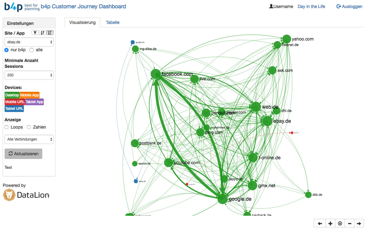
For our client GIK, we’ve implemented a web-based analysis and visualization software for technical measurement data of 8,000 people’s Internet usage (desktop, smartphone, tablet) in Germany.
The aggregated user journeys between more than 300,000 websites can be displayed as a network or as a table with a number of cases and percentages. All data can be exported as images or Excel sheets. Companies and agencies are using this software to:
- find out how different websites are related in User Journeys,
- where the incoming and outgoing traffic is directed,
- filter user journeys by sites, incoming and outgoing links or by devices
- flip through typical daily Internet routines with the add-on Day-in-the-Life
Interested in a free demo? Then send us a short message and we’ll set up your test account.
Social Media network visualization of Youtube stars

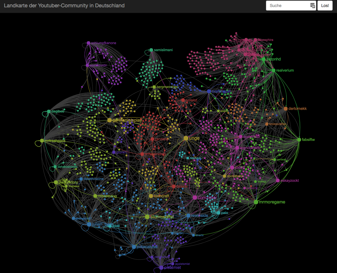
For this analysis, we used our Social Media software to identify the 1,300 most influential Youtube stars in Germany and trace their links on Twitter. The result is a map of Youtube Germany that immediately shows different thematical or social clusters of Youtube stars.
As we are repeating this analysis on a regular basis, it can also be used to identify new shooting stars in Youtube Germany and identify trends. With mouseover, you can also highlight sub-networks and display additional information and figures on each Youtube star.
You can visit the live demo right now.
Big Data Investment Map Visualization

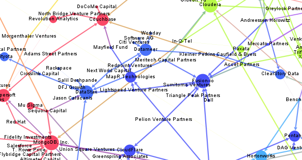
This network visualization links Big Data startups and larger companies and Venture Capital firms by their investments in these companies. This way you can identify investment trends and strategies by the top VC firms in the Big Data space – or find out which companies are trending at the moment.
More information and a behind-the-scenes look at the method used here is on our Beautiful Data blog.
