Sharing & Embedding, Reimagined — We’ve completely overhauled how dashboard sharing and embedding works. Cleaner URLs, more reliable authentication, and a smoother experience for everyone — whether you’re sharing with colleagues or embedding dashboards for your clients.
✨ What’s New
🔗 Smarter share links: Ever shared a report link and the recipient ended up on the wrong page after logging in? Not anymore! Unauthenticated users are now redirected straight to the shared report — zero friction, zero confusion.
👁️ Clean shared reports: Sharing a report with external stakeholders? You can now hide the navigation buttons for a sleek, presentation-ready view. Find this option in your dashboard’s share settings.
📊 “Different base” warning control: Got pie charts where the “different base” warning is more noise than signal? A new setting lets you hide it. Head to Admin → Projects → Settings → Value Display and toggle “Hide different base warning”.
🔍 Sorted filter lists: Excluded questions in global filter dropdowns are now sorted alphabetically — finding the right filter just got a lot easier.
📈 Improvements
PDF report export now runs in the background, so you can keep working while your reports are being generated. No more waiting around!
Benchmark filters now support selecting multiple values at once — power users, rejoice!
Codebook export validates visibility settings more strictly, preventing items with invalid display values from sneaking through.
Grid layout changes are automatically cleared from your browser when you navigate away — no more stale layouts reappearing unexpectedly.
🐛 Bug Fixes
Fixed tooltip display issues on certain chart types.
Faster Filters — No More Page Reloads! — This is a big one. Global filters now update instantly via dynamic dropdowns. Changing a filter no longer reloads the entire page, making dashboard exploration dramatically faster and smoother. Once you try it, you won’t want to go back.
✨ What’s New
⚡ Dynamic global filters: Filter dropdowns now load data on the fly and apply changes without a full page reload. Navigating large dashboards with multiple filters has never been this fast.
📊 Per-chart filter menu: Each chart now has its own dedicated filter menu with AJAX-powered dropdowns — giving you granular control over individual chart data without touching the global filters.
🔘 Custom buttons in filter bar: The global filter bar now supports optimized custom action buttons, giving administrators more flexibility to design the perfect filter experience for their users.
🧠 Smart codebook column mapping: Importing a codebook? DataLion now suggests column mappings automatically based on your data structure — saving you time on repetitive setup work.
📈 Improvements
CSV import now accepts #, @, and . characters in identifiers, with clearer error messages when validation fails.
Login page auto-fills your email from the URL and focuses the password field — one less thing to type!
Password reset now shows clearer validation feedback so you know exactly what to fix.
🐛 Bug Fixes
Case numbers in sorted multistack charts now display correctly when no filters are active.
Fixed global filter dropdown positioning and toggle behavior.
Chart translations are now properly merged instead of overwritten, preserving all settings.
Single filter selection now correctly closes the dropdown before navigating.
Friendlier Error Messages for Charts — No more staring at blank spaces wondering what went wrong. When a chart can’t load, you now get a clear, helpful message telling you exactly what happened — whether it’s a timeout, a server hiccup, or something else entirely.
✨ What’s New
💬 Chart error cards: Charts that fail to load now show beautiful, user-friendly error cards. Timeout errors and server errors each get their own tailored message — no more guessing!
🧹 Smart CSV column name handling: Importing a CSV with tricky column names (dots, spaces, special characters)? DataLion now offers to auto-fix them for you, or lets you cancel and correct the file yourself. Your call!
✏️ Edit custom filters in place: Finally! You can now modify existing custom filters directly from the dashboard — no more deleting and recreating them from scratch.
📈 Improvements
PDF multi-page exports now produce higher quality output with smarter page handling.
Theme management is more reliable, especially in multi-tenant environments.
CSV delimiter detection is smarter and handles edge cases more gracefully.
🐛 Bug Fixes
Improved file path validation during data imports.
Fixed delimiter detection for certain CSV file formats.
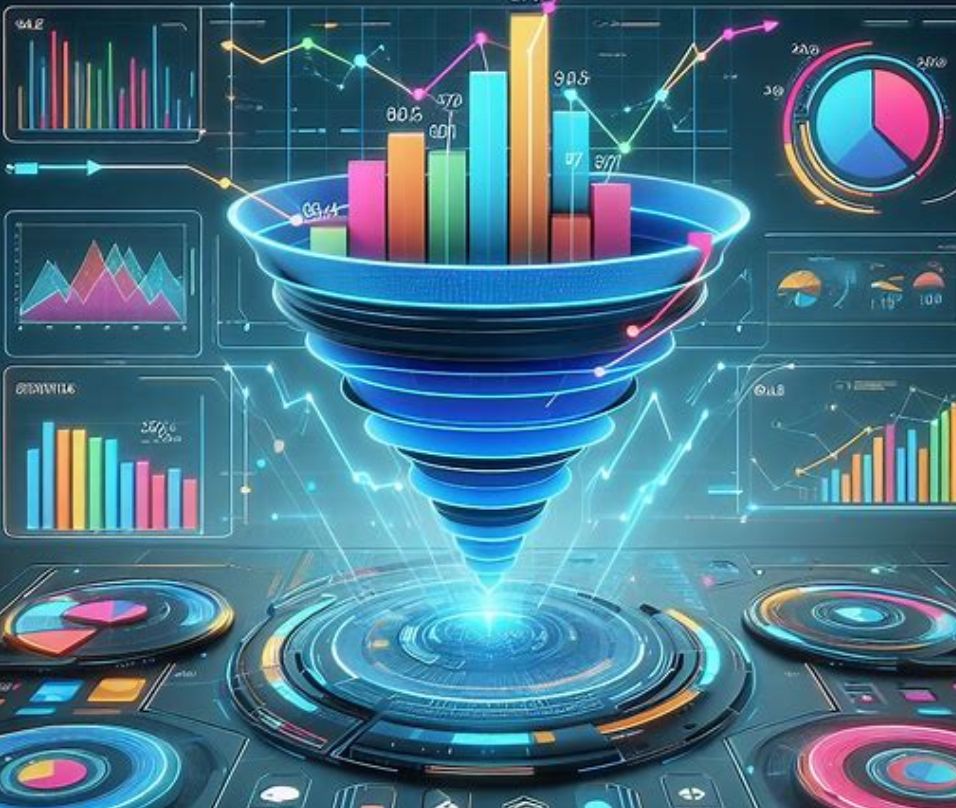
Ever wondered how to effectively track your customer’s journey, sales pipeline, or conversion rates? Enter the mighty Funnel Chart! 🎩✨
When to Use Funnel Charts:
Conversion Analysis: Perfect for visualizing stages in a sales process or customer journey, highlighting where you’re losing prospects.
Bottleneck Identification: Spot and address bottlenecks in processes, be it in sales, recruitment, or production workflows.
Path to Purchase: Track how customers move through a purchase decision, identifying key drop-off points.
How to Use Them Effectively:
🧘♂️ Simplicity is Key: Keep it simple. Too many stages can make the chart hard to read.
🎨 Color Coding: Use distinct colors for different stages for instant comprehension.
🔢 Contextual Data: Pair with relevant data points (like percentages or numbers) at each stage for depth and clarity.
Funnel charts aren’t just visually engaging; they are a powerhouse in conveying complex processes in an intuitive manner. 🌟
Incorporate these in your dashboards and watch your data storytelling reach new heights! 🎢📈
“We now work much more efficiently, giving us more time to take care of the derivations and insights from the data for the customers.”
Jens Falkenau, vice president of market research at Nielsen Sports, shared the market research firm’s reporting and automation challenges and explained how DataLion is helping him and his team.
Nielsen Sports is a leading insights specialist in the sports sector. The institute has been providing its clientele with data and insights from this sector for over 30 years. Its research focuses on the analysis of sports and fan target groups, as well as the impact of advertising and sponsorship in the context of sports. With extensive expertise in this discipline, Nielsen Sport implements around 300 individual projects each year for a wide range of clients including marketers, clubs, media, and the advertising industry.
Automating Nielsen Sports’ reporting of tracking projects
Insights specialist Nielsen Sports has long faced two challenges: First, the classic PowerPoint institute was constantly driven by its clients to provide data and insights in the form of interactive dashboards, especially for international tracking projects with large amounts of data. Additionally, the institute’s goal was to encourage its customers to work more with their data and to be able to do this themselves. The high amount of work involved in preparing the data and the large number of PowerPoint slides that had to be produced were to be reduced. Jens Falkenau reported on a typical situation before switching to DataLion dashboards: “A trauma for me was a customer request after receiving a comprehensive report of a 20-country study. He was very satisfied with the report and the preparation, but wanted to have each chart prepared “once again only below the surveyed women”. In the dashboard, one click of a button, as a PowerPoint, several days of work.”. A dashboard solution was intended to increase the added value of the analyses for the clients and, on the other hand, to minimize the workload of queries and new preparation of the data in PowerPoint.
“It’s a classic win-win situation: the customer gets value out of it, but so do we.”
The requirements for dashboarding software for market research
A vendor was sought that met the needs of market researchers. In particular, easy data integration, differentiated rights management options, and the ability to perform simple and quick data segmentations would facilitate reporting. Before coming across DataLion, Nielsen Sport tried several dashboard solutions, including those from market-leading vendors. The problem was always that these products were not focused on the needs of market researchers. The data integration was complex and the display and analysis options were too limited from a market research perspective. Aligning with the needs of market research was critical for Nielsen Sports in selecting DataLion as its dashboarding software.
“Finally, we could easily and effortlessly integrate our data into the dashboard and create engaging interfaces for our clients that offered all the statistical analysis capabilities they were accustomed to. And some exciting features on top of that.”
In particular, the ability to work with broad data sets with multiple responses that are typical for market research, without having to transform the data in advance in a time-consuming manner, helps the researchers from Nielsen Sports save time. In addition, the differentiated rights management options in DataLion are essential for the reporting of tracking projects.
Easy entry into automated reporting with DataLion
Nielsen Sports now uses DataLion for reporting for many projects of larger customers and forgoes the preparation in PowerPoint. The changeover was uncomplicated and without major hurdles: “Of course, we first had to build up the skills in the team for working with DataLion. But that went easier and faster than expected.”. Workshops by DataLion and later by internal specialists helped with this process. Jens Falkenau has one tip for institutes planning to implement their reporting with DataLion: Involve the project managers in the process at an early stage. This way, their creative potential can be fully exploited.
Customer loyalty and increased efficiency through DataLion dashboards
By switching to reporting with DataLion, the institute has reduced the workload for their international market research trackers many times over. “We now work much more efficiently and thus have more time to take care of the derivations and insights from the data for the customers,” reported Jens Falkenau. This helps both the institute and its clientele, he added.
“The improvements in reporting and the time saved are considerable.”
Customers can also work much more flexibly and independently with their own data using DataLion. The high level of customer satisfaction with the dashboards has another positive effect: “This also supports customer loyalty to our institute,” explained Jens Falkenau.
In a world where data is ubiquitous, the clear presentation and visualization of data in market research are playing an increasingly significant role. As a leading SaaS startup in data visualization for Insights Professionals, we would like to present you with 10 compelling reasons why, in our view, data visualization is the future of market research.
Instant Understanding:
Data visualization allows you to transform complex and unwieldy datasets into clear and compelling graphics. At a glance, you can discern patterns, trends, outliers, and relationships. This visual approach provides an immediate grasp of information, making complex data more intuitive to understand.
Effective Communication:
Visualized data is more easily comprehensible and is excellent for conveying insights to teams, customers, and other stakeholders. Instead of slogging through lengthy reports, visualizations can present complex information in a more digestible form. This fosters clear communication and facilitates collaboration within organizations (and can even be enjoyable).
Rapid Decision-Making:
In today’s fast-paced business environment, making timely decisions is of paramount importance. With data visualization, you can make informed decisions more swiftly by analyzing data in real-time through automated imports or APIs. This enables companies to respond to shifting market conditions and customer needs before it’s too late.
Understanding Customer Behavior:
The ability to comprehend customer behavior is invaluable for businesses. Data visualization allows you to correlate and represent demographic data, interests, and behaviors in meaningful graphics. This supports audience segmentation and the ongoing customization of marketing strategies to cater to customer needs.
Elevating Customer Satisfaction:
Visualizing and benchmarking customer surveys enables you to identify weaknesses and take targeted measures for improvement. By analyzing feedback, companies can continuously enhance their products and services, ultimately increasing customer satisfaction.
Competitive Advantage:
In a fiercely competitive market landscape, distinguishing oneself from the competition is crucial. Data visualization empowers companies to gain valuable insights by visualizing market trends and competitor data. This helps in crafting effective competitive strategies and establishing a successful market presence.
Product Development:
Linking customer feedback and sales data in visualizations assists companies in identifying product improvements and new ideas. This information is pivotal for product development, allowing companies to offer products that align with their customers’ needs.
Effortless Reporting:
Effective reporting is an integral component of market research. With software like DataLion, you can seamlessly integrate visualizations into reports through drag-and-drop and export them as PowerPoint presentations or Excel spreadsheets with a simple click. This streamlines the communication of research findings and saves valuable time.
Professional Data Visualization:
The quality of visualization plays a pivotal role in data interpretation. “Smart” tools offer professional techniques for effective data visualization, including conveying clear messages, simplicity, and thoughtful color selection. These principles are essential to ensure that the created visualizations are both understandable and persuasive.
Prepared for the Future:
The world of data visualization is continually evolving, with even more innovations on the horizon. With the ongoing development of artificial intelligence (AI) and machine learning, data visualization tools will become even more powerful and accessible. DataLion is proud to be at the forefront of this field, assisting customers in harnessing the advantages of these advancements.
Prepare for the future of market research! Data visualization with DataLion is the key to better decision-making and the development of successful marketing strategies. Discover how DataLion can transform your business.
Whether you want to uncover complex data patterns or communicate clear insights, DataLion is your trusted partner for data-driven successes. Contact us today to learn more about how we can elevate your business to the next level in market research.
The new Version 2022.2 is here! DataLion wishes you a relaxing summer and makes it easier for DataLion admins to work with the software: Filter and delete data online, an overview page for project reports, as well as ownership and exports with notification. There are also new features for data visualization such as the network chart for showing connections, a revised chord diagram and new functions for the calendar drop-down menu. At the same time, we further reduced the number of page reloads and improved the usability of the project setup for a more pleasant user experience.
A comprehensive overview of all improvements and new features can be found here.
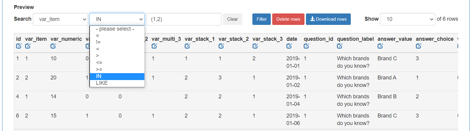
Edit data tables online in DataLion
Data tables can now easily be filtered online in DataLion and the filter selection can be deleted. An example: The data of a new wave was imported into the project, but the data has to be changed again. Simply filter on this wave in your table, delete the entries and then import the current data. This means that not all of the project data has to be removed and re-imported. The filter function can also be used to find out the number of cases for an entered condition, e.g. WHERE var_item IN (1,2) returns the cases where the variable var_item = 1 or = 2. Filtered data can also be exported. Learn more here mehr.
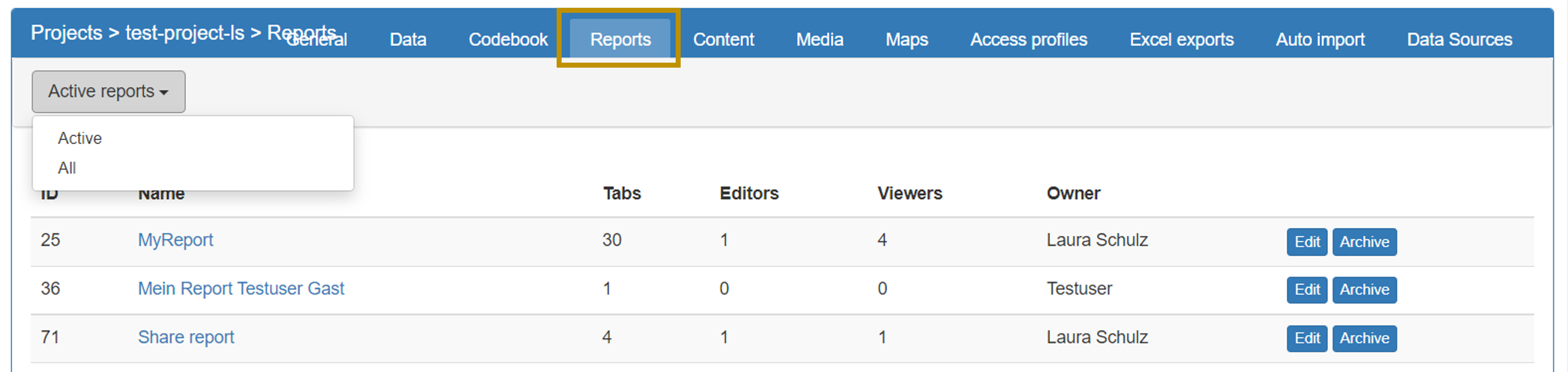
As an admin, keep track of projects with the new report overview!
The report overviewhelps you to know which reports exist in a project and who has rights to them. The report overview is a list of all reports in the project with the report owner and a link to the corresponding report settings (“Edit”). There is also the option in the report overview to organize reports into active and inactive. Inactive reports are listed as archived in the frontend, but can be retrieved via the report overview if required.
Also new is that report ownership can be changed. The change can be made in the report settings.
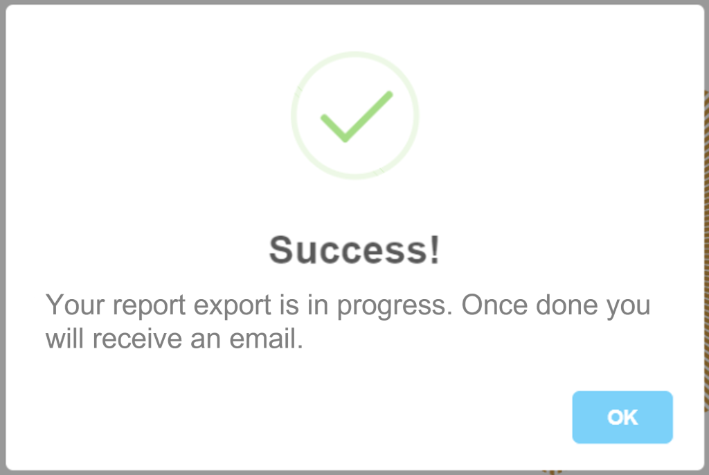
Export large amounts of data with notification
Exports of data tables or exports of reports/dashboards in formats such as xlsx, PDF or pptx can now also be carried out as a queue job with notification. This is particularly useful for large amounts of data to be exported, e.g. reports with a large number of tabs and charts. The user can simply continue working while the export is being generated in the background and will conveniently receive a notification to the stored e-mail address after completion.
Find out here in the Project Settings – Reports and Dashboards section how the report export with notification is activated and here in the Export Project section how the table export with notification for access profiles is activated.
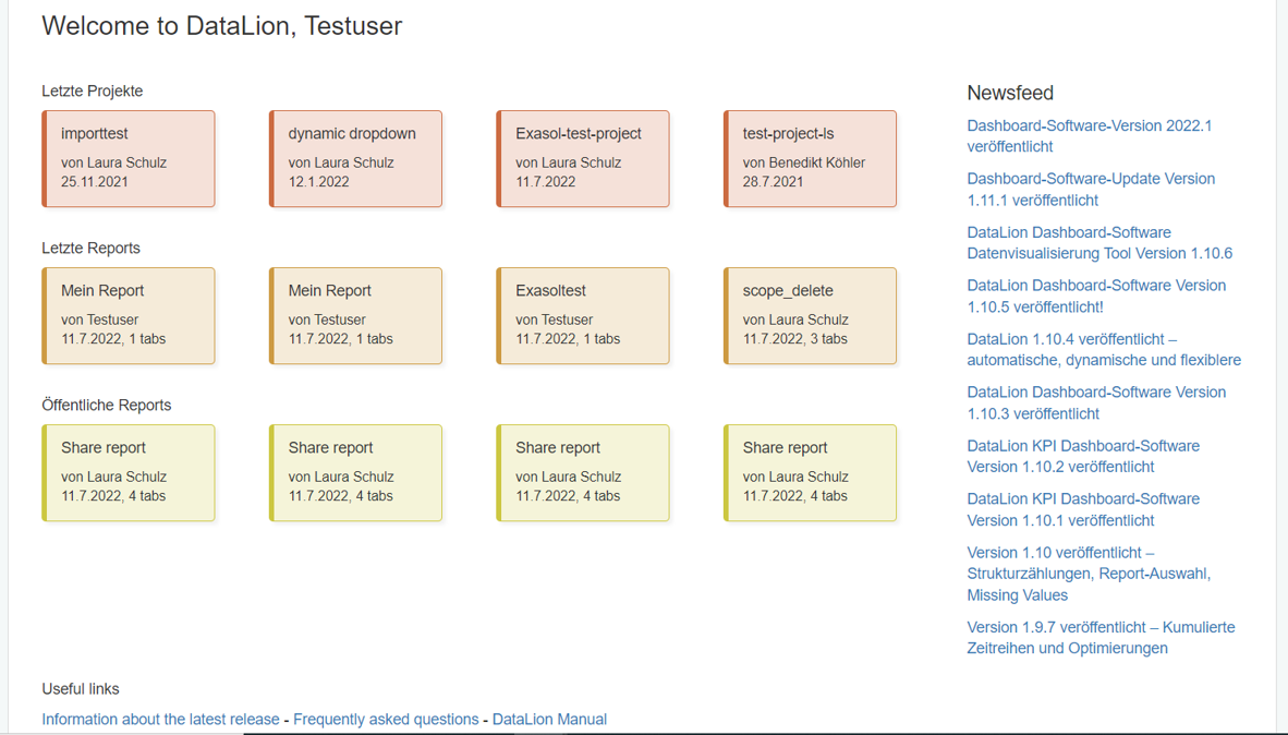
DataLion start page with your personal recent work and the latest DataLion information
The start page gives you an overview of your recent work and navigates you directly to your dashboard by clicking on an item. You will also find helpful links to the DataLion documentation, the latest announcements and release logs on the start page.
The start page is displayed after login if no default project is applied, to which you are automatically forwarded after login.
Set up large dashboard projects quickly and clearly: define metrics via the codebook
In DataLion, representations can be output in many different metrics, e.g. percent, absolute values, sums, maximum, minimum, etc. You can first define a default metric at project level and then change this metric in the frontend for each chart if desired, e.g. from absolute values to percent. This second step can now also be carried out in a time-saving manner via the codebook and thus significantly reduce the number of clicks in the front end, especially in large projects with many charts and dashboards. Learn more about how to define the metric per chart via the codebook here.
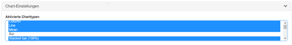
Select project chart types
The chart types that are available in the project can be selected in the Project backend > General > Chart settings. The chart IDs no longer have to be entered.
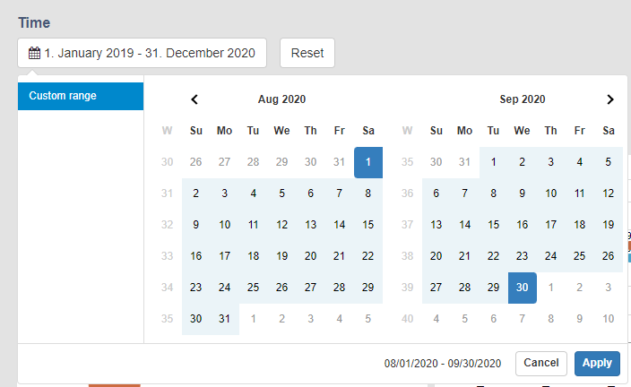
The datepicker has evolved: default time periods
Additional periods are now available for the date picker (calendar), which can be defined as default time periods. With a default time period, the dashboard is always displayed to the user as a standard, filtered to this preset time period. Find outherein the Datepicker section (time series menu) how to define a default period for the datepicker.
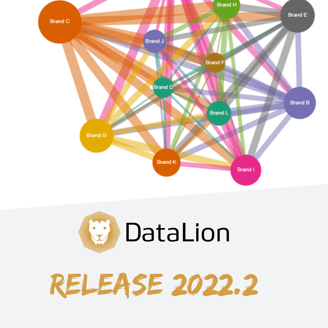
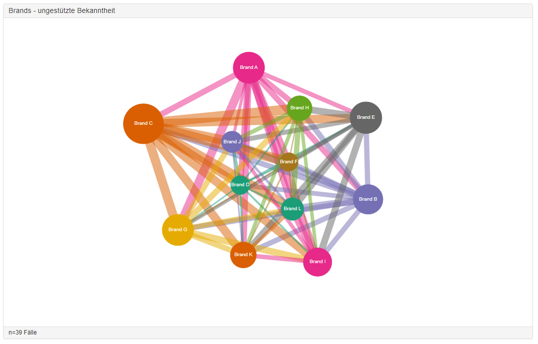
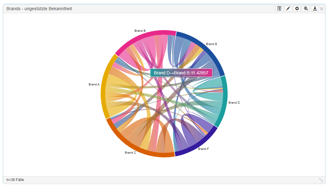
Visualizing interconnectivity: The network chart
The network chart shows how things are connected to each other. Variables are shown as nodes that are linked to each other via lines. The size of the node indicates the absolute value of the node. The lines show with which nodes there is a connection and how strong this connection is. For example, it is easy to visualize which brands were named together with other brands in an open mention and how often they were named together with the other brand (line width).
The network chart is an alternative representation of the chord diagram.
Dashboard software for market researchers – Part 2
.Check the Part 1 – Dashboards for Market Research of the series here: Part 1 – Data.
DataLion is designed as a market research dashboard software for market researchers. This is certainly because of our professional background in the industry. We want to shed light on the topic of “Dashboards for Market Research” from different perspectives in a series of blog posts. After our first article: Dashboards for Market Research – Part 1: Data, in the second part of the series “Dashboards for Market Research” we want to take a look at the challenges that arise from combining different studies within one project – especially concerning timelines.
Meet and succeed with DataLion: “Succeet21” – Stand. 114
On October 27th and 28th, the market research fair Succeet21 will take place in Munich – the trade fair for insights and market research. After there was initially a virtual trade fair in spring 2021, a face-to-face event will now also be held. With the motto: Meet and succeed, DataLion will be happy to present as an exhibitor on both days of the fair.
Are you on-site? Come by and visit us! Our booth has booth number 114. Let us arrange a meeting in advance by simply sending us a message with the form below. We are ready to show how you can use DataLion dashboard software to quickly and easily create interactive dashboards that enable efficient data visualization and inspire customers. We look forward to welcoming many new and familiar faces to our stand.
Continue reading “DataLion at Succeet21 – AI in Market Research Dashboards”→
DataLion is exciting to join the two events of DMEXCO & DIGITALX to join the discussions with other businesses in Europe about business analytics, digital business, marketing, and innovation this September. We are fascinated to share with all Data-fan some great insights which are sharing during the events.
Dmexco – Digital Marketing Exposition & Conference
We use cookies on our website to give you the most relevant experience by remembering your preferences and repeat visits. By clicking “Accept”, you consent to the use of ALL the cookies.
This website uses cookies to improve your experience while you navigate through the website. Out of these, the cookies that are categorized as necessary are stored on your browser as they are essential for the working of basic functionalities of the website. We also use third-party cookies that help us analyze and understand how you use this website. These cookies will be stored in your browser only with your consent. You also have the option to opt-out of these cookies. But opting out of some of these cookies may affect your browsing experience.
Necessary cookies are absolutely essential for the website to function properly. This category only includes cookies that ensures basic functionalities and security features of the website. These cookies do not store any personal information.
Any cookies that may not be particularly necessary for the website to function and is used specifically to collect user personal data via analytics, ads, other embedded contents are termed as non-necessary cookies. It is mandatory to procure user consent prior to running these cookies on your website.