Dashboard software for market researchers – Part 2
. Check the Part 1 – Dashboards for Market Research of the series here: Part 1 – Data . DataLion is designed as a market research dashboard software for market researchers. This is certainly because of our professional background in the industry. We want to shed light on the topic of “Dashboards for Market Research” from different perspectives in a series of blog posts. After our first article: Dashboards for Market Research – Part 1: Data, in the second part of the series “Dashboards for Market Research” we want to take a look at the challenges that arise from combining different studies within one project – especially concerning timelines.
Tracking studies
Tracking studies involve repeat surveys on a topic, usually at short intervals. This means that data sets are generated at regular intervals: annually, quarterly, or even daily. While automatic imports are ideal for certain studies – especially when data is generated on a daily or weekly basis – other studies must be appended to the existing dataset at regular intervals. . Dashboards offer the advantage that data sets can be appended to existing ones without the need to manually merge and visualize data. DataLion Dashboard software offers the possibility to replace or append data without having to adjust anything in the dashboard. Thus, market researchers can save a lot of time in the preparation of regularly collected data.
Timelines in Market research dashboard
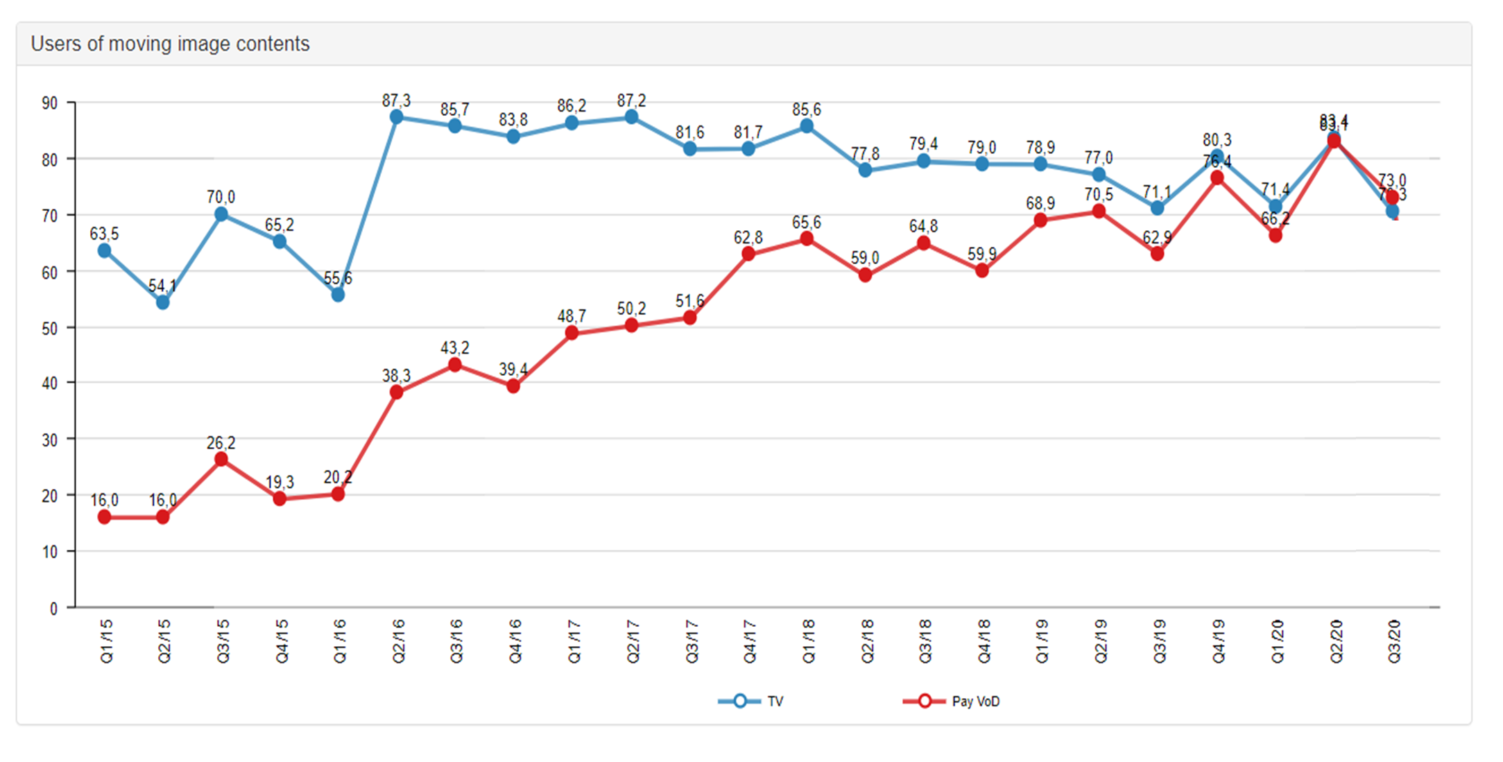
While we are on the subject of tracking studies for market research data, the subject of timelines also becomes relevant. The purpose of repetitive studies is to visualize (long-term) developments and interpret trends. To visualize data as timelines, a time variable is necessary for the data set(s). . This can be either a non-time stamp variable (e.g., year, calendar week, or wave) or a timestamp variable (format: “YYYY-MM-DD”) in the Market research dashboard software. Timelines with non-timestamp variables offer the great advantage that also arbitrary variables, e.g., the survey wave, can serve as a basis for development analysis. . However, DataLion KPI dashboards can also handle date formats (= timestamp variables) and visualize time series dynamically. Data sets with timestamp variables offer market researchers the great added value of being able to switch flexibly between time intervals within the chart. This means that data can be visualized not only daily but also on a weekly, monthly, quarterly, and yearly basis – a good way to keep track of long-term studies.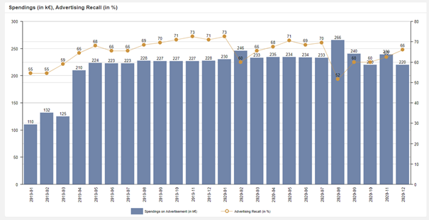
Datepicker
Another option to keep track of tracking studies is to work with a date picker in the dashboards. Just like dropdown filters, the data picker shows only the data for a certain period in a dashboard. This is especially helpful for market researchers who want to get a “deep dive” into their data. . A prerequisite for using the data picker is the use of a timestamp variable in the data set. But also, data sets with a non-timestamp variable can be filtered using dropdowns, so that the visualization of a specific period (e.g., survey wave) is possible.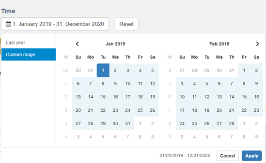
Integration of different studies
In addition to tracking studies, many market researchers also work with several studies simultaneously. For example, ad-hoc studies often need to be supplemented by studies with panel data. DataLion dashboard tools offer the possibility to integrate different data sources within one project. Again, there is the option to append datasets to data sources or to replace existing data sources. In addition, the various data sources can also be linked to each other via a unique key variable. The big advantage here is that market researchers can combine and filter the data as they wish. The weighting of the data sets is also still possible.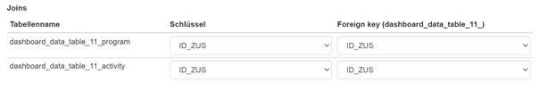
Integration of different studies and visualization in timelines
The more complex the data sets become, the higher the demands on visualization software become. We, as a market research dashboard software provider, are also constantly encountering new challenges. Only through close cooperation with our customers and their trust can we continue to develop DataLion. Recently, we have been working on the possibilities of time series with a lot of passion and energy. Market researchers can now calculate variables from different and unrelated data sources and display them in time series. This is not only possible with timestamp variables, but also with non-timestamp variables. In addition, different variables from different data sources can now be visualized in time series. We are convinced that we can provide you with real added value by once again expanding the visualization and analysis options.