From the beginning, we designed DataLion as a dashboard software for market researchers. One reason for this is certainly our professional background in the industry. But what exactly makes a market research dashboard software? Since we are asked time and again what exactly differentiates DataLion from other software platforms, we want to shed light on the topic of "Dashboards for Market Research" from different perspectives in a series of blogposts and go into more detail about the special features in data, chart types, metrics, and reporting, among other things.
Let's start with a look at the data structures in market research. Here you can find the biggest peculiarities that always challenge institutes and corporate market researchers in the implementation of interactive dashboards. The typical software for data processing and visualization is usually based on data structures from accounting: sales and volume by region, company unit, product in a certain period have been the typical use case since the emergence of spreadsheets in the 1980s.
But in market research, we have a completely different data structure. Here, it's not always the same products that are sold in certain periods, but respondents answering hundreds or even thousands of questions in questionnaires about demographics, lifestyles, attitudes, rankings, preferences, and so on. In the process, different areas are repeatedly skipped, displayed, or even randomly selected, depending on the course of the survey. The result is data sets that are often extremely "broad" (i.e., have very many columns), but with only a portion of the values filled in ("sparse data").
Filters and percentages
This already leads us to the first special feature when it comes to the market research dashboard: Due to the emergence of online, telephone, or face-to-face surveys, one often finds entire variable ranges in the data set that were only shown to certain people (e.g., only women or connoisseurs of a certain brand). This in turn requires special measures in the evaluation: Depending on the statements one wants to make and how the filtering is done, percentages have to be applied to a population, a certain sample, or the filter: 10% of the connoisseurs of a brand and 10% of the population are two completely different statements.
It is equally important to be able to recognize at all times in all presentations the basis on which percentages were calculated. This is even further complicated in longitudinal surveys or tracking studies, as new questions are added from time to time or old questions are dropped. Or in queries about brands, certain characteristics are added. For example, if you have 10 brands in a bar chart, each added at a different time, each bar has its base.
We have made this as simple as possible in DataLion: The software automatically detects whether all characteristics in a chart refer to the same base or whether there are different numbers of cases or missing values - for example, due to characteristics that were added later. The calculation of the percentages is then based on the respective case numbers. And if - and this also happens - you want to use a completely different variable as the basis, you can also set this so that evaluations of a question always automatically use a specific variable as the basis. In this way, our users can concentrate on the content and figures and do not have to constantly think about which basis to use here.
Missing values
While in typical spreadsheet data sets a 0 means that simply nothing was sold in a given period, in market research data there is a big difference between a zero, a blank value, and a missing value. Depending on the context, there are even different types of missing values: not in the filter, don't know, other, not specified, etc., which are often coded with different values such as -77 or 999.
Some of these missing values you want to see in evaluations, but others you don't. Some missing values should be included in the calculation of proportions, others should be excluded here. If you have ever tried to create evaluations with a mixture of -99, -77, 99, NULL, and 0 with a spreadsheet or a normal visualization software, you surely know the feeling of uncertainty when an average value of a scale from 1 to 5 is suddenly much larger than it should be, or unexpectedly throws out a negative result.
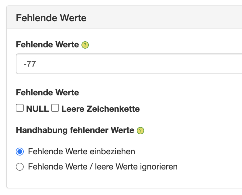
Instead of working with complicated workarounds, recodes, or auxiliary variables, we have provided extensive handling of missing values in DataLion from the beginning. One can define the different missing values or zero values and then optionally include or exclude them in calculations. This also works in mean values or sums, so that here a 999 is not counted as a number, but not at all.
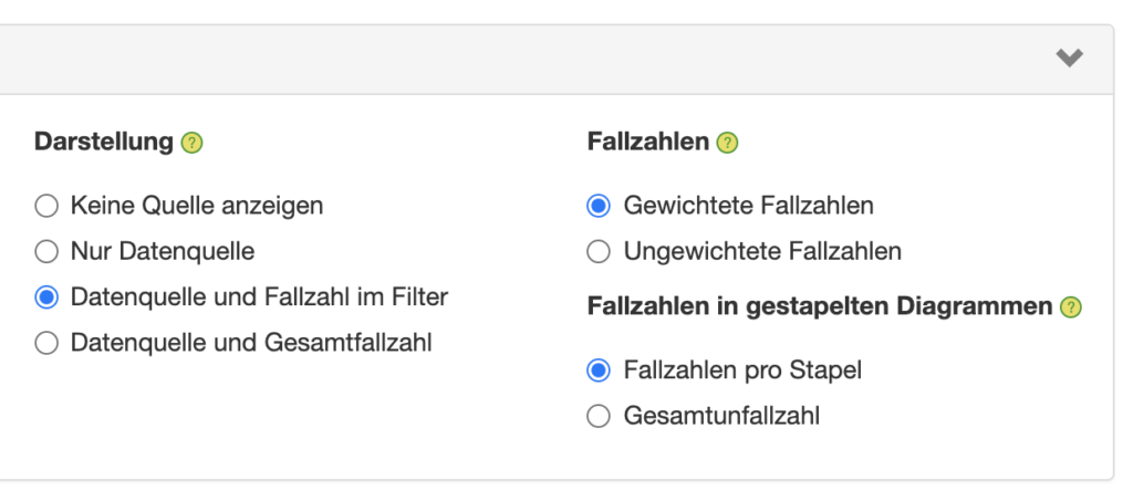
Missing values are also taken into account in the specification of case numbers, so that here, too, it is always possible to see in the legend which case number framework is used as the basis for statements about specific filters, target groups, or brands. Because even if a survey went out to 2,000 people: If a brand or product only has real values for 10 respondents and otherwise only missing values, then this should always be recognized in the evaluation.
Case numbers
This brings us to the next big topic: case numbers. If you come from a controlling or sales background, the term "number of cases" makes no sense to you. A unit sold is a unit sold. And whether 100 different products are sold in a store or just one, is irrelevant for the significance of the figures.
It is completely different in market research. For each statement, we must be able to see on which case number basis this statement is based. If the base is too small (e.g., smaller than 50 or 100), then we have to be especially careful when interpreting this statement. And this is where the filters and missing values come into play again: because it is not the total number of cases that is decisive, but in the end, it is a question of who specifically answered this one question.
Statistical tests such as t-tests for comparing mean values or chi-square tests for comparing proportions also require the respective case numbers to be able to determine whether and how significant the results of a market research study are at all.
Weights
As if this were not complex enough, very often there is not just one case number in market research studies, but several case numbers. This is because many market research studies work with data that are weighted using weighting factors so that the sample proportions of the most important subgroups - for example, regions or age groups - correspond to the distribution in the population.
In other studies, the data are not only weighted but also projected to the population using projection factors. In these cases, we always have two different sets of cases - weighted and unweighted - each of which is relevant in different contexts. If the objective is to test statistical significance, the unweighted case numbers are used; if the objective is to make statements about the behavior or attitudes of the target groups, the weighted case numbers are relevant.
In many cases, one wants to make sure that no statements can be made about populations that are too small - either for data protection reasons or for reasons of the resilience of the numbers. In these cases, of course, the raw, unweighted case numbers must be taken into account. Especially in table volumes, both case numbers are therefore often included in the output, so that the relevant case number is always available for the analysis.
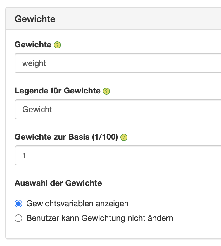
The mathematics behind the weighting is not very complicated (each case is multiplied by the corresponding weight and then divided by the sum of the weights), but calculating the weighting manually is relatively time-consuming. Therefore, in DataLion market research dashboard, you can easily define the weighting variables - these can also be several as in the case of monthly, quarterly, or representative sample weights - and then select in the dashboard with a mouse click whether and by which variable to weight. We are currently testing a DataLion extension that even allows data to be weighted dynamically in the software according to specifications.
Test DataLion Dashboard Free Demo:
Data volume
Anyone who has ever tried to open the data set of a survey with 10,000 columns and 30,000 rows in standard software knows that this does not run smoothly. But especially when a survey has many multiple-choice questions in which individual characteristics either apply (1) or do not apply (0), data sets can grow very quickly. Relational database systems have no problem with many millions of rows, but tens of thousands of columns are usually impossible to represent.
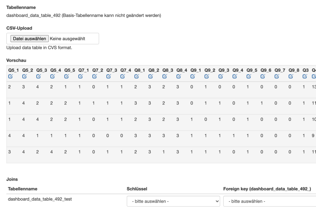
Here we have several options: Either one splits the dataset into several horizontal parts, each containing a part of the variables for all respondents, and then evaluates these datasets linked via a common key variable - this works in DataLion via the dropdown in the backend.
The second variant in the market research dashboard is to "verticalize" the dataset - i.e., turn the columns into rows, so that only the filters and the relevant variable or metric then remain. 100 columns of 1-5 for brand liking, most of which are empty, then become just a few rows with a small number of columns - for example, the ID, a timestamp, the brand, and then a column with the value for liking. Depending on how wide a dataset is beforehand, and how heavily populated the columns are, this can be a useful alternative. Calculating the number of cases in such a case, where there are several rows per respondent, can be conveniently solved in DataLion using a formula that counts the different IDs, for example.
The third variant in the market research dashboard is column-oriented database systems. We have had very good experiences with Apache Drill and Exasol when it comes to fluently evaluating data sets that have many (i.e., more than 2000) columns, but also many rows. Here, too, the connection can be set up conveniently in the backend.