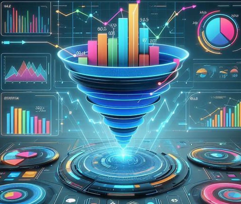
Ever wondered how to effectively track your customer’s journey, sales pipeline, or conversion rates? Enter the mighty Funnel Chart! 🎩✨
When to Use Funnel Charts:
- Conversion Analysis: Perfect for visualizing stages in a sales process or customer journey, highlighting where you’re losing prospects.
- Bottleneck Identification: Spot and address bottlenecks in processes, be it in sales, recruitment, or production workflows.
- Path to Purchase: Track how customers move through a purchase decision, identifying key drop-off points.
How to Use Them Effectively: 🧘♂️ Simplicity is Key: Keep it simple. Too many stages can make the chart hard to read. 🎨 Color Coding: Use distinct colors for different stages for instant comprehension. 🔢 Contextual Data: Pair with relevant data points (like percentages or numbers) at each stage for depth and clarity.
Funnel charts aren’t just visually engaging; they are a powerhouse in conveying complex processes in an intuitive manner. 🌟
Incorporate these in your dashboards and watch your data storytelling reach new heights! 🎢📈
#FunnelCharts #DataVisualization #BusinessIntelligence #Dashboards #DataDriven #MarketingAnalytics