BI dashboard updated: Time Series, data import, drag & drop for customized dashboards
New Month – new update! Our software engineering lions worked until last night on the BI dashboard software‘s latest new features and hunted for the last remaining bugs. Their hunt was so successful that we can finally launch the new DataLion version 1.6.
Here are some of the most important new features and improvements in our newest BI dashboard:
Drag and drop for even more customized dashboards
The new software release allows you to create even more customized dashboards: All charts can be moved freely on the dashboard and you can also adjust the size of the charts by drag and drop. When you hover over the lower right corner of a chart, an arrow will appear that allows dragging the chart larger or smaller.
Easy import with our new wizard in BI dashboard
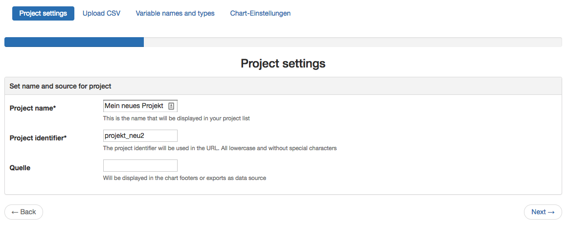
Previous versions of DataLion required administrative rights to import data. Now, you can import your CSV files into DataLion as a normal user, recode the values in the files and create dashboards with your own data. In our free version, you can test this feature with CSV files containing up to 500 rows and up to 100 columns. Try importing your data now!
Automated data import and dynamic variables
These two new features are complementing each other perfectly. In version 1.6 you can set up an automated data import so your data can be updated at regular time intervals (e.g. every Sunday at 2 am). All analyzes and reports are also updated automatically for you.
By using the new dynamic variables, real-time analyses will become even more comfortable. With just a few clicks, you can e.g. look at the results for the last 10 days and save the results in a dynamic report that will always refer to the correct time frame.
New timeline features in the BI dashboard Ver 1.6
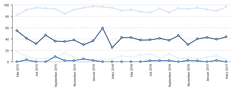
Time-series analyses are becoming more and more important for many of our users, so we have improved the timeline chart even more. Now it allows the user to define columns that contain timestamps or dates in the date and then switch between different time intervals (e.g., weeks, months, and years) with one click.
In addition, you can now also compare target groups or evaluate different variables over time.
BI dashboard Software tour
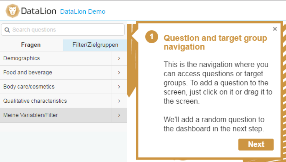
Especially for new users, we have created a quick tour through the most important features of the DataLion software. To access the tour, click “Start Tour” in your login menu in the top right corner (you have to be logged in).
Create presentations in record time
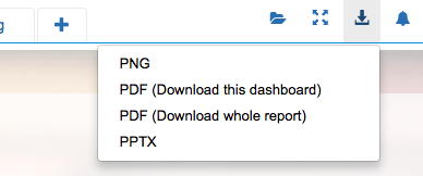
With our new advanced export features, you can export not just individual charts, but also entire dashboards and reports. This allows you to create your presentations in record time.
Further updates in 1.6
- Visualize Google Analytics data in real-time with DataLion
- Add text and images to your dashboards and reports
- Change the look and feel of your dashboard with themes
- “Rainbow” mode: Apply different colors to the bars in bar or column charts
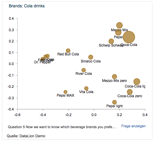
- New chart types: gauge and multidimensional scaling (See live example here)
We are looking forward to your feedback on the new features and improvements!