In Data visualization, dashboards are a great way to make sense of complex data. How effective a dashboard is, however, ultimately depends on the specific composition. In modern dashboard systems like Datalion, the compilation of charts is easy, but how to choose the right chart types? Check our Data visualization tips to make your dashboards perfectly. Continue reading “Data visualization tips: these chart types are worth a thousand words”
Tag: best dashboard software
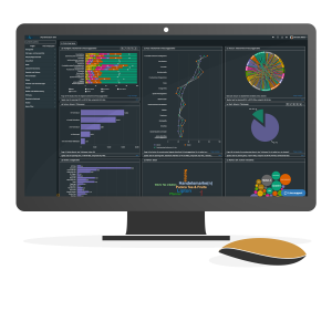
Dashboard solution: Six tips to build a perfect dashboard

In the age of big data, business intelligence and artificial intelligence, data plays an increasingly important role for companies. Dashboard solution is now widely used, bringing data to the point and thus becoming an important basis for decision-making. If you are visualizing your data, these dashboard tips might be helpful for you.
But the optimal visualization of data still is a challenge. With the following six tips in the dashboard solution, you will be able to build a great dashboard and save time. Continue reading “Dashboard solution: Six tips to build a perfect dashboard”
Space visualization: The 5 most beautiful data visualizations
These days we are celebrating the 50th anniversary of the Apollo 11 moon landing and focusing on a possible new lunar conquest by 2023. But let’s dream a bit and look at the most beautiful space visualizations of the universe the Internet can offer today! For all skywatchers out there, here’s a list of the sites to visualize data related to galaxies, space visualization and the world around us.
Apollo 11 traject Space visualization
Apollo 11 (July 16–24, 1969) was the spaceflight that first landed humans on the Moon. Commander Neil Armstrong and lunar module pilot Buzz Aldrin formed the American crew that landed the Apollo Lunar Module Eagle on July 20, 1969, at 20:17 UTC. Let’s experience Apollo 11’s way to the moon.

Continue reading “Space visualization: The 5 most beautiful data visualizations”
Dashboard software released: DataLion dashboard solution Ver 1.10.6
Improvements and new features in Dashboard software released:
DataLion team is proud to introduce our newly dashboard software released: Dashboard solution Ver 1.10.6. You will find the following new features to improve your KPI report’s quality, the dashboard in real-time, data visualization, insight analysis, dashboard design in the latest DataLion Dashboard software version:
Dashboard software released new features:
-
- Custom stylesheet for login page
- Send notification per mail
- Create support for executing custom features
- Admin – delete old
- PPTX export – calculation variable in the title
- Table – rolling % as a metric
- Apply chart filter to multiple charts
Continue reading “Dashboard software released: DataLion dashboard solution Ver 1.10.6”
Dashboard Platform updated – DataLion 1.9 released
Experience more lion power in the new Dashboard Platform version

There’s exciting news from DataLion Dashboard Platform: we released version 1.9 which includes numerous new features we’ve developed in close cooperation with clients & users. We have incorporated your feedback and suggestions gathered in the past months. Among new features like visualizations and export functions, we have also implemented several optimizations (e.g. loading time) and bug fixes.
In short, DataLion Dashboard Software now is faster, more flexible and more productive than ever. We hope you will love it!
Let’s have a closer look at some highlights: Continue reading “Dashboard Platform updated – DataLion 1.9 released”
BI dashboard tools DataLion version 1.6 is live now
BI dashboard updated: Time Series, data import, drag & drop for customized dashboards
New Month – new update! Our software engineering lions worked until last night on the BI dashboard software‘s latest new features and hunted for the last remaining bugs. Their hunt was so successful that we can finally launch the new DataLion version 1.6.
Here are some of the most important new features and improvements in our newest BI dashboard: Continue reading “BI dashboard tools DataLion version 1.6 is live now”