In Data visualization, dashboards are a great way to make sense of complex data. How effective a dashboard is, however, ultimately depends on the specific composition. In modern dashboard systems like Datalion, the compilation of charts is easy, but how to choose the right chart types? Check our Data visualization tips to make your dashboards perfectly.
Before visualizing your data
First, ask yourself what messages and information you want to communicate with your dashboard in your data visualization? And what kind of data is available for that purpose? Different chart types are possible depending on whether you want to display distributions and shares or visualize trends and processes. Also, the target audience of your dashboards is important: a data analyst often expects a different level of detail than, for instance, a marketing employee. You find more information about the basic approach in another article about “Data Visualization: Six tips to build a perfect Dashboard”.
On the one hand, you should be brave and, in addition to common bar charts and line charts, use unusual chart types to inspire the target audience of your dashboard. On the other hand, you must always pay close attention to clarity and meaningfulness. Therefore, offering added value through interactivity in the form of selection filters makes great sense, but also has an impact on the selection of appropriate forms of presentation. In addition to deciding on the right charts, the definition of colors, fonts, and dimensions is ultimately part of the optimal composition of a dashboard. The best diagram does not help if, such as colors are hardly meaningful or do not match the corporate identity.
The easiest way to play and test different visualizations in the dashboard software is to step by step and select the best charts and graphs. For example, Datalion offers more than 50 different chart visualizations that can be inserted and exchanged with just a few clicks. Here are some particularly important chart types.
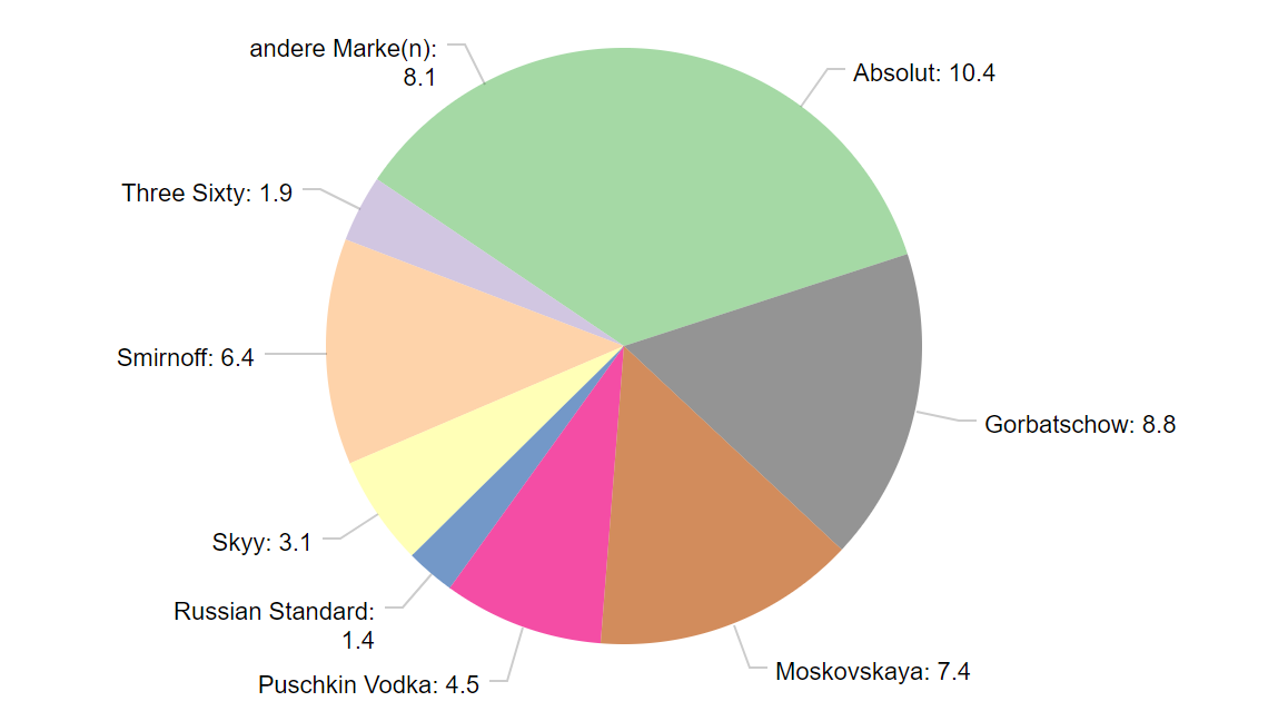
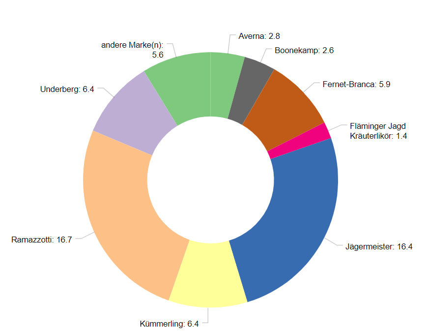
Data visualization: Pie- and Donut Chart
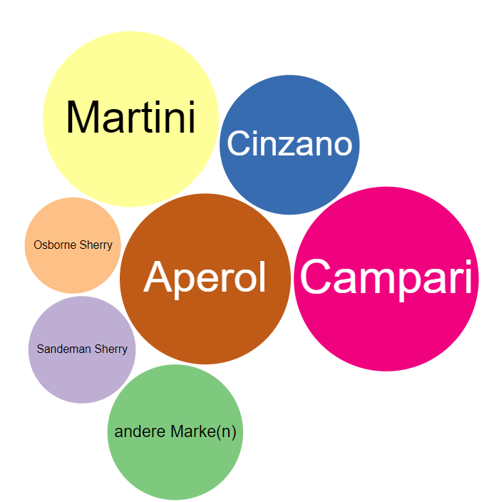
The good old pie chart is a classic one and well understood for less data-savvy people. This graph type is suitable for representing relative frequencies within a category of data – all shares together are 100 percent. Classic example: age groups or genders and their proportions within a sample.
The so-called radial chart is also in great demand for design-oriented chart professionals. It looks like a speedometer and is very meaningful thanks to its simplicity. However, the range of applications is limited, since it is only suitable for the visualization of variables with only one expression. By the way, for your data visualization tips, the donut chart is closely similar to the pie chart: The hole in the middle loosens up the image, thus providing (at least) an optical treat.
 |
 |
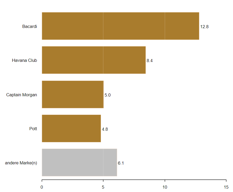
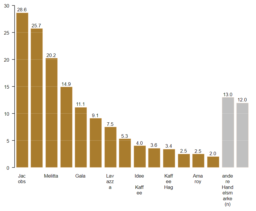
Data visualization: Column and bar chart
Column and bar charts are also part of the basic equipment of every dashboard artist. A bar chart is when the columns are vertical. If the columns, pardon bars, run horizontally, it is a bar chart. For charting relative and absolute frequencies and their comparisons, these chart types are great, making them one of the most popular chart types, whether vertical or horizontal.
|
|
 |
Data visualization: Stacked bar chart
An important special form of the bar chart is the stacked bar chart. It is suitable for displaying scaled data and, thanks to the compressed representation, provides a quick overview – even over extensive result tables. Stacked bar charts are often used when you want to put results into so-called item batteries in the dashboard. However, it is important to have a good color choice that intuitively reveals, such as approval (green) or rejection (red).
Data visualization: Line chart
Another well-known classic is the line chart. For comparisons of features or trends, there is hardly a better choice. The results of various image measurements are available and important differences made easily visible. For the visualization of time series, Datalion offers an optimized separate time series.
 |
 Polarity chart Polarity chart |
If you want to compare two or more features and highlight differences, the Polarity Chart is great. In the case of usage trends or awareness measurements, the presentation is equally clear and easy to understand. In addition, it is ideally suited for the additional integration of filters.
Radar chart
Somewhat fancier is the radar chart. Visually appealing and meaningful, even larger amounts of data can be displayed. Typically, You use this chart type to represent several evaluations, such as brand awareness. The prerequisite is that the variables to be compared have the same scaling. Each value is entered on an axis and evenly distributed to 360 ° around the zero point, for each category, there is an axis. Not only in marketing radar charts regularly meet with a positive response and have many fans.
Wordcloud
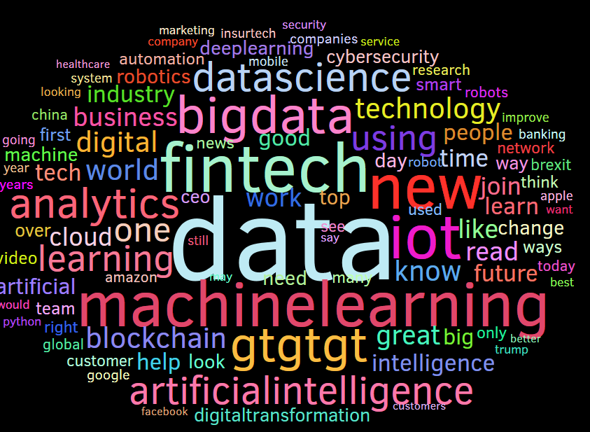
TheWordcloud is truly a special case in this article, but can not be used to represent quantitative results. For qualitative data, however, the Wordcloud is worth gold as one of the best data visualization tips: terms that are particularly common are displayed in a larger or more prominent manner. Words that are rare, smaller. This gives open-ended questions an easy form to display and looks good. Well, it’s not quite that easy: depending on the question and the response, the results have to be adjusted and the words such as “and” or “me” have to be removed. If you still use the matching colors for the presentation, the Wordcloud could definitely be an eye-catcher.
Data visualization: Funnel chart
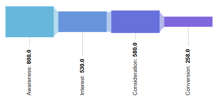
Especially sales professionals have their joy on this chart type, as they allow the different stages of a sales funnel (read more: the full power of KPIs in dashboards) simple and impressive. But also characteristics of other gradients or phases can be elegantly communicated herewith. Hence, an important added value of the chart is that potential problems between stages of a process or process can be identified quickly.
Multidimensional scaling
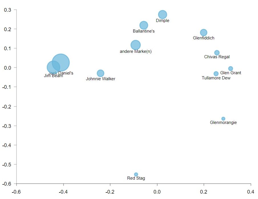
Also, another Data visualization tips is the presentation of multidimensional scaling (MDS) is very effective. You can use MDS, for instance, to identify certain buyer groups and to clarify their respective differences. The combination of two features is reflected in the coordinate system, whereby the corresponding scaling can be read on the x or y-axis. This form of presentation is not for beginners, but a must-have for data professionals.
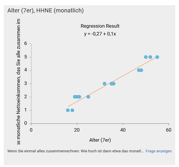
Incidentally, this also applies to the scatterplot chart: Similar to the MDS chart, values of two dimensions are displayed in a coordinate system. However, this type of diagram deals with the depiction of relationships between two variables or characteristics. It is easy to see from the pattern of points whether variables correlate and to what extent they do so.
Data visualization: Bubble chart
Rather, something for design lovers is bubble charts. You can use the circles to compare the expressions of a variable, for example, when comparing different age groups within the variable “age”. On the one hand, the radius of the circles represents the size of the portion, on the other hand, colors can also be used to illustrate the differences. However, if you are not a fan of “bubbles”, you better use the treemap: It works like the bubble chart but uses squares instead of circles. This looks a bit tidier and the differences can often be better interpreted.
 |
 |
Chord chart

A true piece of art is the chord chart – if you use the right data. From a design point of view, this chart type is out of competition, but experience has shown that interpretation is difficult for many people. It shows relationships and overlaps between data in a matrix. For example, to identify different groups of buyers. Once you have understood the basic principle of a dashboard user, the added value is huge. However, as a dashboard designer, you should provide an explanation for this to happen.
Further chart types
You haven’t found the chart types or data visualization tips what you are looking for? No problem, because there are many more chart types. Moreover, you can check out our overview to find information on numerous forms of presentation, and try within Datalion dashboards here: Overview of the Datalion chart types and how to use them.