
In short: A dashboard is not a collection of everything you know. It is an argument, laid out in a fixed order, for one audience. Dashboards that go unused almost always break the same rule: they were built to show the data rather than to answer a question someone actually has.
These six rules are about layout and design. If you are still choosing between platforms, start with the dashboard selection checklist instead.

In the age of big data, business intelligence and artificial intelligence, data plays an increasingly important role for companies. Dashboard solution is now widely used, bringing data to the point and thus becoming an important basis for decision-making. If you are visualizing your data, these dashboard tips might be helpful for you.
But the optimal visualization of data still is a challenge. With the following six tips in the dashboard solution, you will be able to build a great dashboard and save time.
1. Dashboard tips: Have a clear goal in mind
What sounds trivial is a common reason for overburdened and meaningless dashboards. First of all, ask yourself the following questions:
- What do you want to achieve with your dashboard?
- Who is the target audience for the dashboard?
- What data do you need to display to get your target audience attracted to your dashboard solution?
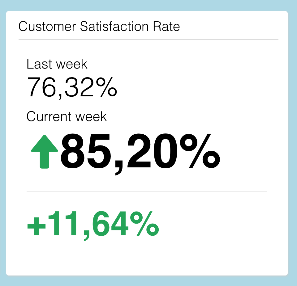
It makes a huge difference whether you create a dashboard for your finance department, consumer research or marketing team. Although the database may be the same, users' interests and priorities can vary a lot. Market researchers usually want details and with many drill-down options, whereas marketing colleagues often have more interest in central KPIs. A dashboard for the management board usually needs a lower level of detail than a dashboard for special departments.
It's better to create different versions of a dashboard instead of trying to make everyone happy with one view. In modern dashboard tools, you can quickly and easily adapt existing visualizations and then offer different versions separately.
2. Dashboard tips: Create stories with your data
Data and results have a special impact when told as a story. Focus on the questions your target audience will have and visualize the data in a logical and thrilling order. A dashboard needs a leitmotif. The order of charts should be based on the interest of the target group.
How should the user proceed from result A to result B? What data must be shown first to set the context for the following data? Storytelling within reports and dashboards is a very powerful way to get your target audience attracted. Further useful may be e.g. appropriate headings, interpretations and explanations. Pictures can help to clarify your story.
3. Focus, focus, and focus
A very common mistake derives from the idea to provide as much data and results as possible. Overloaded dashboards with unattractive information for the target person, have no right to exist. The added value of a good dashboard solution lies precisely in bringing important information to the point. Simplicity and clarity are kings. And if the user wants more information, you may provide him with some drill-down options.
But usually, it’s much more difficult to get things straight to the point than to get lost in details. Unfortunately, this applies to dashboards as well as to all other forms of data visualization.
4. Not only bar plots in your dashboard solution: choose an appealing design
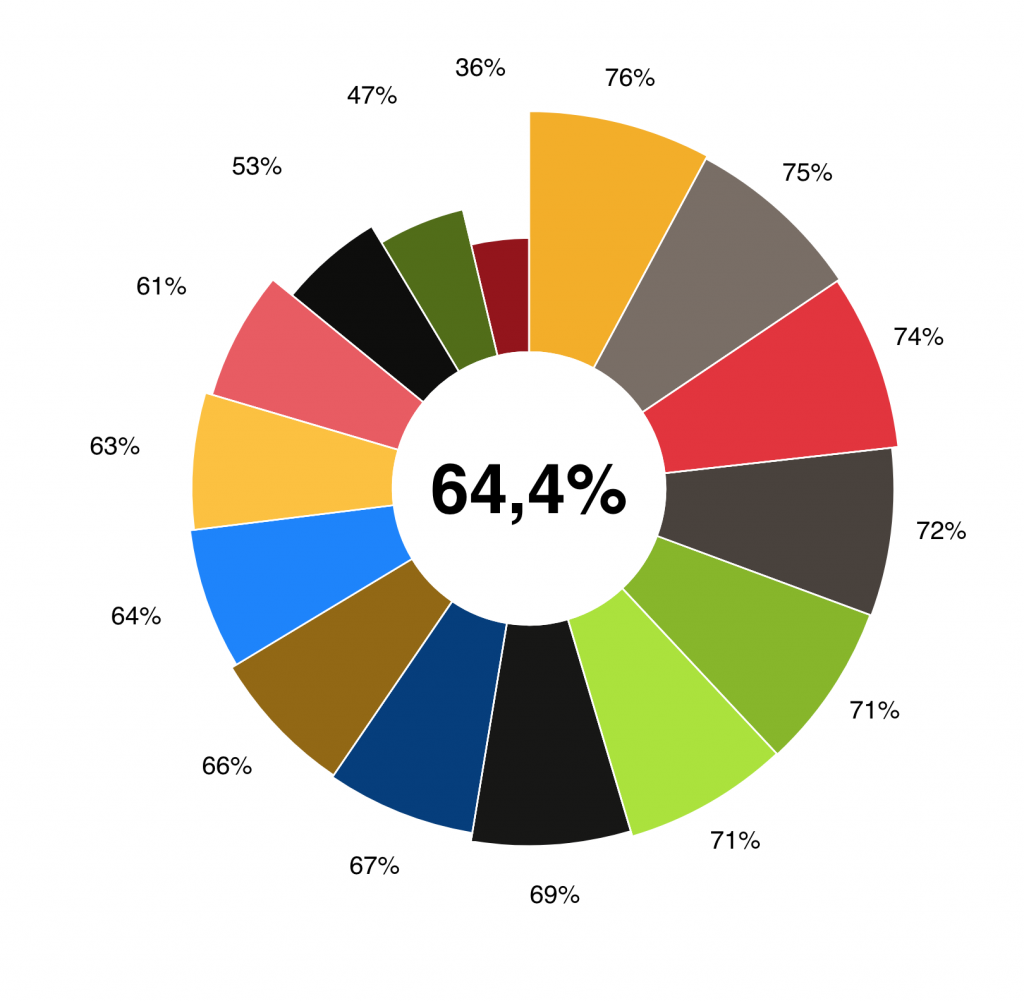
Undoubtedly one of the most important success factors of good dashboards is a clear and appealing design. First of all, it's about choosing the right visualization: bar charts can be very useful, but there are many other types of graphs to present data. Depending on the topic and objective of the dashboard, it could also make sense to use pictures or text elements. In addition, the corporate identity should be clearly visible.
Don’t worry: you don’t have to reinvent the wheel, there are many templates and examples of good dashboards out there.
Even with dashboards, orient to visual standards that users are already familiar with. Use known icons and navigation elements. A good UX design is key for making the dashboard an important tool in the company. Therefore, test the dashboard to some users before going live. But don’t worry: you don’t need a complex usability test scenario. But go out and watch your target audience during use and take the feedback to improve the dashboard.
5. Dashboard tips: Let the user play
A major benefit of online dashboards is that they are interactive, not static as PowerPoint reports or Excel spreadsheets. Provide users with the opportunity to delve deeper into data by offering filters or different target groups to choose from. So users can customize the dashboard for their purposes and "play" with data. This interactivity increases the added value of a dashboard and ensures greater use.
Keep in mind, however, that the more possibilities of analysis and customization you provide, the more you have to train users beforehand. Otherwise, there is a risk of misinterpretation. Finding the right balance between too much and too little data in a dashboard is an art.
6. Choose the right dashboard tool
Using good dashboard software the key factors mentioned above should be implemented easily. But there are also some technical requirements to consider. Of course, the dashboard should also work on a smartphone or tablet device. And ideally in all common browser versions. Since data volumes are getting bigger and the time of your target group ever shorter, loading times must also be as short as possible. Flexibility in data sources is another feature that can decide between success and failure.
It is also good if a dashboard offers export interfaces to Powerpoint and Excel so that results can be quickly compiled for Executive Board / offline reports as needed. And last but not least: most data is sensitive. Data security should be guaranteed and data protection rules have to apply.
Datalion's dashboard solution provides the perfect tool to build good and successful dashboards.