
Use case: UX research & product teams
Product research with methods your survey tool does not compute
Your survey tool shows that 62 percent want feature A. It does not show whether that differs between the Team and the Enterprise plan, whether the difference is significant, or what users would give up for it. DataLion computes SUS, MaxDiff, Van Westendorp and product-market fit and breaks everything down by plan, role and feature.
Free to start · no credit card · hosted in Germany
DataLion is the analysis platform for product teams that need more than a response distribution: usability scores such as SUS and UEQ are computed by the scoring engine, feature requests are prioritised with MaxDiff, prices tested with Van Westendorp, and the product-market-fit question is broken down by plan and role. Plan, role and feature come along as URL parameters from your app. Anyone with a question for the data asks it in the dashboard or through Claude via MCP.
- 🇩🇪 Made in Munich
- GDPR-compliant
- DPA included
- Hosted in Germany
- 🌐 Interface in EN, DE, FR, ES, IT & NL
Trusted by research institutes, brands & insights teams






- 50+ interactive chart types
- 20+ statistical methods
- SPSS · Excel · CSV import without data loss
- ISO 27001 certified data centers (Germany)
Where product research breaks down in practice
- The SUS score is computed in a spreadsheet, with inverted items that someone else gets wrong every quarter.
- The feature survey asks "how important is X to you?" and gets "very important" for everything. A ranking that reflects trade-offs only comes from MaxDiff, and the tool cannot do it.
- Results come as one bar per question. Whether the Team plan answers differently from the Enterprise plan, or admins differently from users, nobody finds out, because the tool has no crosstabs.
- The in-product microsurvey is running, the answers land in an export, and the CEO's question about the trend since the last release goes without a chart.
SUS and UEQ with scoring that knows the inverted items
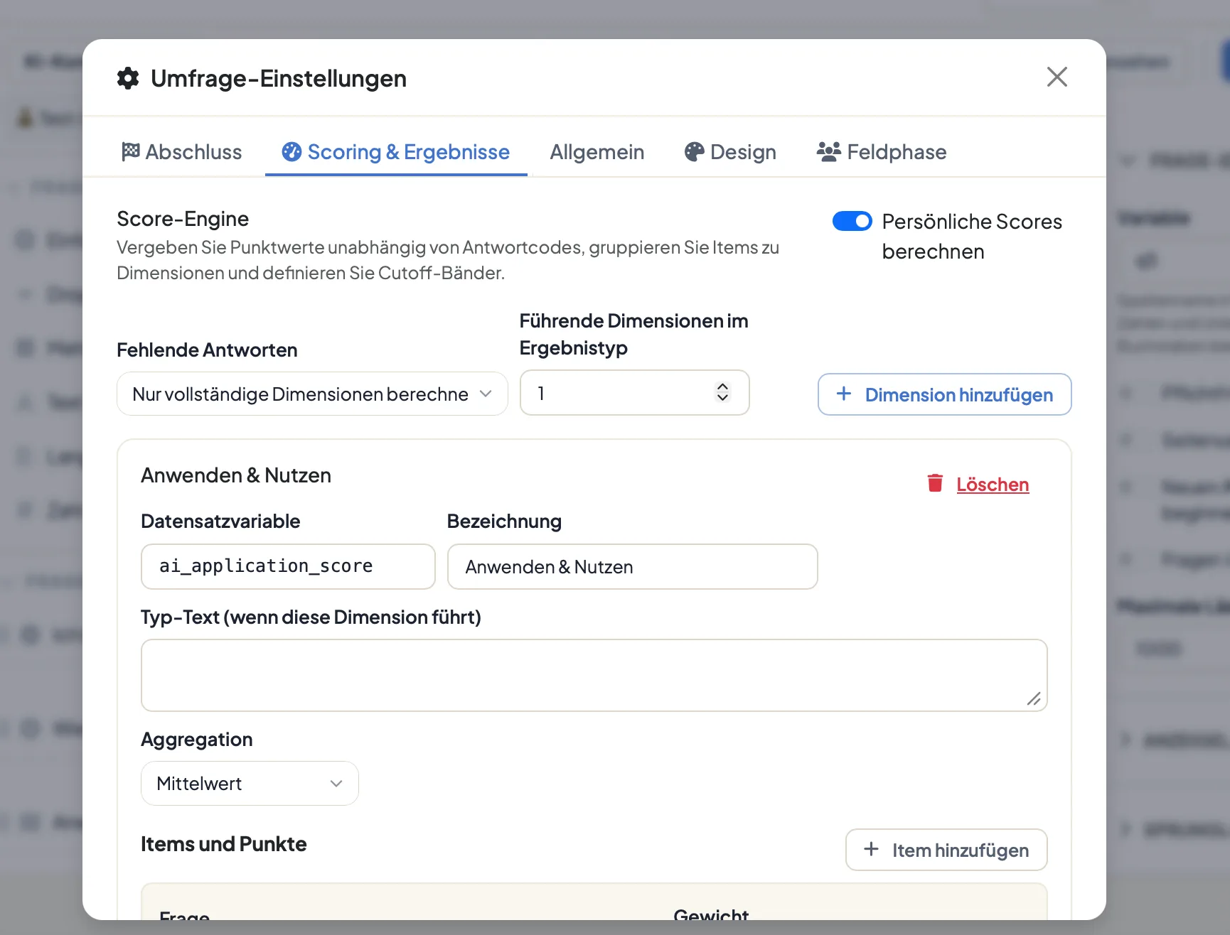
The System Usability Scale and the User Experience Questionnaire are available as templates with scoring built in: response points, inverted items, dimensions, total score. The scoring engine computes the SUS value per respondent and writes it into the dataset as a variable. That makes the score cross-tabulate by plan, role or release like any other question, and the spreadsheet with the formulas is history.
Across several waves this becomes the time series a release review needs: the SUS value before and after the redesign, per segment, with a significance test on whether the improvement holds. Top boxes are computed automatically for every scale question; the share of "strongly agree" for "I would like to use this system frequently" is a click, not a recode.
- SUS and UEQ as templates with scoring
- Score as a variable in the dataset, cross-tabulable
- Time series per release with significance tests
- Top boxes computed automatically for every scale question
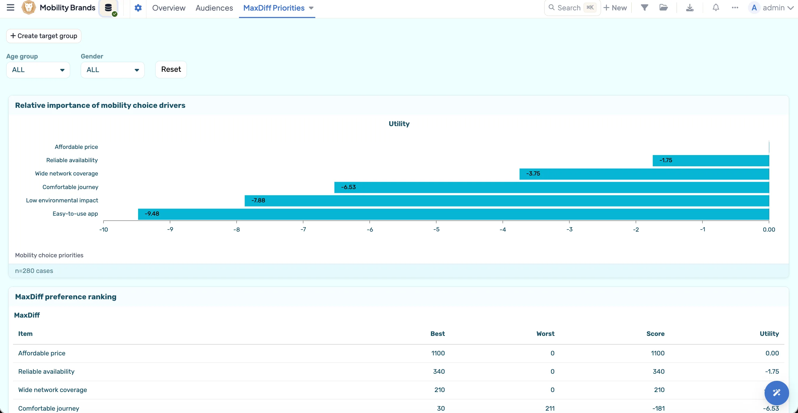
Feature prioritisation with MaxDiff, with utilities per segment
Ask about twenty features one by one and you get "important" twenty times. MaxDiff forces a choice: in each set respondents pick the most and the least important feature, and the sets produce a ranking with real distances. DataLion renders the experiment in the questionnaire and computes the utilities in the dashboard, as a preference ranking and as a best-worst table.
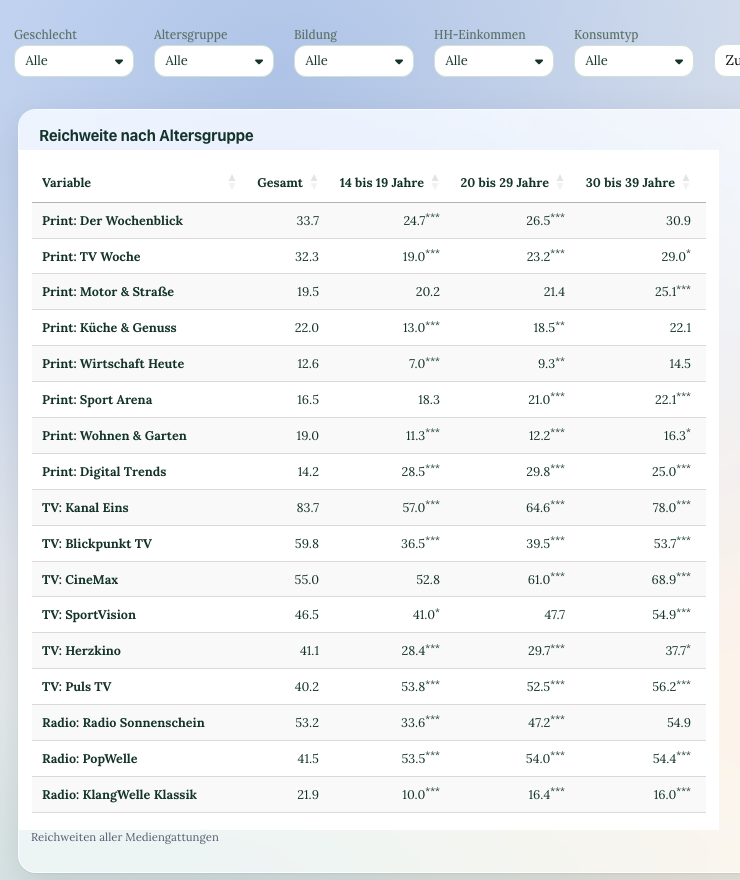
Because plan and role sit as variables in the dataset, you see the ranking per segment: what admins want, what users want, what the Enterprise plan weights differently from the Team plan. For pricing questions there are Van Westendorp and Gabor-Granger, for must-haves versus delighters the Kano question type, and for packaging decisions conjoint analysis.
- MaxDiff in the questionnaire, utilities in the dashboard
- Ranking per plan, role or segment
- Van Westendorp and Gabor-Granger for prices, Kano for delighters
- Conjoint analysis for packaging and pricing decisions
Plan, role and feature come from the app, not from the questionnaire
Your app knows which plan the user is on, which role they have and after which action the survey appears. Append that to the survey link as URL parameters, for example ?plan=team&feature=export, and DataLion stores the values as separate variables with every response. The questionnaire stays short, and analysis by segment is still possible. User IDs do not belong in the parameter if the survey is meant to stay anonymous.
The Sean Ellis product-market-fit question thus becomes a top-box share per segment: for which role is the product already indispensable, for which still replaceable? Crosstabs with significance tests say whether the difference between two plans holds up or is sampling noise.
- URL parameters from the app as variables in the dataset
- Microsurvey as an iframe embed or link
- PMF question as a top-box share per segment
- Significance tests between plans and roles
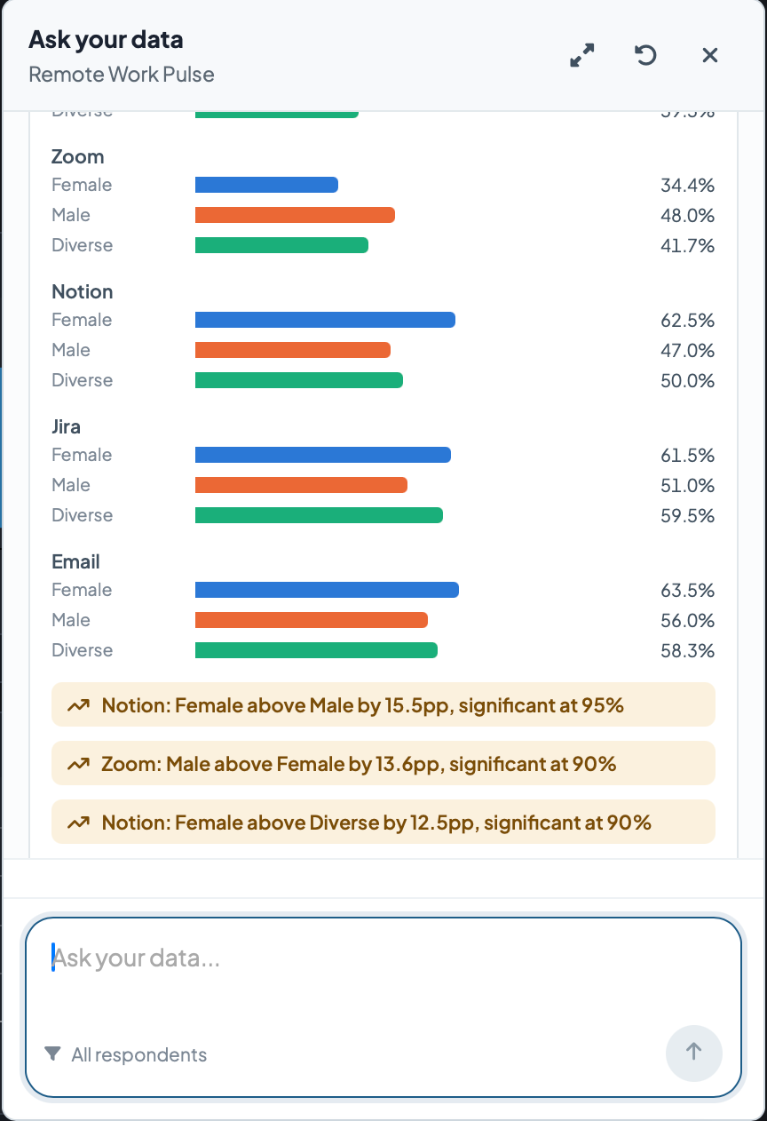
Ask your data in the dashboard, Claude via MCP in the terminal
Product managers ask questions, they do not set filters. In the dashboard, "Ask your data" answers questions such as "Which features do admins on the Enterprise plan request most?" with a table, the steps taken and significance notes. If you prefer working in Claude Desktop, connect the workspace via MCP and have charts built and results summarised there.
The open answers to "What do you miss most?" are coded by AI for topic and sentiment. Give it your feature list as the topic scheme and 2,000 comments become a ranking per plan you can take into the roadmap meeting, labelled "(AI-classified)" so it stays visible what came from the machine.
- Ask your data with steps taken and significance notes
- MCP connection for Claude Desktop
- AI coding of open answers against your feature list
- Report as PowerPoint, Excel or PDF
Six questionnaires for a product team's research calendar
-
In-product microsurvey
CES after a task, product-market-fit question, NPS and the open question about the biggest gap. One minute.
View template → -
System Usability Scale
The ten SUS items with scoring built in, inverted items included.
View template → -
User Experience Questionnaire
The UEQ with its six dimensions from attractiveness to novelty.
View template → -
MaxDiff feature prioritisation
The MaxDiff experiment for ranking features, with choice sets in the questionnaire.
View template → -
Product-market fit
The Sean Ellis question with follow-ups on benefit, alternatives and target audience.
View template → -
Van Westendorp price sensitivity
The four price questions for the acceptable price range and the optimal price point.
View template →
Charts that fit
The analyses you actually need
DataLion ships over 40 chart types. For product teams, these three carry the work, because they force decisions instead of showing distributions.
-
maxdiff
MaxDiff preference ranking
The features as a ranking with real distances, from choice sets instead of importance scales. The chart that ends the roadmap-meeting debate about whether "all features are important".
-
psm
Van Westendorp price curves
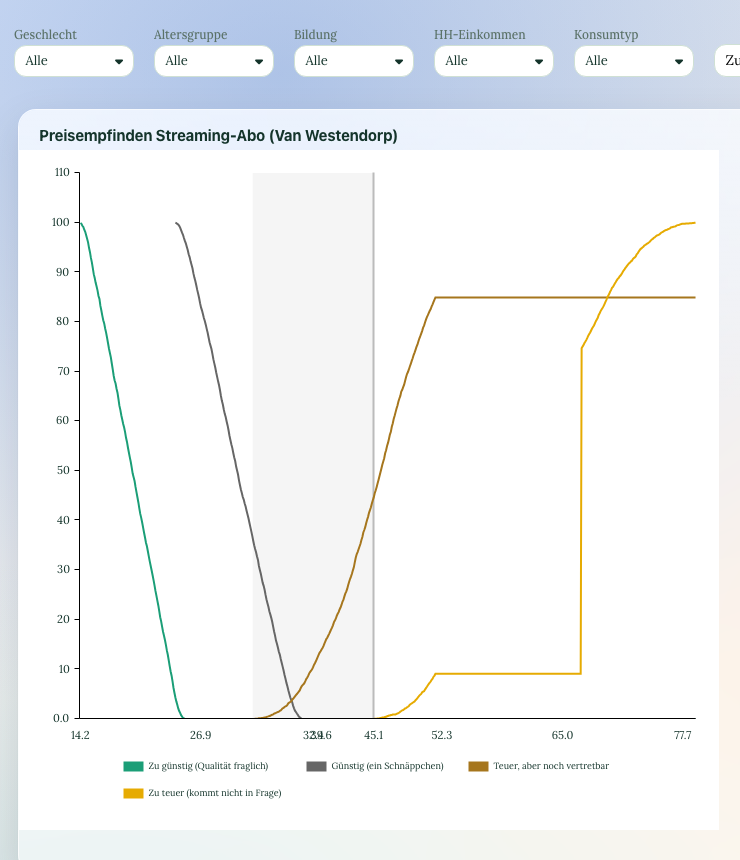
The four cumulative price curves with the acceptable price range and the optimal price point. For the question of whether the new plan may cost 29 or 39 euros, filterable per segment.
-
timeline
Time series across releases
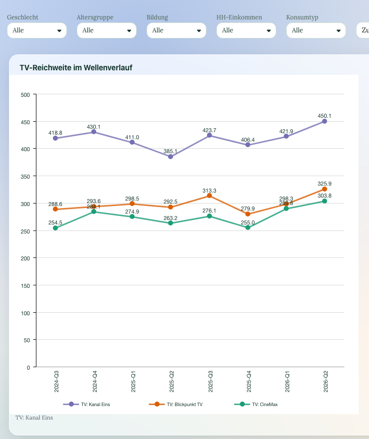
SUS, CES and NPS as a line over time, filterable by feature and plan. A release that worsens the effort score shows up the week after, not in the annual report.
See DataLion with your own data
Start free with your own raw data. Or book a personal demo of the path to a finished dashboard.
What users say about DataLion
- via G2
The embedding function allows us to generate insights of our data for our audience and customers by far less than half of the usual time needed before.
Verified user · Leisure, Travel & Tourism - via G2
User-friendliness, especially for market research topics. Structured backend with many customization options.
Verified user · Market Research - via G2
The contacts at DataLion are very committed. If you have problems, you can count on help. DataLion reacts quickly to requests for new functions.
Robert Q. · Managing Director - via G2
Very professional company, attentive to the customer needs, provider of a great software and service.
Generoso M. · CRM Analyst, Automotive

We now work much more efficiently, giving us more time to take care of the derivations and insights from the data for the customers.
The relevant features in detail
Guides for product teams
Questions product teams ask
Does DataLion replace Hotjar, Maze or Sprig?
How do the answers get into our data warehouse?
Does DataLion estimate MaxDiff with hierarchical Bayes?
Can we embed the microsurvey in our app?
Is collection anonymous if plan and role come along?
What does it cost for a product team?
Set up your next feature prioritisation as a MaxDiff
Create a workspace, start from the MaxDiff template or the microsurvey and see on the test dataset what the ranking per segment looks like.