
System Usability Scale (SUS)
The standard usability questionnaire: 10 statements, one score from 0 to 100 – comparable with thousands of studies. Includes the established German translation.
The live demo opens the real questionnaire — no signup required.
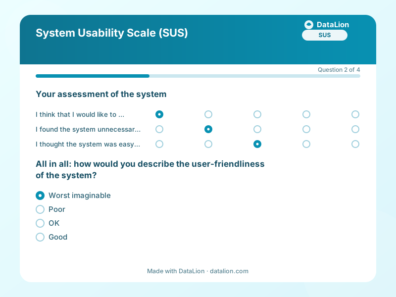
The System Usability Scale has been the world's most-used usability questionnaire since the 1990s: 10 alternately positive and negative statements, answered on a five-point scale and combined into a score from 0 to 100. Its biggest advantage is comparability – few instruments have as many reference values: the average across thousands of studies is 68 points, and from about 80 a system counts as very good. John Brooke developed the scale at Digital Equipment in 1986 and released it for free use. This template contains the original English items and the established German translation, complemented by an overall rating and an open question.
When should you use this template?
This template is a great fit for:
- After usability tests, beta phases or major releases
- As a recurring UX metric per product or feature area
- To compare against competitors or industry benchmarks
Every question in this template
- 1Matrix
Your assessment of the system *
Please rate the following statements. “System” means the product you just used.
Strongly disagree Disagree Neutral Agree Strongly agree I think that I would like to use this system frequently. I found the system unnecessarily complex. I thought the system was easy to use. I think that I would need the support of a technical person to be able to use this system. I found the various functions in this system were well integrated. - 2Single choice
All in all: how would you describe the user-friendliness of the system?
- Worst imaginable
- Poor
- OK
- Good
- Excellent
- Best imaginable
- 3Single choice
How often do you use the system?
- Today for the first time
- Occasionally
- Weekly
- (Almost) daily
- 4Long text
What hindered you most while using the system?
From questionnaire to dashboard
SUS scoring is precisely defined – in the DataLion dashboard it becomes your UX metric with benchmark context:
- SUS score (0–100): A calculation tile implements the official formula: odd items minus 1, even items subtracted from 5, sum times 2.5 – your SUS score, live with every new response.
- Benchmark gauge: The score as a gauge with the familiar thresholds: below 68 under average, from 68 good, from 80 excellent. Presentable at a glance.
- Score distribution: The histogram shows whether your mean reflects a consistent experience – or enthusiastic and frustrated camps averaging each other out.
- Item profile: Means per statement show where it hurts: complexity, consistency or learning effort. This turns the score into a to-do list.
- Segment comparison: Box plots by usage frequency separate first-time from regular users – the real insight often sits between the two.
Go deeper
Related survey templates
- Restaurant Guest FeedbackShort, anonymous feedback on food, service and ambience – via QR code on the table, the bill or the menu.
- Beta Test FeedbackStructured feedback from beta testers: usage depth, stability, missing features and the disappointment question as an early product-market-fit indicator.
- Campsite Guest Survey (post-stay)After departure, collect feedback on pitches, sanitary facilities, team and activities – via QR code at reception, at the barrier or in your departure email.
- Customer Effort Score (CES)Measure how effortlessly your customers could resolve their issue and pinpoint the friction that slows them down.
Frequently asked questions
How is the SUS score calculated?
What is a good SUS score?
May we use the SUS commercially?
How many participants do we need?
Start with this template
Load the template into DataLion, adapt it to your brand and start collecting responses — GDPR-compliant, in minutes.