
Sector: municipal utilities, energy & water suppliers
The customer monitor your sales team uses too
The satisfaction study from the agency reaches the supervisory board and then the archive. The sales team that has to sell the same customers a heat pump never saw it. DataLion collects the customer monitor, the image study and the heat-planning survey and analyses them per division, district and segment, in a dashboard both of them open.
Free to start · no credit card · hosted in Germany
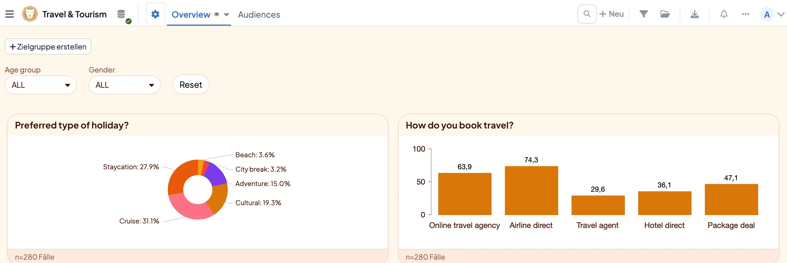
DataLion is a survey and analysis platform for municipal utilities and regional energy suppliers: the customer monitor, the regional image study and the citizen survey on municipal heat planning run on one platform, with division, district and customer segment as analysis dimensions. Switching intention sits as a crosstab next to satisfaction, driver analysis says what explains switching, and sales sees interest in heat pumps, solar and charging per district. Anonymous, hosted in Germany.
- 🇩🇪 Made in Munich
- GDPR-compliant
- DPA included
- Hosted in Germany
- 🌐 Interface in EN, DE, FR, ES, IT & NL
Trusted by research institutes, brands & insights teams






- 50+ interactive chart types
- 20+ statistical methods
- SPSS · Excel · CSV import without data loss
- ISO 27001 certified data centers (Germany)
Where utility surveys break down in practice
- The customer monitor arrives every two years as a PDF, and "what does that look like for district-heating customers in the west quarter?" costs a new quote from the agency.
- Switching intention is on page 34, satisfaction with the bill on page 12, and nobody has ever run the two against each other.
- Sales plans the heat-pump campaign by gut feel, although the survey collected interest per district and age group long ago.
- Heat planning needs a citizen survey, the municipality has no tool for it, and administration builds the questionnaire in a free form tool with no analysis.
Division, district and segment become analysis dimensions
Append a parameter per customer segment or district to the survey link, for example ?segment=heat&area=west. The value is stored as its own variable with every response and is available in the dashboard as a filter and comparison dimension, without asking for the address in the questionnaire. The divisions themselves are a multiple-choice question, so electricity customers with and without gas stay comparable.
If the customer structure by division, district and age group is known, you weight the returns to it; for the citizen survey, to the population statistics. Crosstabs and significance tests tell you whether the difference between two grid areas holds up or is noise. For small segments you set a minimum case count.
- One link per segment or district, one shared dataset
- Divisions as a multiple-choice question, customer groups comparable
- Weighting to customer structure or population statistics
- Crosstabs with significance tests and minimum case count
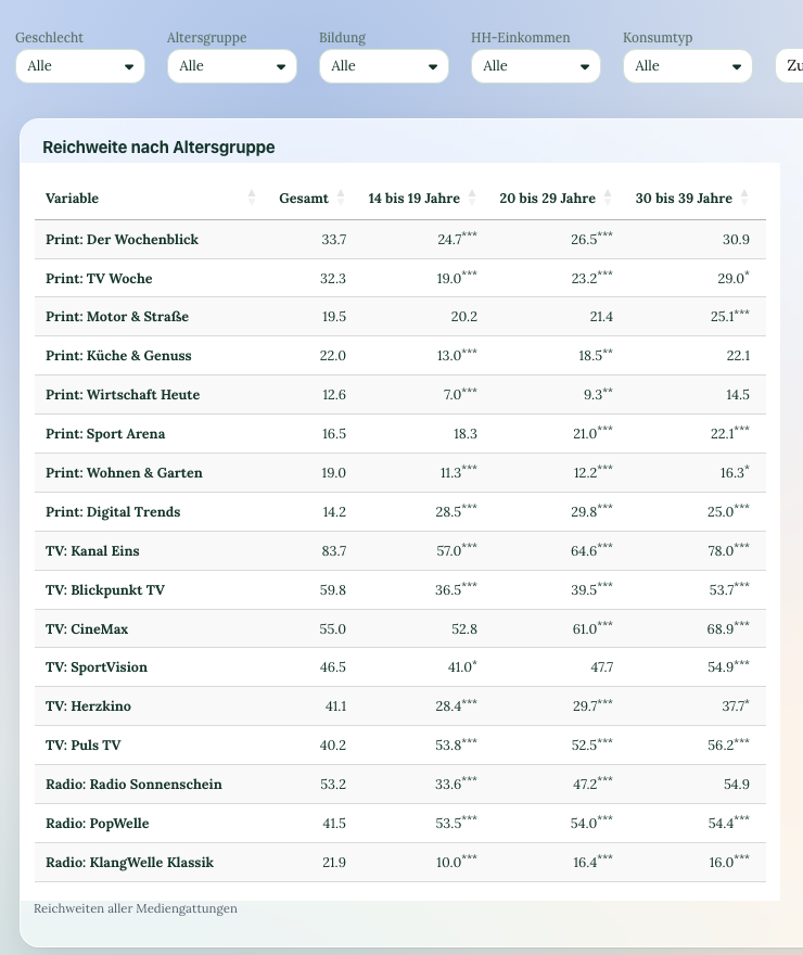
Switching intention against satisfaction, and what explains switching
The most important chart in the customer monitor is a crosstab: switching intention against the nine satisfaction aspects. It shows whether customers about to switch are hung up on price or on a bill they do not understand. The second can be fixed, the first only partly. Driver analysis adds the relative importance of each aspect for recommendation, computed from the data instead of asked.
The open question "What should we improve first?" is coded by AI for topic and sentiment and written into the dataset as variables. 3,000 comments become a ranking per division, and the topic "bill hard to understand" can then be cross-tabulated by district and tenure like any other variable.
- Switching intention against satisfaction as a crosstab
- Driver analysis with relative importance per aspect
- AI coding of open comments by topic and sentiment
- Topics cross-tabulate by division and district
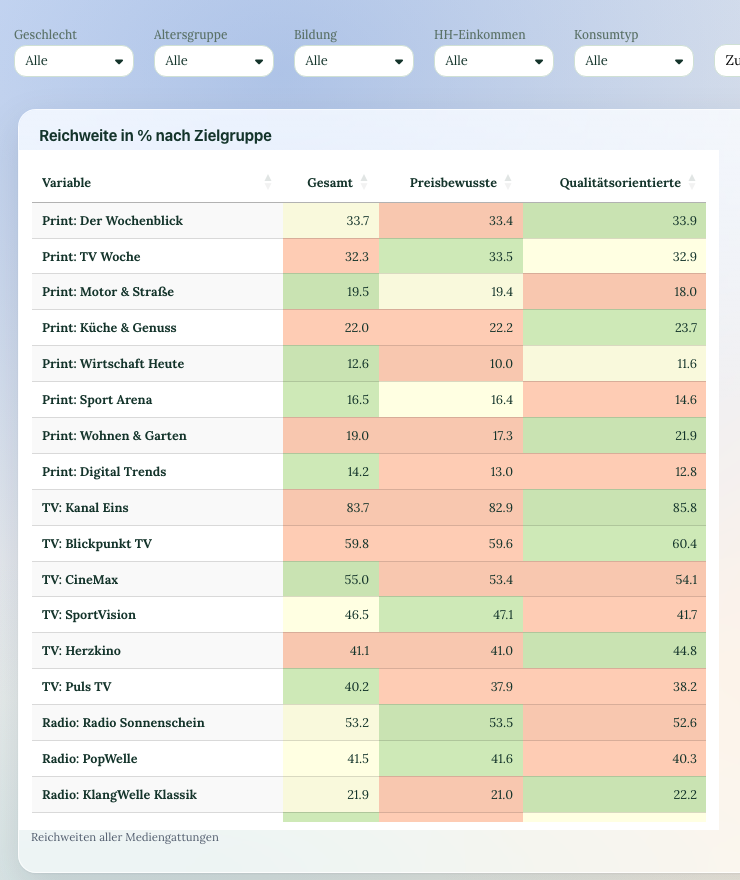
Interest in heat pumps, solar and charging per district
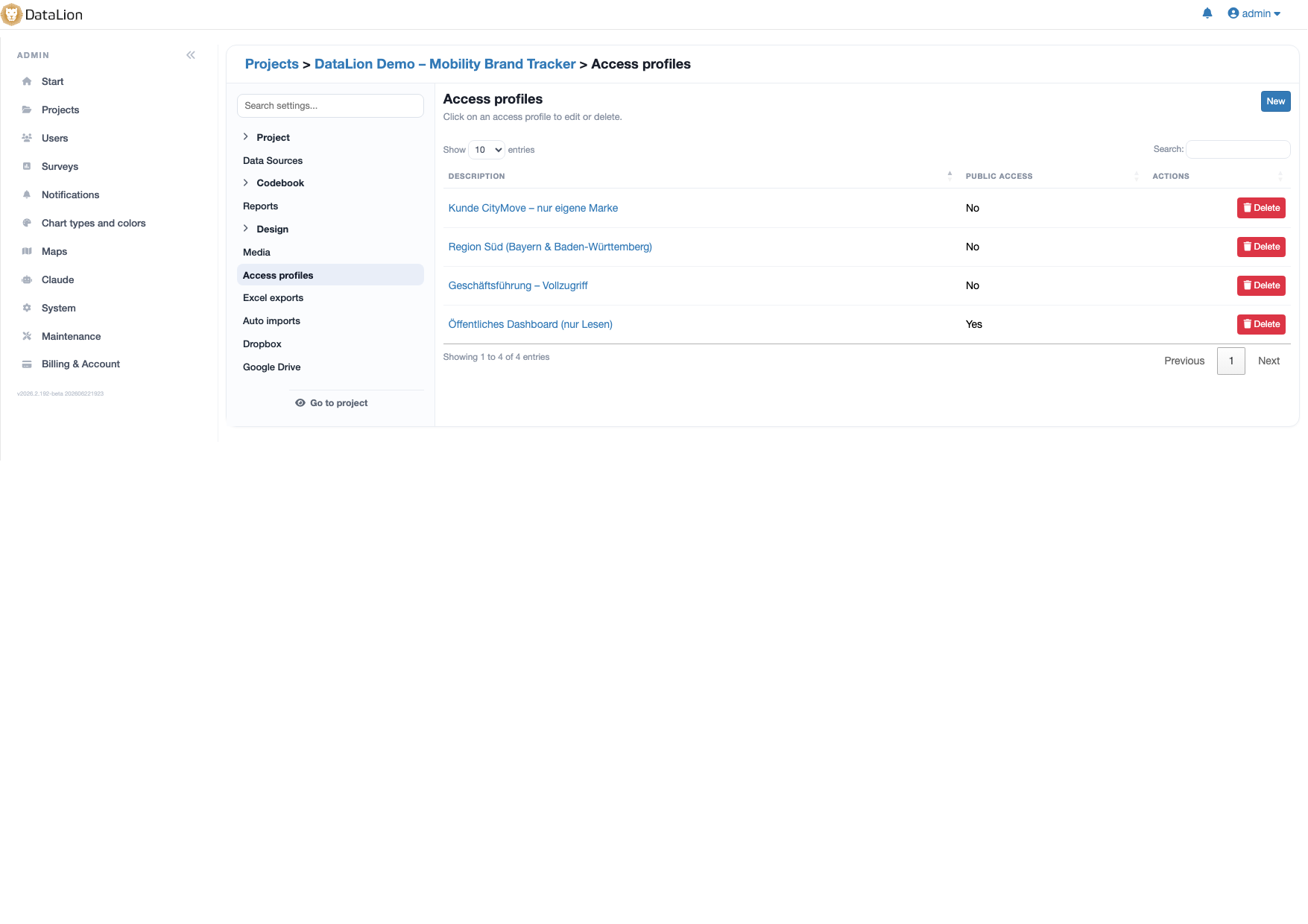
The question on interest in new offers is what makes the customer monitor useful for sales. Broken down by district, age group and heating type, it is the target list for the next campaign: where do the gas customers with heating over 20 years old live who can imagine a heat pump? An access profile for sales shows exactly those charts, and nothing of the rest.
If you want to link the survey to customer segments from your customer system, load them as a second data source into the same project, joined on a segment attribute, not on the person. The responses stay anonymous; DataLion stores neither IP address nor contact details with a response.
- Interest in offers by district, age and heating type
- Access profile for sales with exactly the right charts
- Segments from the customer system as a second data source
- Anonymous: no IP address, no contact details with a response
The citizen survey on heat planning, analysable per suitability area
Germany's heat planning act obliges municipalities to present a heat plan, and in doing so they discover two things that are in no register: what people heat with today and whether they would connect to a heat network. The heat-planning survey template asks both, plus level of information, trust, obstacles and desired support. The QR code goes into the gazette and onto the information evening, and a parameter per suitability area makes willingness to connect readable exactly where the network is being planned.
Agreement to connect, filtered to owners in the suitability area and crossed with heating age, is the figure that feeds the network plan. A survey measures intentions, not contracts; DataLion shows the case counts per cell alongside, so the figure is put in context at the council meeting.
- Template with heating stock, willingness to connect, obstacles and support
- Parameter per suitability area or district
- Connection rate filtered to owners, crossed with heating age
- Printable questionnaire PDF for paper returns
From the dashboard to the board, the council and the customer magazine
One click turns any dashboard into an editable PowerPoint file in the utility's layout, plus Excel tab books and PDF. The report for the supervisory board is an export, the slide deck for the council a second one with a different filter. For the customer magazine you share a dashboard with the overall results as a link that readers open without an account.
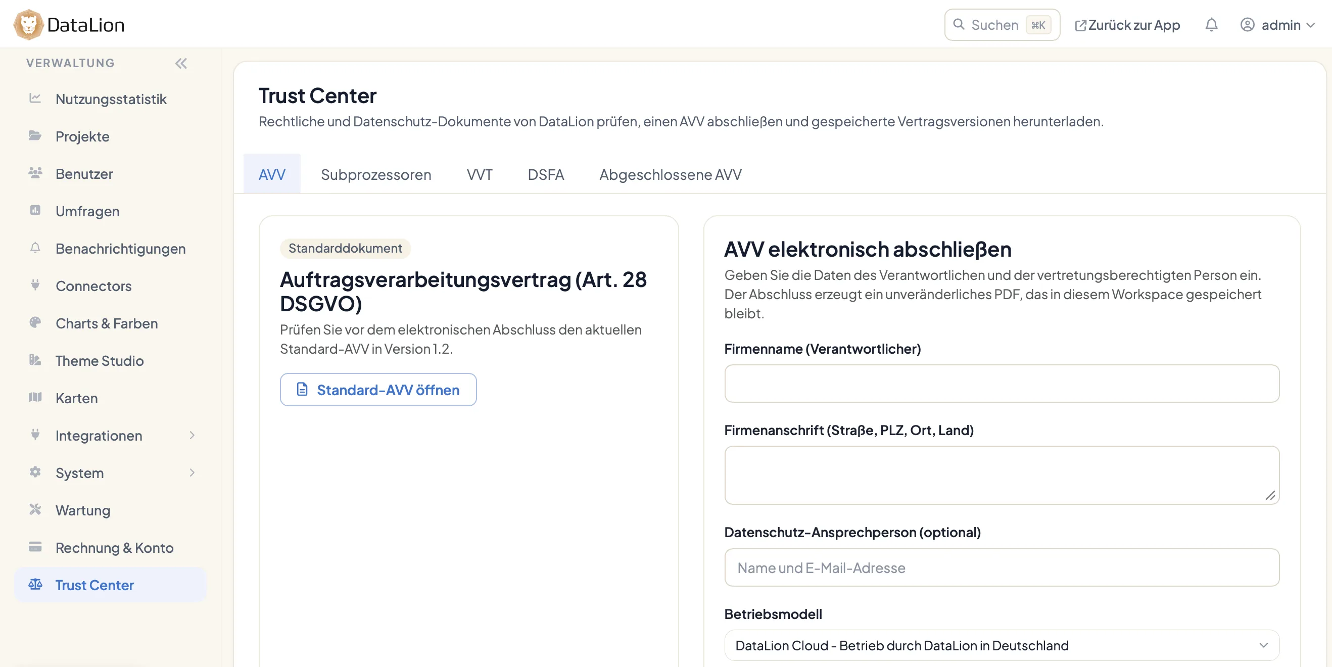
Your data protection officer will find what they need in the Trust Center: the data processing agreement, the list of sub-processors, the records of processing activities and the DPIA documents are there to sign and download. Hosting is in ISO 27001-certified data centres in Germany.
- Editable PowerPoint in your own layout, Excel tab books, PDF
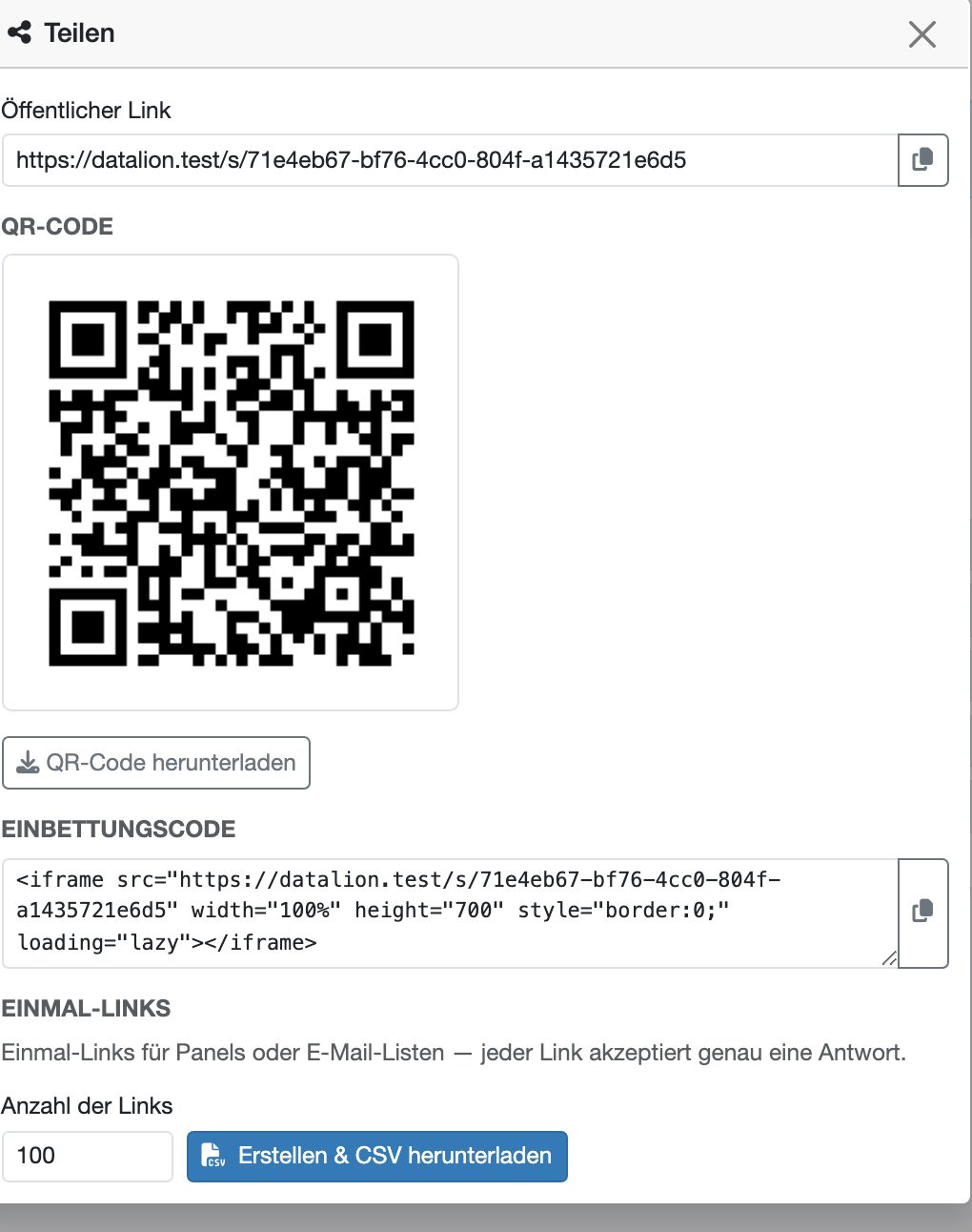
- Share dashboards as a link, no account needed to view
- Trust Center with DPA, sub-processors, records of processing and DPIA
- Hosted in Germany
Four questionnaires for a utility's survey calendar
-
Utility customer survey
Satisfaction per division, customer service, billing, portal, switching intention, interest in energy-transition offers and regional image.
View template → -
Heat-planning citizen survey
Heating stock, level of information, willingness to connect to a heat network, obstacles and desired support, per suitability area.
View template → -
Municipal citizen survey
The general citizen survey on quality of life, infrastructure and administration, for municipal companies and economic development.
View template → -
Complaint feedback
The short survey after every service contact: reachability, resolution, friendliness and effort for the customer.
View template →
Charts that fit
The analyses you actually need
DataLion ships over 40 chart types. For a utility's customer monitor, these three carry the work.
-
table
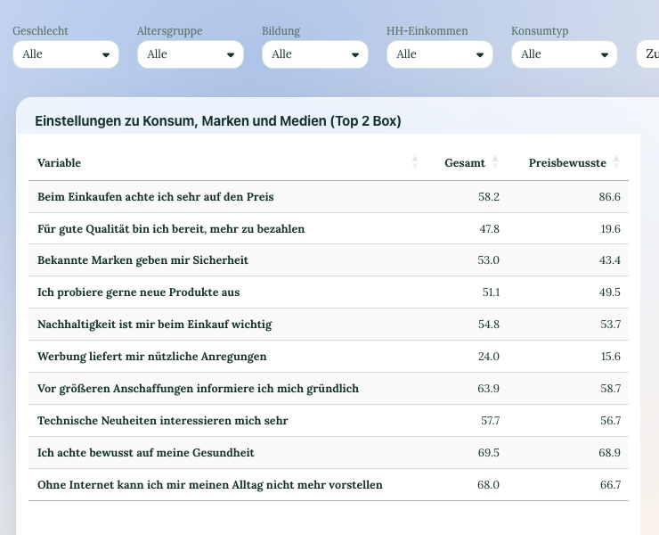
Top-2-box table per division
The share of satisfied customers per division and target group, computed automatically as a box. District-heating customers almost always judge differently from electricity customers, and the table shows it per aspect.
-
heatmap
Heatmap: switching intention against satisfaction
The crosstab that tells sales what customers about to switch are hung up on: the price, or a bill they do not understand. Red cells are the aspects where the switch can still be averted.
-
nps
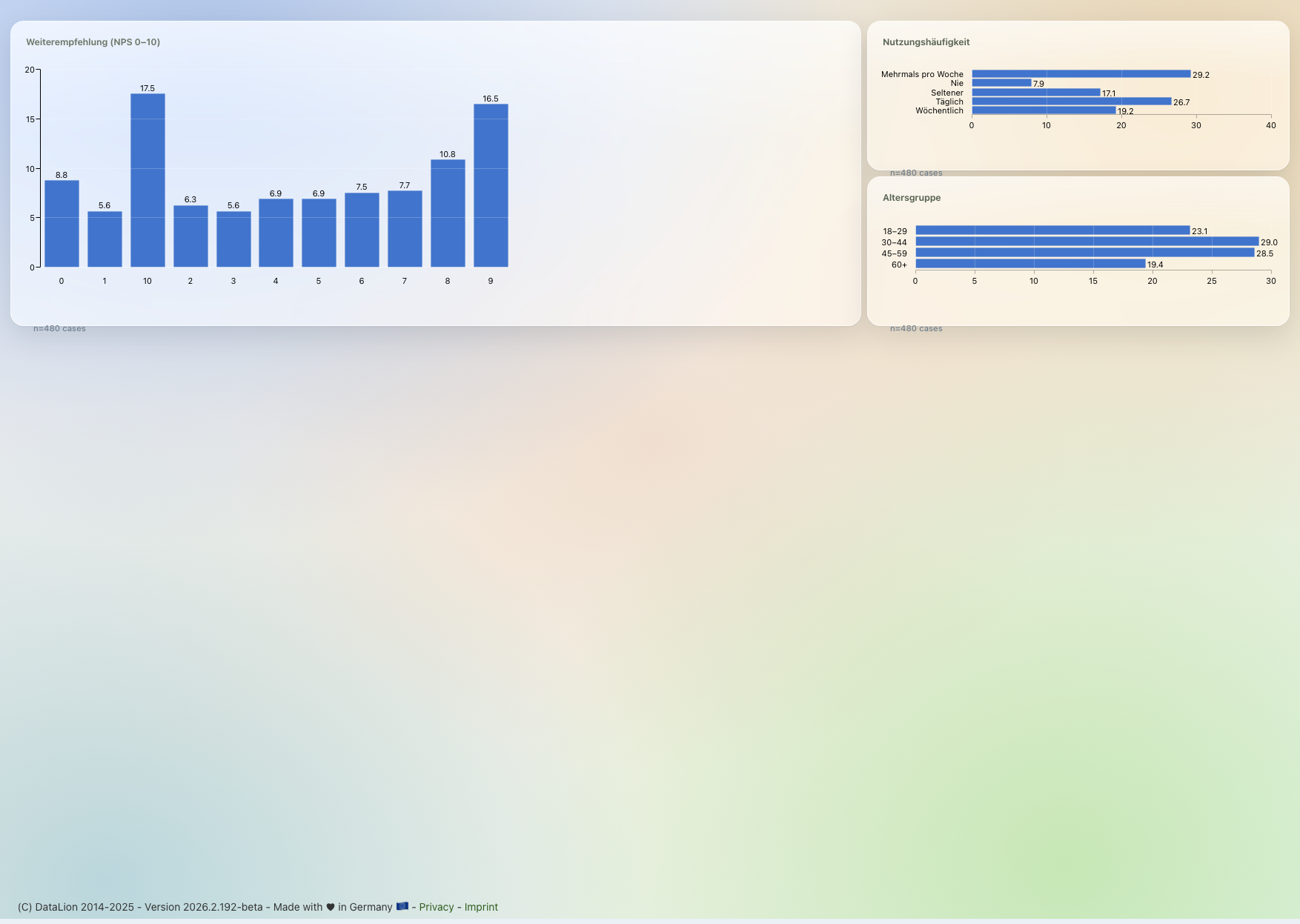
Customer NPS with promoters and detractors
Recommendation as a score with the three shares next to it, filterable by division and district. The one number the board remembers, with the breakdown sales needs.
See DataLion with your own data
Start free with your own raw data. Or book a personal demo of the path to a finished dashboard.
What users say about DataLion
- via G2
The embedding function allows us to generate insights of our data for our audience and customers by far less than half of the usual time needed before.
Verified user · Leisure, Travel & Tourism - via G2
User-friendliness, especially for market research topics. Structured backend with many customization options.
Verified user · Market Research - via G2
The contacts at DataLion are very committed. If you have problems, you can count on help. DataLion reacts quickly to requests for new functions.
Robert Q. · Managing Director - via G2
Very professional company, attentive to the customer needs, provider of a great software and service.
Generoso M. · CRM Analyst, Automotive

We now work much more efficiently, giving us more time to take care of the derivations and insights from the data for the customers.
The relevant features in detail
Guides for utilities & energy suppliers
Questions utilities and suppliers ask
Can we show the results on a map of the districts?
How do we invite all customers without giving up anonymity?
Is there an integration with our billing system?
Is the heat-planning citizen survey representative?
We work with a regional research agency. Does DataLion fit alongside?
What does it cost for a utility with 80,000 customers?
Analyse your next customer monitor yourself
Create a workspace, start from the utility customer survey template and see on the test dataset what switching intention and satisfaction per division look like.