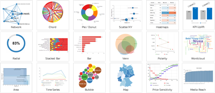
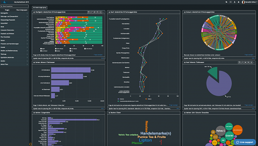
Chart types
50+ interactive chart types
From bar, line and donut to MaxDiff, conjoint, heatmap and geo map: DataLion has the right chart for every question. Drag a chart onto the grid, assign a question, done — and most types export natively to PowerPoint.
DataLion offers 50+ interactive chart types — from classic bar, line and pie charts through stacked bars, polarity charts and word clouds to MaxDiff, conjoint, heatmaps, networks and geo maps. Drag a chart onto the grid, assign a question, done. Most types export natively to PowerPoint.
- 🇩🇪 Made in Munich
- GDPR-compliant
- DPA included
- Hosted in Germany
- 🌐 Interface in EN, DE, FR & NL
Trusted by research, insights & media teams
- 50+ interactive chart types
- 20+ statistical methods
- SPSS · Excel · CSV import without data loss
- ISO 27001 certified data centers (Germany)
Market research does not fit standard charts
- Classic BI tools know bars and lines — but not polarity charts, MaxDiff or price sensitivity.
- Every special chart means switching to another tool, exporting and gluing it back together.
- Static charts from Excel have to be rebuilt for every wave and every segment.
Drag a chart onto the grid, assign a question, done
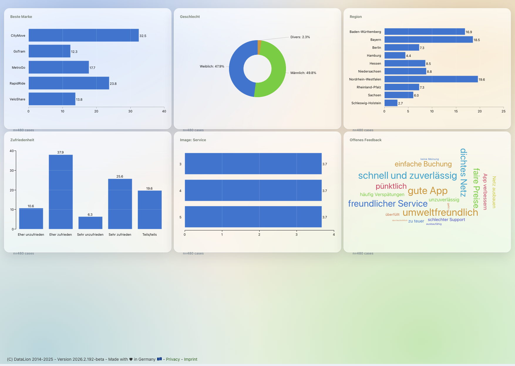
You do not build charts — you pick them. Drag a chart type onto the dashboard grid with drag & drop, assign it a question from the codebook, and DataLion draws the finished, interactive chart.
Every chart is live: filters, drill-downs and wave comparisons act on all charts at once. And because the codebook supplies labels, nets and bases, the labelling is right from the first click.
- Drag a chart type onto the grid
- Assign a question from the codebook — labels come along
- Interactive: filters, drill-down and wave comparison
- Switch chart type any time, no rebuild
The classics for every analysis
For frequencies and means everything you expect is there: bar, column, pie and donut charts, the mean bar chart, and number/KPI tiles plus a gauge for the one number that matters and its target attainment.
Add radial, multiring, bubble and treemap charts for shares and size relationships, a waterfall for contributions to a total, and — for storytelling across waves — the animated bar (bar race).
For the distribution of numeric variables, DataLion draws a histogram (automatic or freely chosen bin count) and a box plot (a Tukey box with whiskers and outliers — one box per variable or per group).
- Bar, column, pie, donut & mean bar chart
- Number/KPI tiles & gauge for a figure and its target
- Radial & multiring for shares
- Bubble, treemap & waterfall for sizes and contributions
- Histogram & box plot for distributions of numeric variables
- Animated bar (bar race) for movement across waves
Visualise scale batteries and open ends
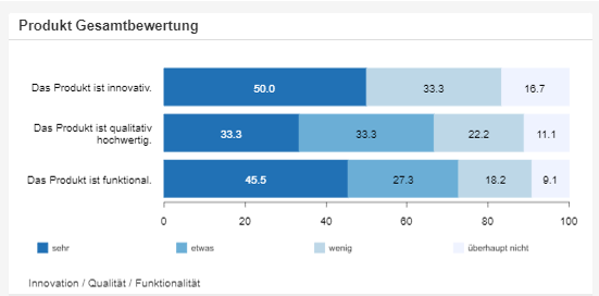
For Likert and matrix questions, stacked bars (vertical and unscaled too), polarity charts and radar charts are on board — ideal for comparing scales and image profiles at a glance.
Open ends become a word cloud or open-text chart that visualises the frequency of the mentioned terms. For sentiment and topics, the sentiment & topic analysis additionally codes every answer with AI.
- Stacked bars incl. vertical and unscaled
- Polarity charts for scale batteries
- Radar for multi-dimension comparisons
- Word cloud & open text for open ends
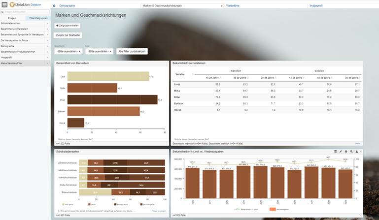
MaxDiff, conjoint, heatmap & co. — built in
DataLion also visualises the demanding methods other tools do not know: MaxDiff and conjoint, heatmaps and network charts, Venn and chord for overlaps and relationships.
For pricing, use the price sensitivity chart (a Van Westendorp-style Price Sensitivity Meter), and with uplift, calculation, scatterplot and funnel (vertical too) you cover lift over a baseline, funnels, correlations and derived metrics.
- MaxDiff & conjoint for preference and trade-off studies
- Heatmap, network, Venn & chord for relationships
- Price sensitivity (Van Westendorp style) for pricing
- Uplift, funnel (vertical too), scatterplot & calculation
Exported natively to PowerPoint
What is on the dashboard lands in your presentation in one click: most chart types export as natively editable PowerPoint in your CI layout — as real, still-editable charts, not screenshots.
Add specialised visualizations as a high-resolution image, and send whole dashboards out as PDF or Excel report books as well.
See DataLion with your own data
Start a free trial or book a personal demo — from raw data to a finished dashboard.
What users say about DataLion
- via G2
Very professional company, attentive to the customer needs, provider of a great software and service.
Generoso M. · CRM Analyst, Automotive - via G2
The contacts at DataLion are very committed. If you have problems, you can count on help. DataLion reacts quickly to requests for new functions.
Robert Q. · Managing Director - via G2
User-friendliness, especially for market research topics. Structured backend with many customization options.
Verified user · Market Research - via G2
The embedding function allows us to generate insights of our data for our audience and customers by far less than half of the usual time needed before.
Verified user · Leisure, Travel & Tourism

We now work much more efficiently, giving us more time to take care of the derivations and insights from the data for the customers.
More dashboard features
Chart types in action
Common questions about chart types
How many chart types does DataLion offer?
How do I create a chart in DataLion?
Are there dedicated market research charts?
How do I visualise open-ended responses?
Can I export the charts to PowerPoint?
Find the right chart for your data
Try DataLion free and explore the 50+ chart types on your own dataset — or get a demo.