Chart types
The flexible table chart type
The table is your dashboard workhorse: pick the metrics you need, show difference columns, make it readable with heatmaps and conditional formatting — and export to Excel and natively editable PowerPoint, with formatting preserved.
DataLion's table chart type shows counts, percentages by row, column and total, valid %, mean, median and index. It supports subcolumns, difference columns, in-cell heatmaps and conditional formatting, plus flexible sorting. Tables export to Excel and natively editable PowerPoint — with formatting preserved.
- 🇩🇪 Made in Munich
- GDPR-compliant
- DPA included
- Hosted in Germany
- 🌐 Interface in EN, DE, FR & NL
Trusted by research, insights & media teams
- 50+ interactive chart types
- 20+ statistical methods
- SPSS · Excel · CSV import without data loss
- ISO 27001 certified data centers (Germany)
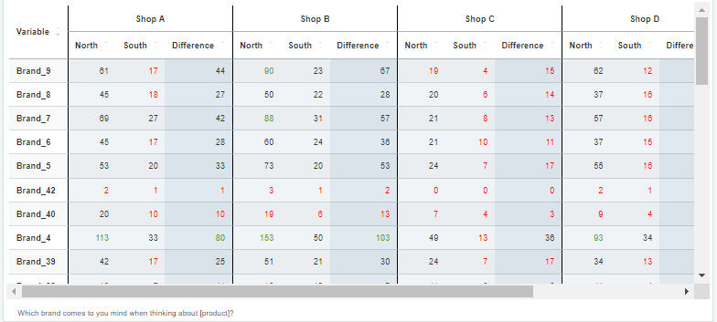
Counts, percentages, mean, median and index
The DataLion table shows exactly the number you need: counts (absolute values), percentages by row, column and total, plus valid % that cleanly removes missing values from the base.
For metric questions you add mean and median, and the index relates each cell to the total sample — so you spot over- and under-represented groups at a glance. Several metrics can sit side by side as subcolumns.
- Counts and percentages by row, column and total
- Valid % with missing values removed
- Mean and median for metric questions
- Index against the total sample
Subcolumns and difference columns
Place groups right next to each other: with subcolumns you compare target groups, regions or waves in a single table. A difference column computes the change between two columns and shows it right alongside — no side calculation.
That way you read the development wave by wave straight from the table. When you need complete banners and significance testing, the crosstabs page has you covered.
- Subcolumns for groups, regions and waves
- Difference columns show the change right alongside
- No helper columns, no side calculation
- For banners and significance: see crosstabs
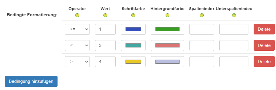
Heatmaps, formatting, sorting — and export
Make the table readable at a glance: color cells as an in-cell heatmap or flag outliers with conditional formatting by threshold. Sort freely by any column, ascending or descending, so the most important values sit on top.
And the best part: tables export to Excel and as natively editable PowerPoint — with the formatting preserved. For more on colouring, see the conditional formatting page.
- In-cell heatmaps and conditional formatting
- Freely sortable by any column
- Export to Excel and natively editable PowerPoint
- Formatting preserved on export
See DataLion with your own data
Start a free trial or book a personal demo — from raw data to a finished dashboard.
What users say about DataLion
- via G2
Very professional company, attentive to the customer needs, provider of a great software and service.
Generoso M. · CRM Analyst, Automotive - via G2
The contacts at DataLion are very committed. If you have problems, you can count on help. DataLion reacts quickly to requests for new functions.
Robert Q. · Managing Director - via G2
User-friendliness, especially for market research topics. Structured backend with many customization options.
Verified user · Market Research - via G2
The embedding function allows us to generate insights of our data for our audience and customers by far less than half of the usual time needed before.
Verified user · Leisure, Travel & Tourism

We now work much more efficiently, giving us more time to take care of the derivations and insights from the data for the customers.
More on tables & charts
Guides in the help center
Common questions about the table chart type
Which metrics can a DataLion table show?
What is a difference column?
Can I sort and colour tables?
Is the formatting preserved on export?
How is the table different from crosstabs?
Build your first table
Try DataLion free: metrics, difference columns, heatmaps and export in one widget. Or get a demo of how flexible the table chart type is.