Reports & sharing
Conditional formatting for tables
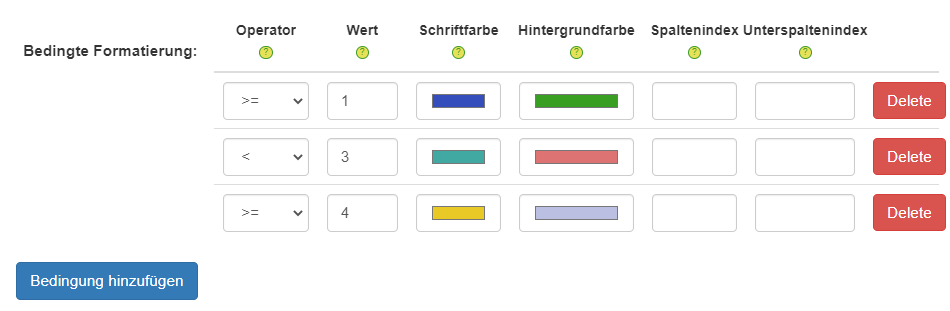
Colour cells by rule: map the operators =, <, >, <= and >= to a hex colour per column. The formatting is preserved in PowerPoint and PNG exports.
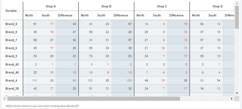
Conditional formatting colours table cells by rule in DataLion. You map the operators =, <, >, <= and >= to a hex colour per column or subcolumn. The formatting is preserved in PowerPoint (PPTX) and PNG exports and pairs with heatmaps and tables.
- 🇩🇪 Made in Munich
- GDPR-compliant
- DPA included
- Hosted in Germany
- 🌐 Interface in EN, DE, FR & NL
Trusted by research, insights & media teams
- 50+ interactive chart types
- 20+ statistical methods
- SPSS · Excel · CSV import without data loss
- ISO 27001 certified data centers (Germany)
Colour cells by rule
Define rules that make your table speak: with the operators =, <, >, <= and >= you set which value gives a cell which colour — say green for a top-2 box above target, red below it.
Readers spot what stands out immediately, without reading every figure one by one. A bare table becomes a traffic-light system that tells the story itself.
- Operators =, <, >, <= and >= per rule
- Freely definable thresholds
- Outliers visible at a glance
Hex colours per column and subcolumn
You choose the colours yourself — as hex values, exactly in your corporate design. And you control them precisely: per column and subcolumn, so different metrics get their own logic.
The colouring of a satisfaction column can differ from the one for recommendation — each metric by its own thresholds.
- Free hex colours in your own CI
- Rules per column and subcolumn
- Own logic per metric
Colours survive the export — PowerPoint & PNG
The best part: conditional formatting is not just a screen effect. It is preserved in the PowerPoint export (PPTX) and the PNG export — the coloured cells arrive in your deck exactly as you set them.
Conditional formatting also pairs beautifully with heatmaps and crosstabs. Learn more on the Heatmaps and Crosstabs pages.
- Formatting preserved in the PPTX export
- Formatting preserved in the PNG export
- A perfect complement to heatmaps and crosstabs
See DataLion with your own data
Start a free trial or book a personal demo — from raw data to a finished dashboard.
What users say about DataLion
- via G2
Very professional company, attentive to the customer needs, provider of a great software and service.
Generoso M. · CRM Analyst, Automotive - via G2
The contacts at DataLion are very committed. If you have problems, you can count on help. DataLion reacts quickly to requests for new functions.
Robert Q. · Managing Director - via G2
User-friendliness, especially for market research topics. Structured backend with many customization options.
Verified user · Market Research - via G2
The embedding function allows us to generate insights of our data for our audience and customers by far less than half of the usual time needed before.
Verified user · Leisure, Travel & Tourism

We now work much more efficiently, giving us more time to take care of the derivations and insights from the data for the customers.
More on tables & reporting
Common questions about conditional formatting
How does conditional formatting work in DataLion?
Which operators are available for the rules?
Can I use my own colours?
Is the formatting preserved on export?
What does conditional formatting pair best with?
Bring colour to your tables
Try DataLion free — or get a demo of how conditional formatting makes your tables readable and survives the export.