
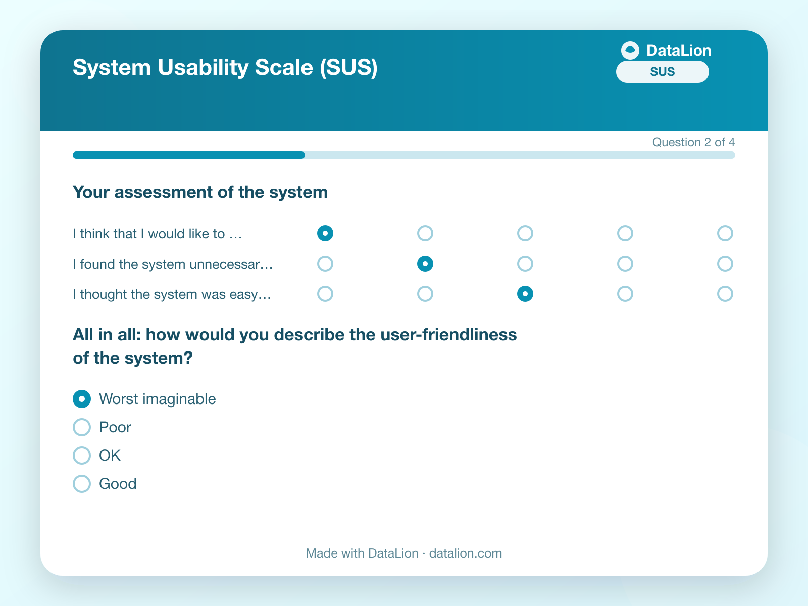
In short: The SUS score comes from ten items in three computation steps, lies between 0 and 100 and is not a percentage; the average across many studies is around 68. The UEQ measures six dimensions on a seven-point scale, and the short form with eight pairs of opposites separates pragmatic from hedonic quality. Both instruments go wrong in product teams almost always at the same place: the inverted items and the analysis without segments. This article covers the formula, the benchmark and the analysis by plan, role and release.
Straight to the templates: the System Usability Scale with scoring built in and the User Experience Questionnaire in its short form, both as online templates.
The SUS: ten items, one number
The System Usability Scale dates from 1986 and is still the most widely used usability questionnaire, because it is short, works for any system and has a benchmark. Ten statements on a five-point scale from "strongly disagree" to "strongly agree", alternately worded positively and negatively: "I think that I would like to use this system frequently" next to "I found the system unnecessarily complex".
The score comes in three steps:
- For the odd items (1, 3, 5, 7, 9) the scale value minus 1 counts. A 4 becomes 3.
- For the even items (2, 4, 6, 8, 10) 5 minus the scale value counts. A 2 becomes 3.
- The ten contributions are summed and multiplied by 2.5.
The result lies between 0 and 100. It is not a percentage: a SUS of 68 does not mean 68 percent of users are satisfied, but that the product sits at the average of the several hundred studies the benchmark comes from. Values above 80 count as good, above 85 as excellent, below 50 as problematic. The classification comes from the work of Jeff Sauro and James Lewis, who have maintained the benchmark since the 2000s.
The two mistakes that make the SUS unusable
The inverted items. Whoever forgets to flip the even items in the spreadsheet gets a score that measures nothing, and whoever flips them in one wave and not in the next gets a time series showing a crash that never happened. The mistake is so common that it is the rule in product teams as soon as the person who built the spreadsheet changes. The fix is scoring that knows the inversion and computes the score per respondent, not a formula in a cell.
Reading it as a percentage. "68 percent usability" appears in more presentations than it should. The SUS is a scale with a benchmark; the statement is "average", not "two thirds good".
The UEQ: six dimensions, short form with eight pairs
The User Experience Questionnaire measures more broadly than the SUS. The full version has 26 pairs of opposites in six dimensions: attractiveness, perspicuity, efficiency, dependability, stimulation and novelty. Each pair is rated on a seven-point scale, values are rescaled to minus 3 to plus 3, and a mean emerges per dimension. Values above 0.8 count as positive, below minus 0.8 as negative, in between as neutral.
The short form UEQ-S with eight pairs suits microsurveys and separates two qualities: the pragmatic (obstructive/supportive, complicated/easy, inefficient/efficient, confusing/clear) and the hedonic (boring/exciting, not interesting/interesting, conventional/inventive, usual/leading edge). Pragmatic quality says whether the product works; hedonic quality whether anyone cares. A product with high pragmatic and low hedonic quality is a tool nobody would miss, and for a product team that is a more important piece of information than the overall value.
The UEQ too has a benchmark dataset from several hundred studies that places the dimensions into five bands from "bad" to "excellent". And the UEQ too has reversed pairs whose order varies randomly in the full version, so that nobody ticks straight down the column.
How many responses does it take?
For a stable SUS value, about 30 responses are enough in our experience; below that the score wobbles by several points, and a five-point difference between two releases is then noise. Whoever wants to compare segments needs the 30 per segment. For the UEQ the same applies per dimension.
More important than the number is the sample: the SUS after onboarding measures newcomers, the SUS after three months measures users who stayed. Both are correct, both are a different value, and a mean across both is wrong for both. Decide when the survey appears, and keep the timing constant across waves.
Analysing by plan, role and release
A SUS of 71 for the whole product is a number for the investor slide. For the product team the breakdown counts, and it emerges when the score per respondent sits as a variable in the dataset and plan, role and release as further variables next to it.
- By role. Admins rate the setup, users rate the daily work. A product can reach 82 with admins and 61 with users, and the overall value of 71 hides both.
- By plan. The Enterprise plan has features the Team plan lacks, and often a different user group. Whether the difference in score is significant is told by the test, not by the bar.
- By release. The SUS before and after the redesign, per segment, with a significance test, is the chart a release review needs. At 30 responses per wave a four-point improvement is usually not significant; that is a prompt to measure longer.
Plan, role and release do not need to be asked for. Your app knows them and appends them as URL parameters to the survey link; the questionnaire stays at the ten items.
The time series across releases
The SUS is most valuable as a line over time. For that the questionnaire must stay unchanged (the ten items are canonical, change nothing in the wording), the timing of the survey must be constant and every wave must land in the same dataset. Then the line shows whether the redesign lifted the curve and whether the October release lowered it, per segment. The short form of the UEQ runs alongside as a second line for the hedonic quality the SUS does not measure.
In DataLion
The templates for SUS and UEQ come with scoring built in: the scoring engine knows the inverted items, computes the score per respondent and writes it into the dataset as a variable. Plan, role and release come along as URL parameters, crosstabs with significance tests say whether a difference holds up, and the time series across waves is a chart. If you collect the survey in your existing tool, you import the answers via Excel and compute the score afterwards.
Next step
Open the SUS template, decide after which event it appears in your app, and append plan and role as parameters. After 30 responses you have the first value with a benchmark; after the next release the second. How feature prioritisation, pricing research and microsurveys run alongside is covered on the page UX research and product research; for the ranking of features there is the article on feature prioritisation with MaxDiff.