For a structured overview of choosing metrics, building the views and connecting the data, see our KPI dashboard page.
Key performance indicators or KPIs are not just a big issue in most companies since the growing importance of business intelligence software. However, it is very controversial which KPIs actually lead to success. Which are superfluous? Which indicators are more misleading than helpful? Even dashboard solutions are an indispensable part of KPI reports, as they are the only ones that develop their full potential here. Imagine you are still late in the office finishing your presentation for the next morning's board meeting. That's where it helps if you can easily pull up the real-time KPI dashboard in the BI system.
On the one hand, the up-to-dateness and availability of the data can be continuously ensured by means of dashboards. On the other hand, the development of indicators over the course of time can also be presented in an attractive and supportive manner. Many KPIs perform their purpose much better, especially in marketing and market research, but also in management and sales. The sole use of static reports increasingly loses its right to exist in times of "real-time data".
Targets are the foundation for every performance indicator in KPI Dashboard
But which KPI should you choose for managing your business? This question is difficult to answer as the choice depends on several factors. It is worthwhile, however, to answer this question in principle for the company, as it simplifies internal discussions immensely. Otherwise, you waste a lot of time discussing different key figures, which may show different trends. Rather than better thinking about what the company needs now.
The right set of KPIs in your dashboard is essential
A key point in choosing adequate KPIs is the objective you pursue with your dashboard and the KPIs shown. A KPI should basically map what its business or a specific department wants to achieve, e.g. contacts with new customers (leads), reach, or customer satisfaction. For example, sales operations should focus on generating new customers as efficiently as possible. By contrast, marketing should achieve the highest possible return on investment (ROI) with regard to the use of the advertising budget. And in customer service, the number of complaints should settle to a low level.
The use of KPI indicators is not an end in itself
Even this small discussion shows how different the goals of the KPI dashboard are. A key success factor is therefore that the use of indicators does not become an end in itself. The chosen KPIs must fit exactly the objective and represent the appropriate level of target achievement. Another mistake sometimes made is that the KPI chosen is the measure that is easily available or easiest to measure.
An example would be e.g. use the number of demo account registries as KPI for leads, without checking if and how much the demo was actually used. In addition, it must be clear to all persons involved what the key figures and their characteristics mean and what blurriness is associated with the corresponding indicator. Even if one speaks frequently of hard numbers, you will be usually amazed, how much blur is also in seemingly "hard" controlling numbers.
Test KPI Dashboard in DataLion Free Demo Now:
Customized KPIs can make more sense in the KPI dashboard
No matter which KPIs you choose: Make sure that the key figures are actually relevant for you and all stakeholders are involved. Sometimes a meaningful indicator only results from the combination of two key figures. And in most cases, individual KPIs make more sense than popular indicators such as the Net Promoter Score (NPS). Everyone benefits, but their informative value can still be below for your concrete goal achievement. In any case, it pays to invest time in planning and coordinate this with all stakeholders.
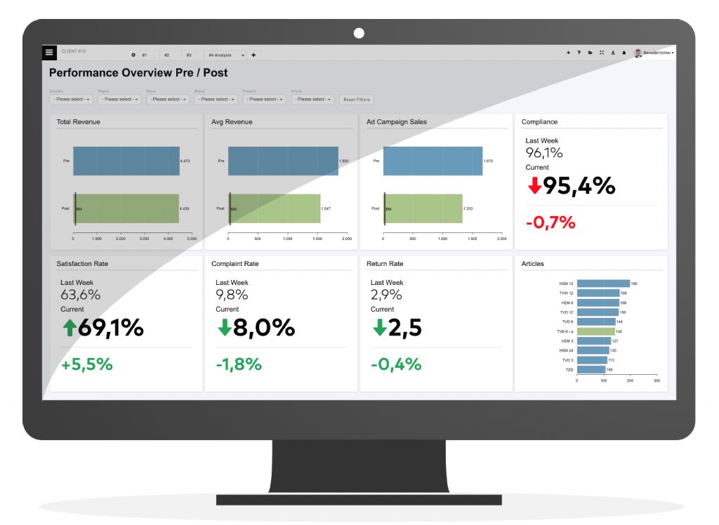
Another important success factor is the appropriate presentation of the key figures. By mapping past values in the form of progressions, KPI developments can be presented very effectively. Good dashboard solutions offer extensive design options and make positive and critical developments visible at a glance. For time series the database must be updated regularly. The best is a real-time connection to the database via an interface if one exists. Such a link has the additional advantage that the cost of maintaining the dashboard in the future is very low. In general, the more up-to-date the KPI is, the greater the informative value.
KPI Dashboard Customized views
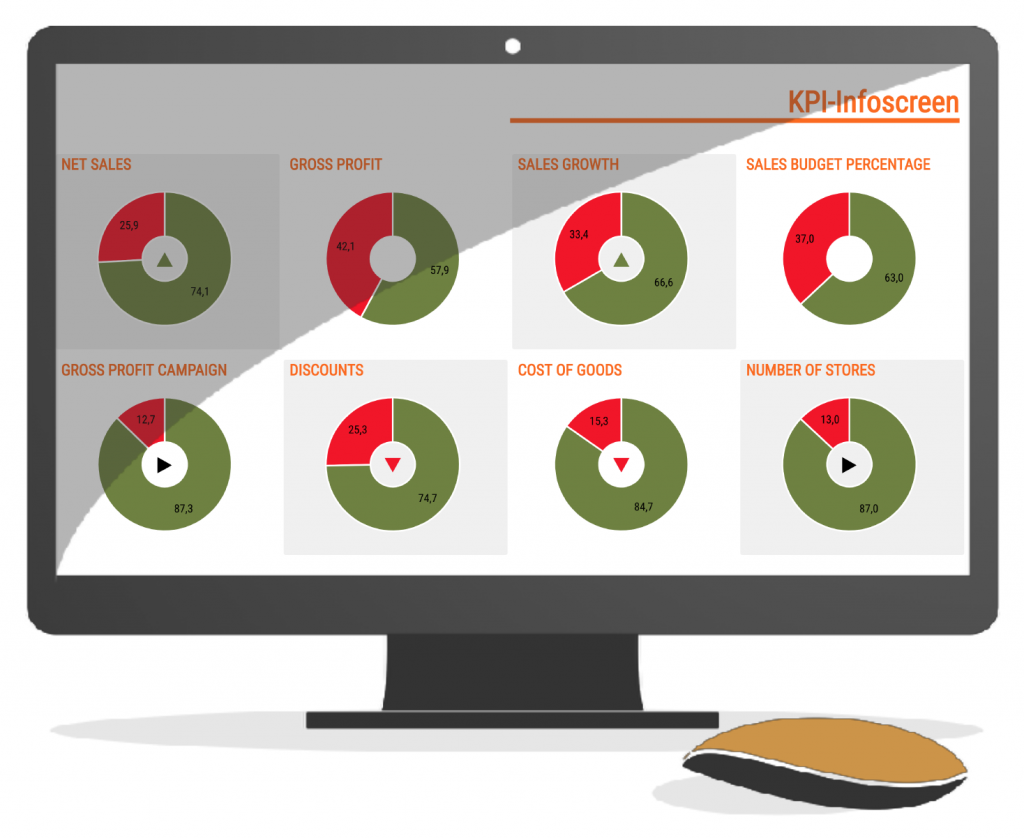
The KPI dashboard becomes even more effective if the possibility of filtering exists within the figures and gradients. Thus, the knowledge gain is often greater, if users can spend depending on the topic personalized KPI developments over certain periods, target groups, cost types, etc. Also, the possibility to compare the filter selections usually brings a considerable added value. Last but not least, the motto "less is more" undoubtedly also applies to key performance indicators. A good dashboard only features KPIs that are actually relevant to users. Even though there is no general rule on numbers, more than ten indicators and time series are more likely to confuse rather than achieve goals. Here are some examples of KPIs from business practice:
Sales KPIs
Net income
The net profit is the difference between revenues and total costs. It can be calculated for the entire company or even for individual products and is not only an important key figure in sales but also a must in the management dashboard. It symbolizes the success or failure of the entire enterprise.
Growth
Being able to see graphically how much the company is growing (or even shrinking) in terms of its sales and revenues is an important support for decision-makers. Do processes have to be changed or optimized? This metric is also a must-have for businesses, but only if it's always up-to-date. The revenue growth rates should be configured in the dashboard so that you can individually change the period for calculating the rate.
Customer acquisition costs (CAC)
Customer acquisition is a painful and expensive topic in many companies. Keeping an eye on the specific costs is also essential and says a lot about the long-term success of the company. Properly presented in a dashboard, acquisition costs regularly provide for wholesome surprises, as they are often underestimated.
Market research-oriented KPIs in your KPI dashboard
Customer Loyalty & CX
In customer-centric organizations, an up-to-date customer satisfaction KPI should be prominently placed on each employee's dashboard. One challenge, however, is the meaningful measurement of customer satisfaction and its dimensions. Not only in large service departments representations in dashboards help to detect and eliminate grievances.
Net Promoter Score (NPS)
The Net Promoter Score (NPS) is a common measure of the likelihood of a customer recommending a company or brand. In some industries, this metric correlates with business success and is therefore standard on many market research dashboards.
Customer Lifetime Value (CLV)
Often used is the so-called Customer Lifetime Value (CLV). The CLV describes the value of a customer for a company, throughout the life of the customer relationship. What revenue is expected of the customer, what is his potential? By means of the CLV one can e.g. justify why you give different customers different care.
Brand Image
Just as important and challenging in measurement as customer satisfaction is the brand image. How well or badly is your brand perceived among your potential customers? The perception within the individual target groups plays a decisive role in purchasing decisions. With the help of a dashboard solution specialized in the market research industry, you can identify important developments easily and early.