“Data is power”: by now an established fact. “Music is power”: a universal truth. So what do we get, when we creatively combine the plethora of available data on music with analyzing techniques and powerful software? We gain knowledge, insight and tremendous inspiration. We have gathered some really interesting and inspiring creative visualizations – both interactive and non-interactive – on the evolution of music as well as on current distinctive trends. Enjoy!
Creative Music Visualizations
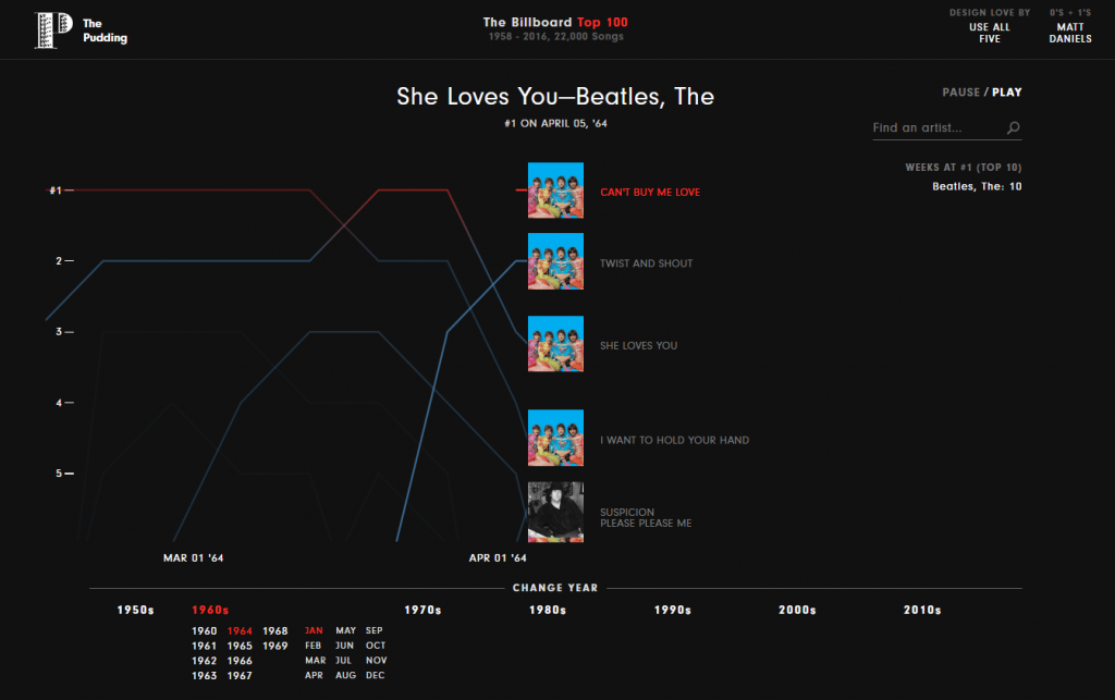
Using data from the Billboard Top 100 Data 1958 – 2016, The Pudding´s Matt Daniels has visualized the evolution of musical taste on a month-to-month basis over the years: every top 5 songs from 1958 to 2016 in the U.S. Headphones required – it´s a “soundalized” visualization!
Quantitative insight visualizations
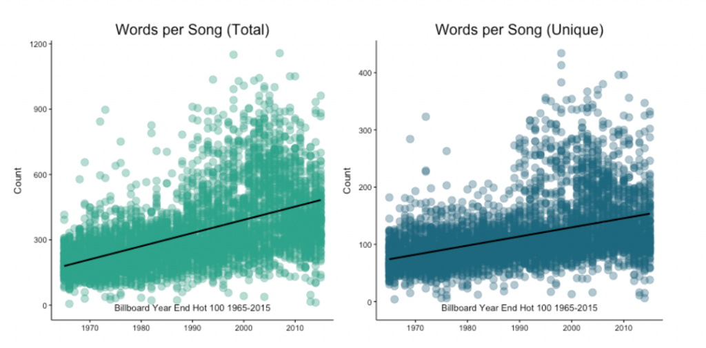
Kaylin Pavlik, on the other hand, in her blog post „50 Years of Pop Music” has used R and data from the Billboard Year-End Hot 100 to offer more quantitative insight into the evolution of Pop from 1965 to 2015 in the U.S. These creative visualizations is also very interesting.
Are Pop Lyrics Getting More Repetitive?
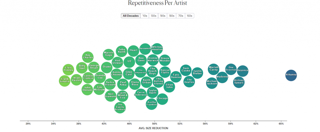
Colin Morris (again of The Pudding) is putting one hypothesis into question: Are Pop Lyrics Getting More Repetitive? The author used the Lempel-Ziv algorithm to measure repetitive lyrics with compression. The higher the compressibility of a song, the more repetitive its lyrics are. So seems like Rihanna´s Lyrics aren’t as much of a piece of poetry as Frank Sinatra´s used to be! Wait, we did see that coming, didn´t we?
Creative Visualizations: Musical Map of the World
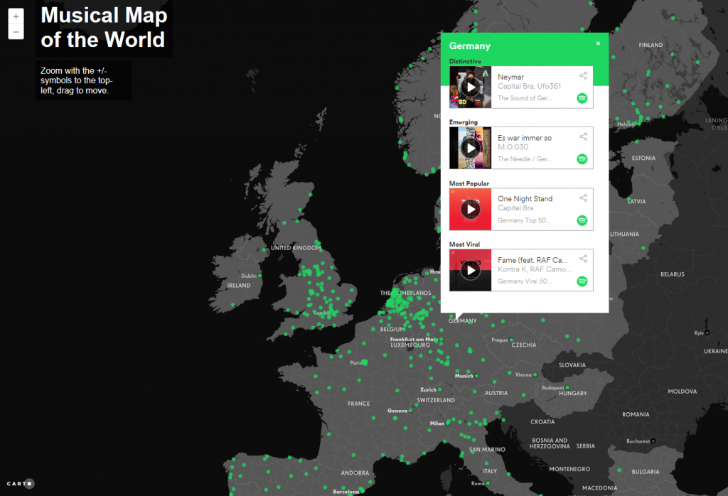
On a more international level, Spotify and open-source platform CARTO have created the “Musical Map of the World”. The creative visualization with an interactive map is making use of Spotify´s data from cities all over the world to give them their special “musical character”. Do you want to know how Germany sounds like? Click on the country to listen to its distinctive music!
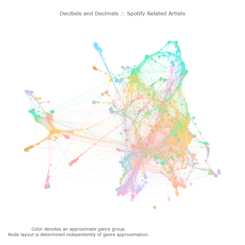
Visualizing the connection between artists and their music
Brady Fowler of Decibels and Decimals is not a friend of classifying music through genres. So he used Spotify data and Python iGraph to visualize the connection between artists and their music. The beautiful graph is the outcome of clustering the artists into groups, based on the listening habits of Spotify users.
Did you find the data visualizations as interesting as we did? What would you add to the list? We are looking forward to your input.
From inspiration to your own dashboard: DataLion turns your own survey and market-research data into network graphs, chord diagrams and 40+ other chart types – point-and-click, no coding required. Explore the chart types or try DataLion for free.