From (demo) raw data to the dashboard [eng]
The aim of this guide is to help you get started with DataLion and to explain the first steps and most important functions using a demo data set.
At the end of these instructions you can:
-
Start with DataLion
-
Register a DataLion-Instance
-
Create projects and reports
-
Upload data
-
Basic Settings
-
Handle missing values
-
-
Create first dashboards
-
Create basic charts
-
Filter data for specific values
-
Make your first design choices
-
-
Publish your projects
-
Export charts and dashboards
-
Give external viewers access to a dashboard
-
Downloads: Demo Data
Start with DataLion
Register a DataLion-Instance
Register an instance (this is the DataLion website through which you will later access all your projects):
https://app.datalion.net/register
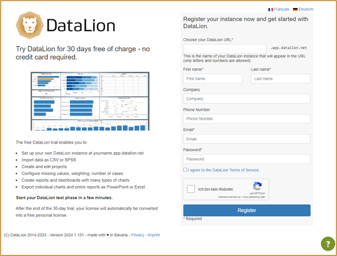
You (and later your viewers) can access your DataLion projects via the DataLion URL.
[Note: This cannot be changed later, so choose it carefully].
Once you have completed registration, you will have access to your personal DataLion instance.
DataLion is divided into the instance administration, the backend and the frontend.
You are welcome to use the frontend and backend tour to get a first feel for the user interface.
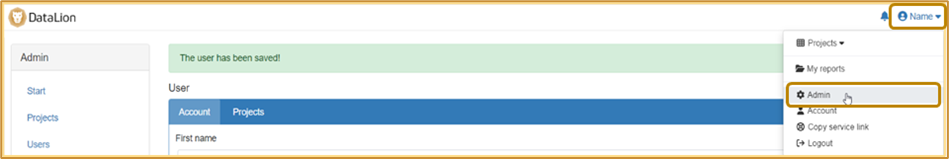
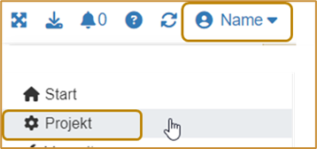
Navigation to the instance administration
· Click on your name in the top right corner
· Choose „Verwaltung“/ „Admin“
This takes you to the administration of your instance. Here you can create projects and users, carry out updates and define basic settings for your account.
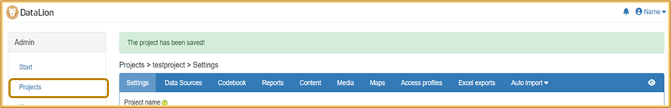
Create projects and reports in the backend
· Click on “Projects” on the left-hand side.
· Click on “New” at the top right.
· Assign a project name (this will be displayed later in the URL), an internal title and select a theme (basic layout for the project - can be changed later at any time).
· Save —> You will then be redirected to the backend of your project (blue navigation bar).
· If required, you can change the project language at the bottom of the page.
Navigate between projects
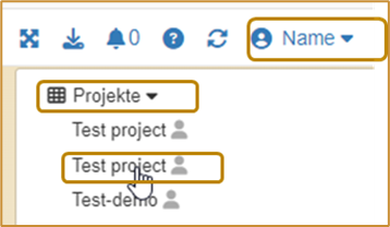
If you have several projects in your instance at a later date, click on “Projects” directly under your name to go to the start page (front end) of the desired project.
Navigate to the backend
If you want to navigate back to the backend from the frontend at a later time, click on your name at the top right and then on “Project” (with the cogwheel).
Upload data
If you would like to create your first DataLion dashboard using our demo data set, you can download it here.
Data can be uploaded to DataLion in all common formats (SAV, Excel, CSV).
[Note: We recommend using an SAV data set if possible, as the variables and characteristics can be provided with labels here. DataLion adopts these labels automatically].
Demo data
The data set contains 18 variables or questions and 500 entries.
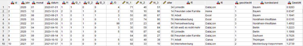
The question variables (f1 - f6) are assigned the following labels and values:
Frage | Label | Antwort (Wert) | Antwort (Label) |
f1 | Nutzen Sie DataLion bereits in Ihrem Unternehmen? | 1, 2 | „DataLion Nutzer“ (user), |
f2_1 | Würden Sie sich selbst als Experte in der Datenvisualisierung beschreiben? | 0, 1 | „Nein“ (no), „Ja“ (yes) |
f2_2 | Haben Sie bereits Software zur Datenvisualisierung verwendet? | 0, 1 | „Nein“ (no), „Ja“ (yes) |
f2_3 | Möchten Sie sich in der Datenvisualisierung weiterbilden? | 0, 1 | „Ja!“ (yes), „Nicht wirklich” (not really) |
f3 | Wie viele Punkte würden Sie sich selbst für Ihr Data know-how geben? | 1 - 5 | - |
f4_1 | Wie gerne arbeiten Sie mit Daten? | 0 - 100 | - |
f4_2 | Wie gerne arbeiten Sie an Darstellungen von Daten? | 0 - 100 | - |
f4_3 | Wie viel Spaß bereitet Ihnen die Arbeit mit Ihrer bisherigen Software zur Datenvisualisierung? | 0 - 100 | - |
f5 | Wie haben Sie von DataLion erfahren? | Offene Nennung (open answer) | - |
f6 | Womit erstellen Sie professionelle Diagramme, Charts und Infografiken? | Offene Nennung (open answer) | - |
If you would like to use your own data set, please check it in advance.
Please check the following points in your dataset
· Recommended data format: UTF-8
· Varia names do not contain dots, spaces, special characters or leading digits
· Variable names are max. 64 characters long
· There are no empty columns
· Point as decimal separator (can be converted during data upload if required)
You are welcome to use our DataLion data validator to check your data set for typical pitfalls: https://datalion.com/datacheck/
Data upload
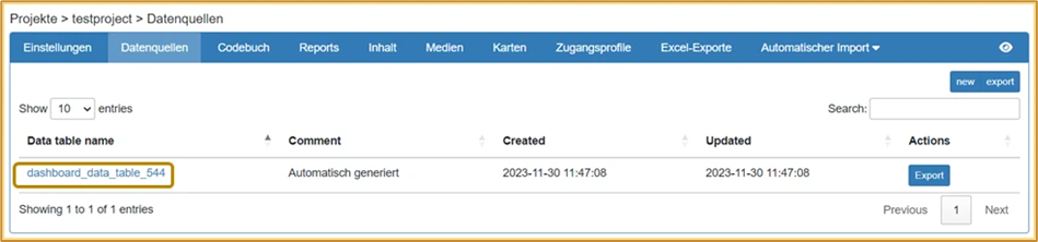
· Click on the “Data sources” tab in the blue navigation bar in the project backend.
[Note: Data is imported into data sources. For most projects, one data source is sufficient; this then contains all the data].
· Click on the automatically generated data source to go to the data upload.
· Click on “Choose file” and select your data record. Click on “Save” at the bottom of the page.
· You will now see a preview of your data. The settings can all be left at the default values (if your data uses commas as decimal separators, please select the option “Convert comma to dot”). Click on “Save” again.
· After a successful upload, you will see a preview of your data at the bottom of the page.
Handling of missing values
[Note: The demo data set contains missing values in the variable f3 in the form of empty cells and the value 99]
-
Click on the “Settings” tab in the blue navigation bar in the project backend.
-
Click on “Missing values”. Define the values to be excluded from the calculations as missing values. Enter several missing values separated by commas (e.g.: 99, 997, 998).
-
If necessary, also define NULL and empty character strings as missing values.
-
Define how missing values should be handled by default in the project (if required, this setting can be overwritten at question level).
-
Click on “Save” at the end of the page.
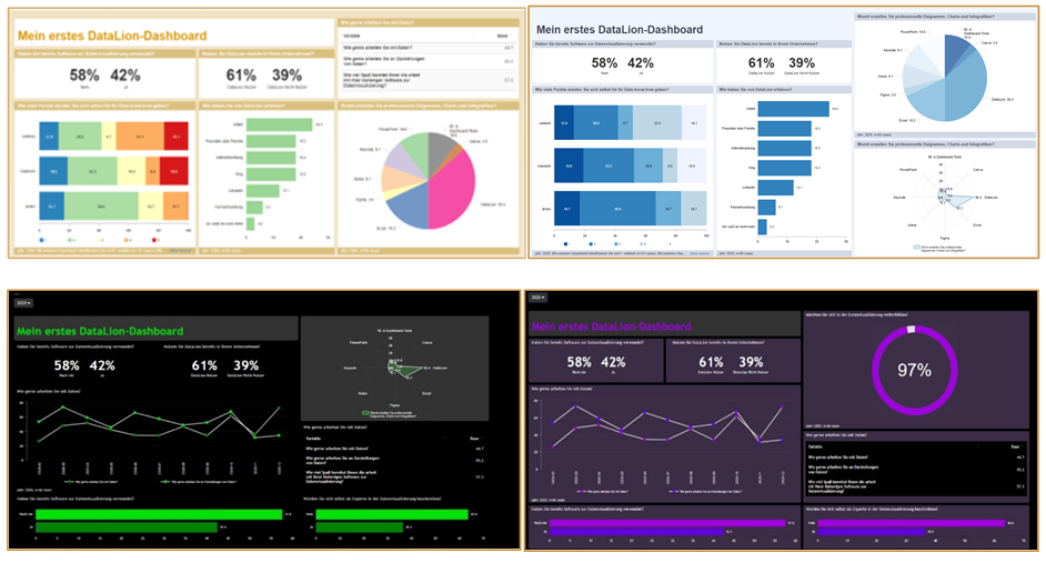
Create first reports and dashboards
A project is divided into reports and dashboards. A report contains one or more dashboards (tabs) on which your data can be visualized using different diagrams/charts.
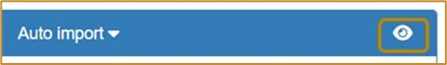
· Switch to the frontend by clicking on the eye in the blue navigation bar on the right.
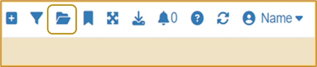
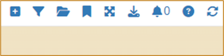
· Create a new report by clicking on the folder icon at the top right and then on “New report”. Give it a name and click on “OK” . You can navigate between your reports later using the folder icon. You will now see your first dashboard “New tab”.
· By clicking on the arrow on the tab, you can rename, copy, label, save or move your dashboard to another report.
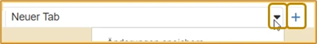
· Don’t forget to save your dashboard as soon as you have made changes.
· You can add another dashboard (tab) to the report by clicking on the “+” next to the tab.
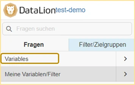
· On the left-hand side you will find the navigation bar (if this is not visible, click on the burger menu at the top left; 3 bars). Here you will find all the variables contained in your data set by clicking on “Variables”.
[Note: You can permanently show or hide the navigation by clicking on your name at the top right and deactivating/activating it via “Show/hide navigation”.]
Create basic charts
You can create a chart by clicking on a variable name or by dragging and dropping a question onto the dashboard.
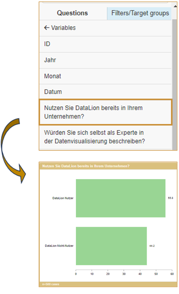
Bar charts are created by default. You can then customize all charts individually.
The most important chart settings can be found under the cogwheel in the chart header:
-
Chart-Typen: Here you can select how your data should be displayed. The most common chart types are
-
For frequencies: Bar, Column, Pie, Donut, Line
-
For scales: Stacked Bar (stacked bars), Stacked Column (stacked columns)
-
For complex data: Tables
-
-
Metrics: Here you can set the metric in which the data should be displayed. Percentages are displayed by default. The most common alternatives are “Absolute values” and “Valid percent”.
-
Sorting: You can set this at the end of the list. By default, the list is sorted according to the order of your values. You can also sort in ascending/descending order or alphabetically.
-
New chart settings: Individual settings (e.g. colors, background color, show/hide various aspects) can be made here.
-
You can change the size of the chart using the arrow at the bottom right of the chart.
-
You can change the chart title manually by double-clicking on it
-
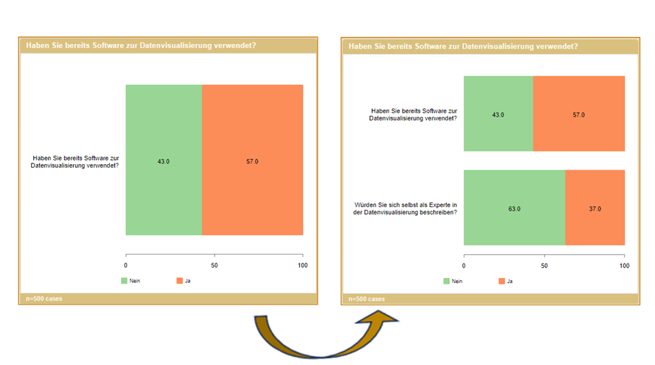
Merge questions: Often different questions with the same values are to be displayed in a common chart (usually for agreement scales). This can be done as follows:
-
Drag and drop the first chart onto the dashboard and set it to “stacked bar”
-
Drag a second question with the same values/labels (!) onto the chart you have already created
-
Click on “OK” in the pop-up (“Merged” setting)
-
The chart now shows both categories:
For stacked diagrams, TOPx boxes can also be created in the settings (gear wheel).
Information on handling multiple answers can be found here .
Filter data according to certain values
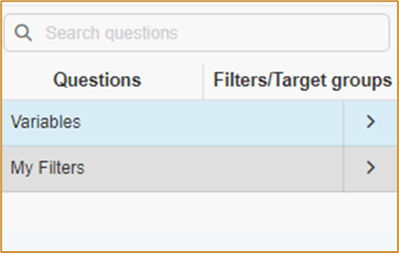
Switch to the “Filter/Target groups” tab in the navigation bar on the left (the background changes from gray to blue). You can now use all variables as a split or filter.
If you drag a variable onto an existing chart, the data is split according to the characteristics (available in most chart types).
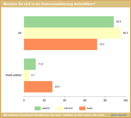
If you click on a variable, the individual characteristics are displayed.
If you drag an individual characteristic onto a chart, the data is filtered according to this characteristic. Adding further characteristics adds them as a split.
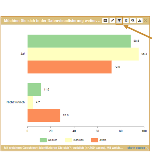
Filter settings can be changed with the newly available filter symbol in the chart settings (order, delete, etc.)
Make first design choices
In DataLion, you have the option of completely and individually customizing the design of your dashboards and projects.
Customize charts
In the default setting: drag-and-drop, the dashboard is based on a grid in which you can position your charts by moving the cursor over the chart header.
[Note: In drag-and-drop mode, the chart always takes up a position at the top of the screen].
You can change the size of the charts by either using the magnifying glass symbol and switching between the single, double or triple options in the vertical and horizontal direction or by moving the cursor to the bottom right-hand corner of the chart and dragging it to the desired size.
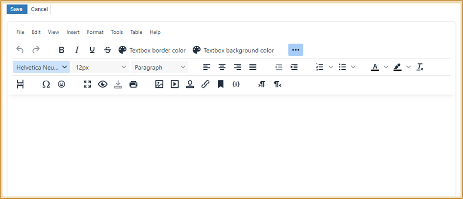
Textboxes
You can use text boxes to structure and organize your dashboard. Click on the “+” symbol at the top right to add a new text box to your dashboard.
To position the text field, simply click on it and move it to the desired position while holding down the left mouse button.
To zoom in or out, simply hold down the left mouse button at the bottom right and drag up or down.
The text field has a WYSIWYG editor (=“What You See Is What You Get” editor). With a WYSIWYG editor, a document is displayed on the screen during editing exactly as it looks after saving in the dashboard.
Further information on text boxes can be found here.
Themes und colors schemes
In DataLion, you can choose between different themes (basic layout of your dashboards) and color schemes (colors of the charts).
You will find a selection in the backend under Settings at the bottom of the page. By checking the box, you can also make the selection directly in the frontend.

You also have the option of creating your own themes and individual color schemes.
You may even use AI to get a first draft.
Go to the backend → Content → AI style promt.
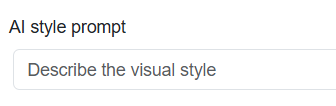
Add a prompt (e.g. business like dashboard with spring colors), hit enter and the AI will create a coloscheme for you and also adapt the background color, chart colors, font sizes etc.
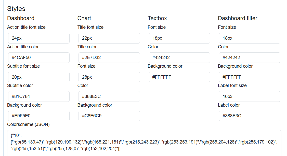
The results are directly saved above (under Styles) and can be modified by overwriting the values. You may also enter values from scratch to adapt the dashboard to you CI.
Further instructions can be found on the following pages: Eigene Themes mit CSS erstellen, Individuelle Farbschemata nach Frage/Variable anlegen
You also have the option of customizing the respective charts and text boxes individually. This means that the entire dashboard can be customized and there are no limits to your creativity.
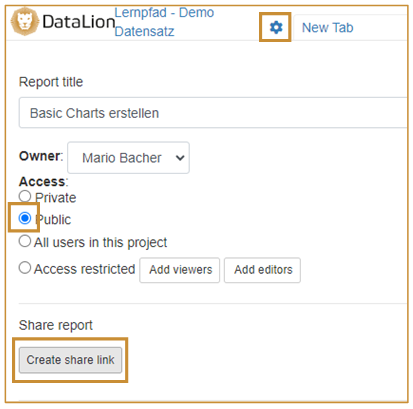
Publish your projects
Enable external viewers to access the dashboard
To publish your report, you can save it as public in the report settings and generate a link to the report. To do this, click on the cogwheel symbol in the relevant report in the top left-hand area.
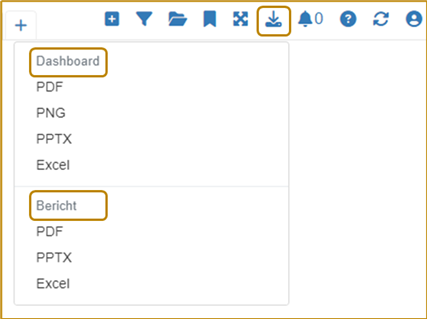
Exporting charts and dashboards
In addition to the ability to use and present your data directly in the DataLion web application, DataLion also offers various export options. You can export either complete reports, individual dashboards or individual charts as a PDF, PowerPoint presentation or Excel file. To do this, select the “Download” icon in the top right-hand front-end area (or when hovering over a chart) and export the file in the desired format.
Integrating a PowerPoint master
You also have the option of integrating a PowerPoint master into your project in order to export the PPTX file directly in your corporate design, for example.
To integrate your prepared master into your project, navigate to the backend of your project. You can find information on configuring your master here.
[Note: When creating your master in PowerPoint, you must close the slide master view before saving].
Congratulations!
Now you can get started with many combinations and display options for your project!
In the next article you will find helpful additions to use DataLion more efficiently and extensively.