
Welcome to DataLion 2026.2. This line turns DataLion from "the place your survey data goes" into a tool that runs the whole loop: collect it, listen to it, and present it. It brings a complete survey module with 75 ready-made templates, one-drop import that turns a dropped file into a finished dashboard, AI-assisted text analytics for open-ended answers, a Theme Studio for your own branded look, native Google Slides export, Google/Microsoft single sign-on, two new distribution chart types, Dutch as a fourth interface language, and a reimagined onboarding start page with one-click demo projects. It bundles everything shipped since the 2026.1 line started.
🚀 Highlights
Drop a file, get a dashboard -- The upload tile on the start page is now a live drop zone. Drop, paste or pick a CSV, Excel or SPSS file and DataLion creates the project, imports the data, generates the codebook and assembles a starter dashboard in one go -- then lands you on the finished charts. When an AI model is configured, it reads your data and designs the layout: survey files get one chart per question with matrix batteries fused into stacked charts, while business exports get themed tabs of KPI tiles, breakdowns, tables, wordclouds and time-series charts. No model configured? The rule-based planner builds the dashboard anyway.
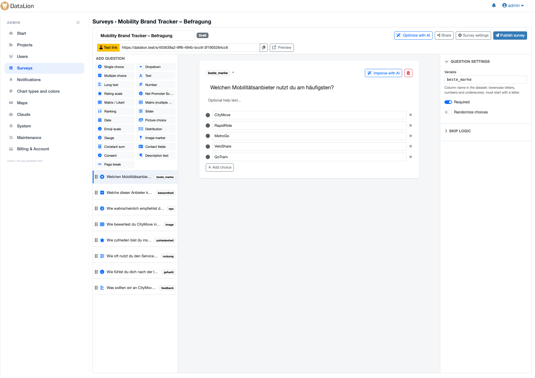
Build and run surveys, natively -- DataLion now has a full survey module. Design questionnaires in a three-pane editor with 23 question types, drag-and-drop reordering, skip logic and display conditions, then publish in a click. Publishing automatically creates a DataLion project with a response dataset and a complete codebook, so results are chartable on the existing dashboard stack from the very first answer. Respondents fill it out on a mobile-first, Typeform-grade runner under a tokenized /s/{token} link -- no login required.
Text analytics for open-ended answers -- New NLP turns free text into structured data. "Analyze open text" classifies every response by sentiment and an auto-discovered topic, then writes the results back as new categorical variables with codebook entries -- so they instantly work with charts, filters, cross-tabs and exports. A ready-made sentiment-and-topic report is created for you automatically.
Export to native Google Slides -- Dashboards, reports and single charts can now be exported as live, editable Google Slides decks into your connected Google Drive, with chart data embedded as native Sheets charts in your DataLion colors, titles, legends and number formats. Tables and KPIs become native Slides tables and number slides; an optional Slides template skins the whole deck.
Sign in with Google or Microsoft -- Users can now log in and register with Google or Microsoft SSO from both the login and signup pages. An existing account is logged straight in; an unknown email registers a new workspace and skips the activation email.
✨ What's New
Surveys
- 📋 The survey builder: A three-pane editor with 23 question types (single/multiple choice, dropdown, picture choice, text, rating, slider, NPS, ranking, matrix/Likert, date, contact fields, consent, and more), drag-and-drop reordering, page breaks, choice randomization, per-type validation, answer-based skip logic, and autosaved drafts.
- 🤖 AI-built and AI-optimized: "Create survey with AI" generates a complete questionnaire from a topic description; "Optimize with AI" polishes wording, options and structure while keeping your variable codes intact.
- 📚 75 templates: A searchable gallery of GDPR-friendly questionnaires across customer feedback, HR (incl. Gefährdungsbeurteilung psychischer Belastung), market & brand research, events, education, public sector and healthcare. Pick one and land straight in the builder. Bilingual (DE/EN).
- 🎨 Survey designs: A Design tab with 17 ready-made themes plus a custom builder (accent/background/card/text colors, four font styles), applied live to the public survey.
- 🎯 Interactive question types: A live distribution swarm, a gauge dial showing earlier answers, an image-marker question storing tapped X/Y position, and a Gen-Z-friendly emoji scale.
- 🔗 Distribution options: QR code download, iframe embed snippet, one-time personal invite links exported as CSV, URL-parameter capture, response limits, automatic close dates, and screen-out disqualification.
- 🏷️ Meaningful variable names: Rename auto-assigned q1/q2 codes per question so dataset columns get names like
genderornps_score-- references remap automatically. - 🧪 Conjoint & MaxDiff research: Choice-Based Conjoint and MaxDiff question types are now available, complete with balanced experimental designs, respondent tasks, R-backed analysis charts, subgroup comparison, a preference-share simulator, willingness-to-pay output when price is present, and two ready-made Market & brand templates.
- 🧭 Draft results preview: Draft surveys now have a View results action that builds the analysis project, dataset, codebook and dashboard from current test responses without publishing. Publishing reuses the same project and clears the test data.
- 📐 More survey controls: Add constant-sum questions, images on description blocks, per-question display logic, survey-runner width options (50% / 75% / 100%), and optional whitelabel removal of the public "Powered by DataLion" footer.
Charts & Visualization
- 📊 Box Plot & Histogram: Two new distribution chart types. The histogram bins a numeric variable into a frequency distribution (auto bin count, overridable via chart settings → Bins); the box plot draws a Tukey box-and-whisker with outlier points, one box per variable or per group with a breakdown.
- 📉 Valid-response timeline bases: Project case-number settings now include a Timeline chart option that counts only rows with non-missing response fields, so survey result timelines can show the valid response base instead of all filtered rows.
Working in dashboards
- ⌨️ Dashboard command palette: Press
⌘K/Ctrl+Kon any dashboard to refresh, toggle filters, add a chart, jump to My Reports or the admin BI screens, and search reports plus questions live inside the current project. - ⚡ Filters without the page reload: Global filters, date ranges, benchmark filters and chart filter dropdowns now redraw just the affected charts and text boxes instead of reloading the whole dashboard. The URL still carries the full state, so shared and exported links behave exactly as before.
- 🎨 Refreshed chart cards: Dashboard charts adopt the new DataLion design language -- a warm canvas, quiet headers and footers, soft hover and focus states, and skeleton loading placeholders while data arrives. Chart titles now use the full card width.
- 🗂️ "Dashboard" is now "Tab": A single page inside a report is called a Tab throughout the interface (EN/DE/FR), so "report" and "tab" no longer both get called a dashboard. Nothing about your saved reports changed -- only what we call them.
Onboarding & Demos
- 🏠 Reimagined start page:
/screen/startis now an onboarding hub -- personalized welcome, a "your setup" progress tracker, a demo gallery, create-a-survey and drop-your-data action cards, a "jump back in" list of recent work, and a consolidated help panel. - 📥 One-drop import: Drop a CSV, Excel or SPSS file on the start page and land on a finished, chart-filled dashboard (see Highlights). Machine-style column names become readable chart titles, umlauts survive the import, and a failed drop never leaves a half-built project behind.
- 🎁 One-click demo projects: Pick from up to six ready-made demos -- five generated studies, each with its own visual identity and a mix of chart types, plus a real Global Market Tracker BI dataset with a filterable crosstab. Opening one hands you the demo project directly, with clean URLs like
demo-mobility-brands; a new Reset action rebuilds it from the sample data once you've played with it.
Design & Branding
- 🎨 Theme Studio: A new admin area for building your own look. Start from a preset or one of the built-in design templates, edit design tokens, custom CSS and custom JS with a live preview, apply the theme to any project, and export or import theme bundles to move them between instances. You can also generate a theme from your brand -- give it a website URL, logo, description or seed colors and let AI propose the palette and typography. Projects without a theme render exactly as before.
- 🖌️ 17 project design templates: Visual preview cards on the New Project page pre-fill page background, chart/text colors, title colors and a matching Google font -- all still editable. Existing projects can switch templates later under Admin → Projects → Design → Visual style.
- 🌐 Browser branding: Configure the instance page title and favicon under Admin → System, and override per project under Admin → Projects → General Settings. PNG/JPG favicons convert to ICO automatically.
- 🎀 Refreshed login page: A warm gold-tinted gradient, a frosted login card, rounded inputs with a brand focus ring, and a centered footer -- matching the new start screen.
Billing & Accounts
- 💳 Coverage-aware billing & seat limits: The upgrade options no longer show a misleading "Upgrade" to a smaller plan; enterprise licenses route to a contact link instead of self-serve checkout. Adding a user respects your plan's admin/editor/viewer seat limits, and the license usage history gains a year selector. The license name on the Billing page is configurable.
- 🔐 Google & Microsoft SSO: Sign in and register with Google or Microsoft from the login and signup pages.
- 🛡️ Signup spam protection: A human-verification challenge (Cloudflare Turnstile) that blocks automated spam signups.
Data, Codebook & Export
- ↕️ Drag-and-drop codebook ordering: Drag rows into a new order within their parent category in the codebook editor -- changing the order in both the codebook and the rendered charts.
- 📈 SPSS dataset export: A new menu entry downloads each accessible data table as a labeled
.savfile, with variable and value labels from the codebook. - 📤 Native Google Slides export: Live, editable decks into your connected Google Drive (see Highlights).
- 🗂️ Clearer data source preview: Split into a Data tab (row preview) and a Columns tab listing every column with its type, length and scale.
- 🧩 BI modeling helpers: Project admins can now define drill paths, promote raw table columns into codebook questions one by one, create Sum/Count/Average measures without SQL, and inspect joins in a read-only data model diagram. Raw date columns can also be grouped by time grain, and the Global Market Tracker demo showcases the full workflow.
- 🔀 Research, BI or Hybrid workspaces: Each project now has a workspace mode under Admin → Projects → Settings → Display, with an optional per-user override under Admin → Users. BI mode applies business terminology (Field, Segment, Rows) consistently across every screen -- in English, German and French.
- 📥 Smarter SPSS import: SPSS imports now choose better default chart types from variable types and labels, fold multiple-response sets into one question, and recognize common multiple-choice battery naming patterns.
AI & Integrations
- 🧠 Bring your own model & Ask your data: Admin → AI lets each workspace use its own HybridAI, OpenAI, Anthropic, Azure OpenAI or Mistral key, model and endpoint. The same area now includes an admin-gated "Ask your data" chat that answers from project codebooks, reports and chart tables with grounded citations.
- 🤖 Claude Desktop, self-service: Admins can offer a self-service integration page where users download the DataLion MCP extension and create scoped API tokens. The local bridge starts read-only by default, includes a connection test, and gates write tools behind an explicit setting.
- 🧱 Build dashboards from Claude: The MCP integration gains higher-level authoring actions -- create measures, add text boxes, and place a widget by describing it ("a KPI of total revenue", "revenue by region as a bar chart") instead of hand-assembling codebook rows and chart parameters.
- ☁️ Google Drive via service account: Google Drive import and Google Slides export now use the instance service account instead of per-customer OAuth apps. Admins share the Drive folders with the shown service-account email, and existing connections keep their folder configuration.
- 📣 Discord admin events: Admin Discord notifications now cover new user registrations, tenant creation, and email confirmations.
📈 Improvements
- 🇳🇱 Dutch, French & business vocabulary: Dutch joins English, German and French as a full interface language -- pick it from the language menu, your profile, or when generating a survey with AI. Users can also switch terminology between Research vocabulary (Question, Target group, Cases) and Business vocabulary (Field, Segment, Rows).
- 🧭 Faster admin navigation: A command palette opens with
⌘K/Ctrl+Kor the top-bar search button and jumps to admin pages or projects by name. The top bar also gets an explicit Back to app control, and Maintenance now has a real log viewer with filtering, levels and copy. - 🧰 Cleaner admin workflows: Admin lists use a quiet edit action plus overflow menus, settings pages track unsaved edits, saves appear as toasts, project Settings/Design/Codebook use one-section-at-a-time navigation, and per-section Save/Cancel keeps one area from disturbing another.
- ✨ A calmer admin look: The whole back office moves to the DataLion brand palette -- one action blue, a warm gold wash on sidebars and table heads, a real project header with a "Go to project" exit, and error pages that match. Blunt browser confirm dialogs are replaced by proper dialogs that name what you're about to change and what happens next.
- 🗣️ Admin tables speak your language: Table search, pagination, empty states and date columns are now localized -- relative phrasing within the last week ("2 hours ago"), a short localized date beyond it -- instead of raw timestamps and hardcoded English.
- 🔐 Safer connector screens: Dropbox and Google Drive connector tables no longer show credentials in plaintext; secrets and tokens are masked with a reveal toggle.
- 📝 Streamlined trial signup: The public signup flow includes localized copy, customer logos, generated workspace suggestions, live availability checks, and a queued provisioning progress screen -- so signup no longer waits on workspace setup.
- ⚡ Faster queued Excel exports: Machine-readable Excel exports now fetch dashboard data in parallel and assemble the workbook from the prefetched pieces, so large exports finish faster.
- 🧠 Faster chart generation: Charts render faster by reusing repeated lookups and query results and skipping work the current view doesn't need.
- ⚡ Immediate export feedback: PDF/PNG downloads show the standard notification the instant you click and close the download menu.
- 🚀 Snappier dashboards: Static assets are now aggressively cached in the browser, so dashboards load noticeably faster.
- 📤 Upload progress popup: Data source Upload Now shows a popup with running, success row count, and error states.
- 🇪🇺 New footer tagline: The footer now reads "Made with ♥ in Germany 🇪🇺".
🐛 Notable Bug Fixes
- Full-width chart titles: Chart headers reserved space for the hover toolbar even while it was invisible, truncating every title ("Total Av…"). The toolbar now overlays the header, so titles use the whole width.
- Stacked charts with significances: Turning on significances for a stacked chart crashed the chart instead of rendering it.
- More accurate significance letters: Z-tests on tables now use the square-rooted standard error, directional one-tailed p-values and weighted column bases. The previous, too-lenient calculation flagged more differences as significant than really are -- the marking is now more precise and more conservative.
- SPSS labels for dotted variables: Variables named like
Q1.1now import their variable and value labels instead of showing bare column names and raw numeric codes. - Exports at the right resolution: PDF and image exports render at the intended viewport again, and the admin-configurable PNG resolution (1x/2x/3x) is actually applied.
- Duplicated projects keep their tabs: Cloning a project (and opening a demo) now attaches the copied tabs to the copy instead of leaving them on the original.
- Sum and count measures render: Measures created through the form now produce values instead of empty charts.
- Multi-select filter dropdowns: Every value picked in one dropdown session survives the submit, clearing all values removes the filter, and legends read "Item 1 or Item 2" for combined values.
- Excel exports of mean charts: Numeric mean charts export the mean under a "Mean" header instead of a meaningless percent value.
- Working social sign-in buttons: Google/Microsoft buttons now use a properly URL-encoded authorize request, replacing the previous buttons whose malformed redirect URL never worked. Microsoft registration reads the verified email correctly, and disabling registration now closes the SSO signup path too.
- A signup flow that finishes: A double-clicked signup can no longer create two workspaces, the provisioning screen stops spinning once you confirm your email and offers an "Open DataLion" button, and each email problem gets its own accurate message instead of a blanket "enter a valid business email".
- Safer saved layouts: Corrupt dashboard grid layouts are rejected on save instead of breaking the dashboard on the next load.
- CSV import row counts: Import preview confirmations show imported data rows instead of counting the CSV header as a data row.
- 🔑 Stronger passwords: Existing passwords are transparently upgraded to a modern hash on the next successful login, and password resets now reject reuse of your recent passwords.
Thanks for being part of the DataLion journey. 2026.2 is our biggest step yet toward closing the full research loop -- collect, analyze, and present, all in one place. As always, we'd love to hear what you think. Happy analyzing! 📊