
Data Culture Compass: Where Does Your Organisation Stand?
Two axes, sixteen statements: how easily do your people reach data, and how often do decisions rest on it? The result is a field in a four-field matrix.
The live demo opens the real questionnaire — no signup required.
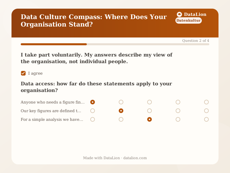
Data culture is usually described as a maturity level on one scale. That hides the most common case: organisations that have invested heavily in access and dashboards and still decide by gut, and organisations that want evidence-based decisions but wait for every analysis. The compass therefore separates two questions: how easily do your people reach data, and how often do decisions rest on it? Eight statements per axis produce a position in a four-field matrix, and each field brings its own next step. As a template, the compass suits the start of a BI or dashboard project, leadership rounds, and consultancies that want to record a client’s starting point.
When should you use this template?
This template is a great fit for:
- Before a BI or dashboard project, to record the starting point
- As a prompt in leadership rounds and strategy workshops
- With several answers from different areas, to reveal differences in perception
- Repeated quarterly, to show movement
Every question in this template
- 1Consent
I take part voluntarily. My answers describe my view of the organisation, not individual people. *
- 2Matrix
Data access: how far do these statements apply to your organisation? *
Does not apply at all Tends not to apply Partly Tends to apply Applies fully Anyone who needs a figure finds it without going through IT. Our key figures are defined the same way, whoever pulls them. For a simple analysis we have to ask someone who has access to the data. Departments assemble their own reports. The same figure often looks different in two departments. - 3Matrix
Decision culture: how far do these statements apply to your organisation? *
Does not apply at all Tends not to apply Partly Tends to apply Applies fully In meetings the figures are on the table before anything is decided. In the end the person with the most senior title decides, whatever the data says. When a measure does not work, it is adjusted or stopped based on the results. Figures are mostly sought to back up a decision that has already been made. Uncomfortable results are discussed openly too. - 4Single choice
In which role are you answering?
- Executive management
- Division or team lead
- Business department
- IT, data or controlling
- Other
Related survey templates
- CSRD Double Materiality Assessment (Stakeholder Survey)Stakeholders rate the ESRS topic areas by impact and financial materiality – the data basis for your CSRD materiality matrix.
- General FeedbackCollect quick and simple general feedback on your company, product or service – including an overall rating and recommendation.
- Big Five Personality Self-AssessmentA compact IPIP-based self-assessment of extraversion, agreeableness, conscientiousness, emotional sensitivity and openness – with a personal radar profile.
- Data & Analytics MaturityWhere does your organisation stand between spreadsheet islands and data-driven decisions? Five areas, a maturity profile and an instant report.
Frequently asked questions
Why two axes instead of one maturity level?
Who should answer?
What happens to the answers?
Start with this template
Load the template into DataLion, adapt it to your brand and start collecting responses — GDPR-compliant, in minutes.