
Which chart types are available and how can I use them?
DataLion offers around 50 chart types, from a simple bar to a conjoint analysis. This article lists them in the groups they appear in in the chart-type menu, says what each type is good for, and notes how it exports to PowerPoint. For newer types such as box plot, histogram and NPS, it explains the main settings.
Requirements
- An account that can edit charts.
- Box plot, histogram and clustered columns are available from DataLion 2026.2.192 and 2026.2.193, the NPS chart from 2026.2.196 and the wave slider on maps from 2026.2.197.
Change the chart type
- Click the gear in the top right of the chart (Chart settings).
- In the Appearance section, open Chart type.
- Pick a type from one of the five groups. The chart redraws right away.
Your administrator can limit the available types per project. Types that don’t fit the question, such as a histogram for a question without numeric values, show a message instead of a chart.
Bar / Column
The first choice for frequencies and comparisons.
- Bar and Column: shares or means per answer. Bars suit long answer texts. PowerPoint: native.
- Stacked bar and Stacked columns, each also as (100%): scales and item batteries at a glance, see Stacked chart with multiple items. PowerPoint: native.
- Clustered bar and Clustered columns: several items or groups side by side instead of stacked
- Mean: means of several items as bars. PowerPoint: native.
- Waterfall: shows which contributions move a value from one level to the next
- Calculation: results of an SQL calculation. PowerPoint: native.
Pie / Donut
For shares of a whole with few categories.
- Pie and Donut: work well up to about five categories. PowerPoint: native.
- Radial: shares as arcs. PowerPoint: image.
- Aster: values as segments of different lengths
- Multiring and Multiring (100%): several rings, for example for groups. PowerPoint: image.
- Depending on the instance, also Funnel (horizontal and vertical, PowerPoint: image) and Pyramid.
Line / Timeline
For developments over time and relationships between numbers.
- Line: simple trends. PowerPoint: native.
- Timeline: values over date or waves, with an adjustable interval. PowerPoint: native. See below.
- Area: a trend as a filled area
- Radar: several items on axes around a center. PowerPoint: native.
- Scatterplot: two numeric values against each other, with a regression line. PowerPoint: native, without the regression equation and line.
- Bubble and XY bubble: like a scatterplot, with size as a third dimension. PowerPoint: native as a bar chart.
Table / Number / Polarity
- Table, Table (nested) and Table (calculations): crosstabs with significance tests, see Tables in DataLion. PowerPoint: native.
- Number: a single value, such as a case count. PowerPoint: editable text.
- KPI: a key figure as a tile. Under Chart style…, on the Layout tab, switch on Show previous value and Show change.
- Polarity and Polarity (auto): profiles across opposite terms or scales. PowerPoint: native.
- Text: open answers as a list. PowerPoint: native.
- Images: images instead of values, such as product photos
Other
- Box Plot: the distribution of a numeric variable with median, quartiles and outliers. With a breakdown, DataLion draws one box per group.
- Histogram: the frequency distribution of a numeric variable. Set the number of classes in the chart menu under Bins: Auto, 5, 10, 15, 20 or 30.
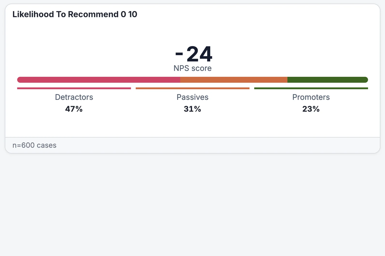
- NPS: the Net Promoter Score of a 0-to-10 question, see below
- Map: values by region, with a wave slider, see below
- Heatmap, Treemap, Chord and Network: relationships and structures. Chord diagrams export to PowerPoint as images.
- Wordcloud: frequent terms from open answers. PowerPoint: image.
- Gauge: a single value on a gauge scale
- PSM: Van Westendorp price sensitivity
- Advanced statistics: regressions, analysis of variance, driver analysis and MaxDiff
Conjoint and MaxDiff questions from DataLion surveys have their own analyses, see Conjoint analysis and Analyze MaxDiff results.
Confidence band and quick ranges on timelines
On a timeline, open Chart style… and the Timeline tab:
- Under Forecasting, Confidence band: adds a band around the line at 80, 90, 95 or 99 % confidence. The default is 95 %.
- Show quick time ranges puts buttons above the chart: 1M, 3M, 6M, YTD, 1Y and All. Default time range: sets what applies when the chart opens.
- Show overview strip adds a strip that lets readers pick a section.
If the project has tracker waves, choose Wave under Time interval in the chart menu.
Mean of all items on polarity and radar charts
For Polarity, Polarity (auto) and Radar, Show mean of all items (under Chart style… on the Layout tab) adds a line with the average across all items. That shows which items sit above or below average.
NPS chart
For a 0-to-10 question, the NPS chart shows the NPS score and, below it, the shares of Detractors (0 to 6), Passives (7 and 8) and Promoters (9 and 10). With several data series, each series gets its own card. DataLion uses the same layout in Excel and PowerPoint exports. How the score is calculated is explained in Calculate the Net Promoter Score.
Map with a wave slider
A Map shows values by region. If the chart has a breakdown by wave with more than one wave, a slider appears below the map:
- The Wave slider jumps between waves, Play shows them one after another.
- Change vs. previous wave colors regions by the difference to the previous wave, Values switches back.
- Regions without values or with suppressed values get their own color, labelled No data in the legend.
Choose which map the chart uses under Map in the chart menu.
Tips
- For scales with many items, stacked bars or polarity charts are usually easier to read than many separate charts.
- Before a PowerPoint export, check whether the type exports natively. Native charts stay editable in PowerPoint, images don’t. More in Create and apply a PowerPoint master.
- To combine or hide answers without changing the type, use Edit chart data.