
Edit chart data: group answers, top-2 boxes, hide categories
Edit chart data changes which bars a chart shows without opening the codebook. You combine answers into groups, add a top-2 box next to the individual answers, split numeric values into ranges or hide categories. If you can edit the project, you can save the definition as a variable and use it in every chart and filter afterwards.
Requirements
- DataLion release 2026.2.197 or later.
- Access to the dashboard. Save as variable and the Combine columns tab are only shown to people who can edit the project.
Open the dialog
- Click the gear in the top right of the chart (Chart settings).
- In the Data section, choose Edit chart data….
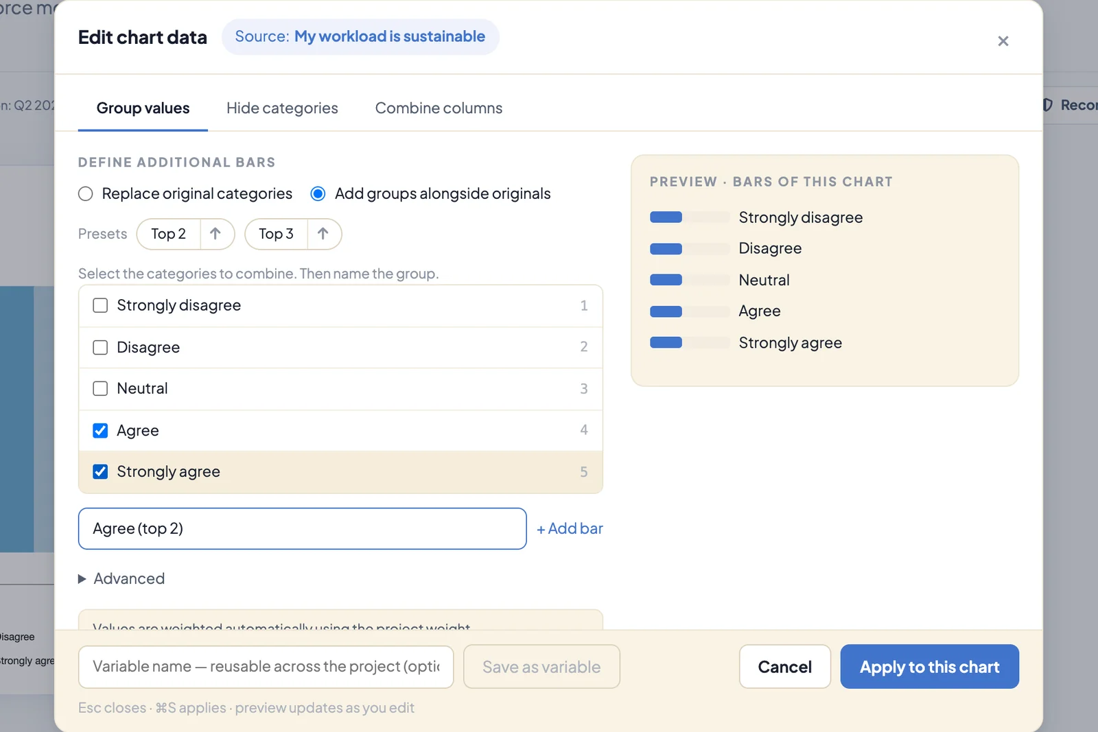
The top of the dialog shows the question the chart is based on under Source. The dialog has three tabs: Group values, Hide categories and Combine columns.
Combine answers into groups
- In the Group values tab, first choose how the groups should appear:
- Replace original categories: the chart shows only the groups, for example “under 40” and “40 and older”.
- Add groups alongside originals: the individual answers stay and the group is added as an extra bar. That’s how you get a top-2 box next to the full scale.
- Tick the answers that belong together.
- Enter a label under Name and click + Add group or + Add bar.
- Repeat for further groups. Edit changes a group, × removes it.
- Click Apply to this chart or press ⌘S or Ctrl+S.
On the right, Preview · bars of this chart lists the bars the chart will show. The numbers appear once you apply the definition. Values are weighted automatically with the project weight.
Under Presets, Top 2 and Top 3 tick two or three answers automatically and suggest a name such as “Top 2 Box”. The arrow next to each counts from the other end of the scale. Which answers a preset picks depends on the codes in the codebook, so check after clicking that the right answers are ticked, and reverse the selection with the arrow if needed.
Split numeric values into ranges
For questions with numbers instead of answer options, such as age in years, the tab shows a small distribution of the raw values. Below it you define ranges: enter a Label, a lower and an upper limit, and add it with + Add group, for example “18 to 29”, “30 to 44” and “45 and older”.
Advanced offers two more options for special cases: Conditions (field=value, comma-separated) for groups across several variables and Formula (advanced) for your own expressions. Total (all cases) adds a bar for all respondents.
Hide categories
In the Hide categories tab, switch answers off with the eye icon. Under Base you decide what happens to the percentages:
- Remove from base: shares refer only to the visible answers and add up to 100 % again. Useful for “don’t know”, for example.
- Hide only: the base stays the same, so the visible shares add up to less than 100 %.
Save as a variable
If you need a grouping more often, save it for the whole project:
- Enter a name under Variable name at the bottom.
- Click Save as variable. DataLion confirms with Saved as a project variable.
The new variable appears in the codebook in the same folder as the source question. You can use it as a chart or filter like any other question.
If a chart already has its own data definition, the dialog shows a note at the top with the number of groups and hidden categories. Remove returns the chart to its original values.
Combine columns into one question
Exports from survey tools often split a question across many columns, such as C8_1, C8_2, C8_3. The Combine columns tab merges them into one variable:
- Enter the first column under Start with this column, for example
C8_1. - Click Find related columns. DataLion detects whether it’s a Multiple response question or an Item battery and shows the columns it found.
- For a battery, check the scale point labels under Shared scale.
- Click Create variable.
The new variable appears in the variable list, ready for charts and filters. The current chart stays unchanged. DataLion scans up to 200 columns, and a battery can have 2 to 12 scale points.
Tips
- To change the calculation, such as mean instead of percent, use Metric in the chart menu.
- Groups you need in many charts are better created once as a variable than redefined in every chart.
- For permanent recodes across many questions, see The codebook, part 2.