
Chart types
Box plot & histogram — see the distribution
Averages hide half the story. With a histogram and a box plot you see spread, outliers and frequencies right in the dashboard — pick the chart type, assign a numeric variable, done.
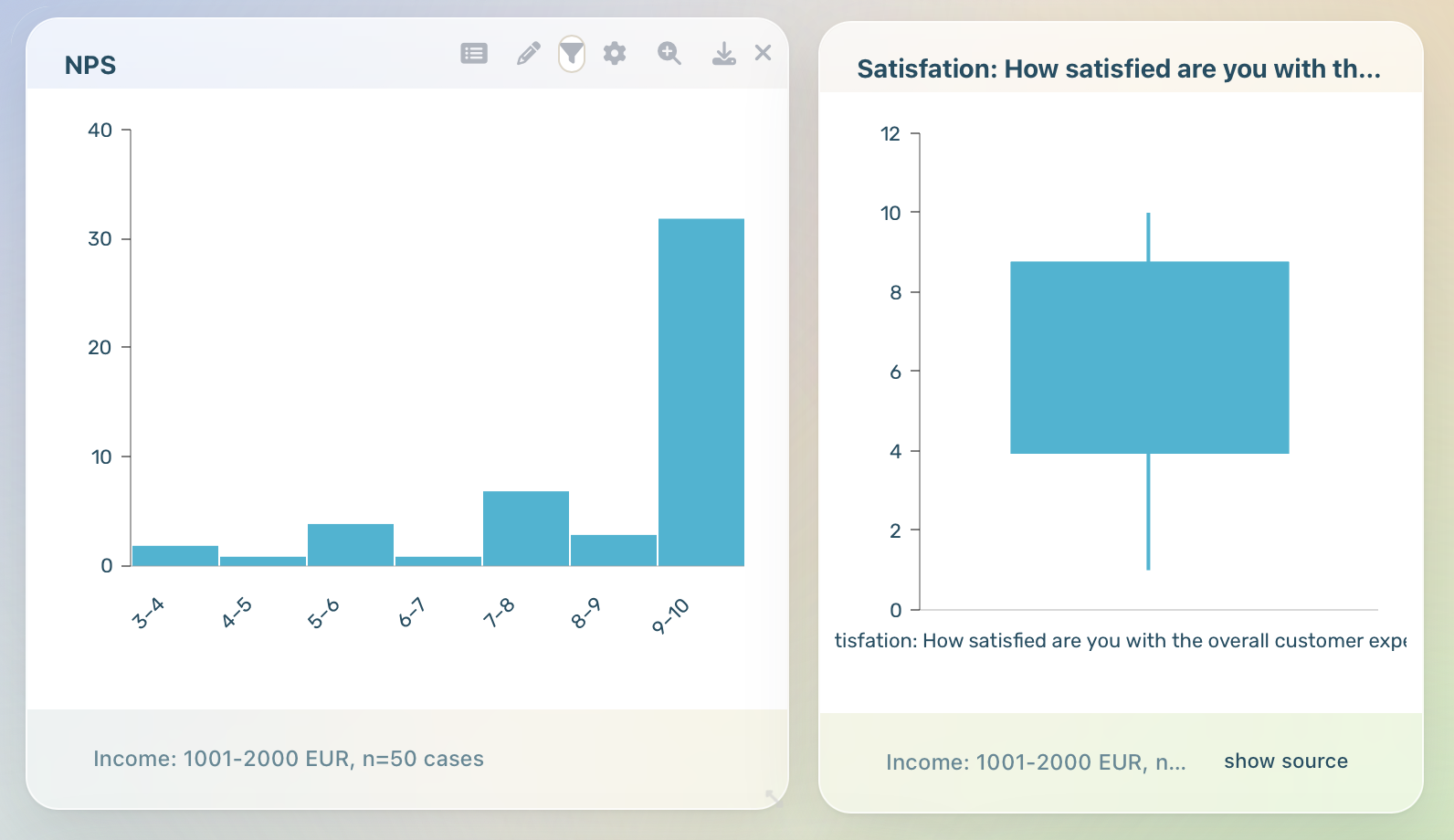
DataLion offers two distribution chart types: the histogram bins a numeric variable into a frequency distribution (automatic bin count via Sturges’ rule, overridable under Bins), and the box plot draws a Tukey box (minimum, Q1, median, Q3, maximum) and flags values beyond 1.5×the IQR as outliers.
- 🇩🇪 Made in Munich
- GDPR-compliant
- DPA included
- Hosted in Germany
- 🌐 Interface in EN, DE, FR, ES, IT & NL
Trusted by research institutes, brands & insights teams






- 50+ interactive chart types
- 20+ statistical methods
- SPSS · Excel · CSV import without data loss
- ISO 27001 certified data centers (Germany)
Histogram with an automatic bin count
The histogram bins a numeric variable into a frequency distribution: DataLion forms the bins automatically and shows how often values fall into each range. The number of bins comes from Sturges' rule — a proven starting point for most distributions.
If the default does not fit, override the bin count under chart settings → Bins. That makes skew, clustering and gaps in age, revenue or ratings visible in a single click.
- A numeric variable binned into a frequency distribution
- Automatic bin count via Sturges' rule
- Bin count freely overridable under chart settings → Bins
- Skew, clustering and gaps at a glance
Box plot as a Tukey box-and-whisker
The box plot draws a classic Tukey box with minimum, Q1, median, Q3 and maximum: the box spans the middle 50% of the values, the line marks the median, and the whiskers reach the extreme values within range.
Values beyond 1.5×the interquartile range (IQR) are drawn as individual outlier points. So you spot spread and extreme cases at once — without an average that hides them.
- Tukey box with minimum, Q1, median, Q3 and maximum
- Whiskers to the extreme values within range
- Outliers beyond 1.5×the IQR as points
- Spread and extreme cases instead of a single average
One box per variable — or per group
Without a breakdown the box plot shows one box per selected numeric variable. Add a categorical breakdown and DataLion draws one box per group — so you compare a distribution directly across segments such as region, age group or wave.
Both chart types render with amCharts4 and export to PowerPoint via image export. DataLion already offers regression, ANOVA and driver analysis — these charts close the gap of visualising a distribution, its spread and outliers directly. Note: in this first version the distributions are unweighted.
- Without a breakdown: one box per numeric variable
- With a categorical breakdown: one box per group
- Rendered with amCharts4, image export to PowerPoint
- Complements regression, ANOVA and driver analysis with the distribution view
See DataLion with your own data
Start free with your own raw data. Or book a personal demo of the path to a finished dashboard.
What users say about DataLion
- via G2
The embedding function allows us to generate insights of our data for our audience and customers by far less than half of the usual time needed before.
Verified user · Leisure, Travel & Tourism - via G2
User-friendliness, especially for market research topics. Structured backend with many customization options.
Verified user · Market Research - via G2
The contacts at DataLion are very committed. If you have problems, you can count on help. DataLion reacts quickly to requests for new functions.
Robert Q. · Managing Director - via G2
Very professional company, attentive to the customer needs, provider of a great software and service.
Generoso M. · CRM Analyst, Automotive

We now work much more efficiently, giving us more time to take care of the derivations and insights from the data for the customers.
More dashboard features
Common questions about box plot & histogram
Which chart types does DataLion offer for distributions?
How does DataLion set the histogram bin count?
How are outliers shown in the box plot?
Can I compare distributions across segments?
Are the distributions weighted?
See your distributions
Try DataLion free and show spread, outliers and frequencies on your own dataset — or get a demo of the box plot and histogram.