
In short: Opening a .sav file tells you what is in it. Analysing it tells you what the data says, and that takes a few decisions a frequency table doesn't make for you. Before the first percentage, codes like 99 for "no answer" have to be excluded and the weight variable has to be applied. Then come frequencies with value labels, crosstabs by subgroup with significance tests, and a way to get the results into slides. This guide walks through those steps for a typical survey file and shows where each one happens when there is no SPSS licence.
Straight to the tools: look inside your file with the free SPSS Inspector (it runs in your browser, nothing is uploaded), then import the file into DataLion for the analysis.
1. Check what the file contains
A .sav file carries more than numbers. Next to the data it stores the variable labels ("How satisfied are you with…"), the value labels (1 = "very dissatisfied" up to 5 = "very satisfied"), the definition of missing values and, if the study has one, the weight variable. Most analysis mistakes begin with one of these being overlooked.
Open the file in the SPSS Inspector and go through the codebook once. Four things are worth writing down:
- Codes for "don't know" and "no answer": often 9, 98 or 99. If the file doesn't declare them as missing, they end up in every mean.
- The weight variable: if the file names one, the agency or panel that delivered it expects you to use it.
- Multiple-response questions: usually stored as one 0/1 variable per answer option, for example q5_1 to q5_8.
- Open answers: string variables with verbatim text, which need coding before anyone can count them.
The Inspector reads the file locally and shows a frequency table with value labels for every variable. That is enough to understand the file. The analysis itself needs a program that can cross variables and test differences.
2. Set missing values and weights before the first percentage
Two settings decide whether every number after them is right. The first is missing values. On a five-point scale, a "don't know" coded as 9 pulls the mean upwards, and a "no answer" coded as 99 pulls it up much further. Exclude these codes per question, then check the base (n) of each question: questions behind a filter have smaller bases by design, and a base that is suddenly larger than expected usually means a missing code slipped through.
The second is weighting. Survey samples rarely match the population on age, gender or region, so agencies and panels deliver a weight variable that corrects for it. Report weighted percentages and means, and show the unweighted number of cases next to them, so readers can see how many answers a figure rests on.
In DataLion both come with the file. The SPSS import takes over the missing-value definitions and the weight variable from the .sav. Codes the file doesn't declare as missing are excluded per question in the codebook (missing values), and a file without a weight can be weighted to target distributions (weighting).
3. Read the frequencies with labels
The first pass is a frequency table for each question, with labels instead of codes. For scale questions, two figures carry most of the message: the top-2 box, the share of the two best answers, and the mean. A top-2 box is easier to explain in a meeting, while a mean reacts to the whole distribution. Report both for the questions the study is about and pick one for the rest.
DataLion builds its codebook from the labels in the file and computes the top and bottom boxes for every scale question automatically, so switching a table to the top-2 box takes one click.
4. Cross by subgroups and test the differences
Frequencies describe the whole sample. Most questions a report has to answer are comparisons: do younger customers rate the service lower, does one region fall behind, has satisfaction changed since the last wave. That is a crosstab, with the question in the rows, the subgroup in the columns and column percentages in the cells.
Every crosstab shows differences, and many of them are noise. A significance test tells the two apart. For shares, a chi² or z-test compares each column with the others; for means, a t-test does. Mark differences at 95 percent, and read columns with fewer than about 30 cases with care, because a single answer moves them by several points.
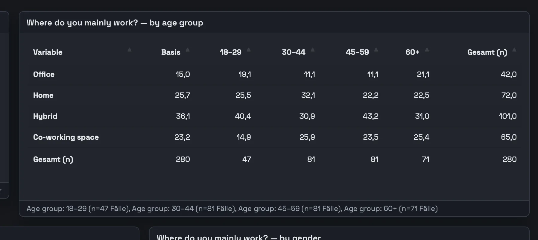
In DataLion, crosstabs can nest breaks, for example age within region, and show the test result inside the table at 80, 90, 95 or 99 percent, as stars or letters (crosstabs, significance tests).
5. Multiple responses and open answers
A multiple-response question arrives as a set of 0/1 variables. Reported one by one they produce eight tables for one question; bundled, they produce one table with the share of respondents per option. In the DataLion codebook such variables are bundled into one question by wildcard (q5_*), and the bundle is applied again to every new wave.
Open answers are the part most analyses skip, because coding them by hand takes days. DataLion's text analysis classifies each answer by sentiment and topic and writes the result back as new variables. From there they can be crossed and tested like any closed question.
6. Get the results out
An analysis usually ends in a slide deck, and copying tables into PowerPoint one at a time is where formatting breaks and numbers go stale. DataLion exports charts, tables and whole dashboards as editable PowerPoint slides in your own template (PowerPoint export), and dashboards can be shared with people who don't have an account. Colleagues who still work in SPSS get the prepared data back as a labelled .sav file.
Which route fits
Without an SPSS licence there are three ways to analyse a .sav file. PSPP is a free desktop program for SPSS-style analyses, syntax included. R with the haven package reads .sav files and does whatever you can program. Both keep the data on your computer, and both expect you to work like a statistician.
DataLion runs in the browser. You upload the file to servers in Germany, the steps above happen in menus, and the results are ready to share. When a project needs more than tables, regression and driver analysis are part of the same tool. The first 14 days include every feature, which is enough to take one study from the file to the slide deck.
Next step
Open your file in the SPSS Inspector and note the missing codes and the weight variable. Then import it into DataLion and build the crosstab for the question your report has to answer. The analysis of a survey beyond the SPSS file, from cleaning to reporting, is covered in the survey analysis guide.