
🚀 Highlights
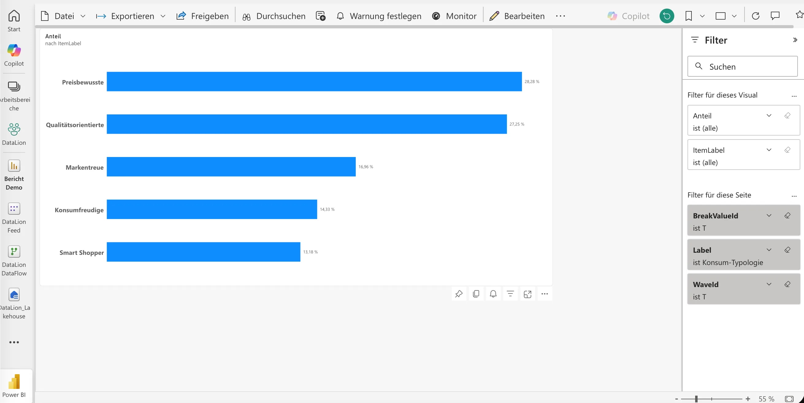
DataLion results flow straight into Power BI: Under Admin → Projects → Settings → BI feed, choose the questions, breakdowns, and waves Power BI should see, then connect Power BI to the project's OData feed. The feed carries the results together with the definitions of those questions, breakdowns, and waves, so one connection covers a whole study. You still set weighting, means, and significance in DataLion, and Power BI receives weighted percentages, bases, means, and significance marks ready to use. DataLion rebuilds the feed every night, or straight away when you ask. If a rebuild fails, the last complete version stays available.
Create the matching access token under Admin → Integrations → API access with the Power BI preset. It can only read. The same page now holds every reusable token for the API and other integrations. Existing projects keep the feed switched off until an administrator enables it and builds the first version.
Edit a chart's data where the chart is: Under Chart settings → Data, group answers or numeric ranges, show those groups as extra bars next to the individual answers, hide options, or change the calculation. The preview shows the resulting bars and numbers straight away. Project editors can save a definition as a reusable variable and use it in other charts. Related columns can also be combined into a multiple-response question or item battery.
Every survey now has four fixed areas: A survey under Admin → Surveys is organized into Build, Field, Monitor, and Results. Sharing, contacts, quotas, invitations, and professional reports each have their own place within Field. Publish, close, and reopen stay visible, and Results opens the analysis dashboard. The Monitor area shows, for each questionnaire page, how many people reach it, how many stop there, and the median time they spend on it. The drop-off overview makes it plain where the questionnaire is losing respondents.
Large tables load faster: Large flat raw-data tables draw only the visible rows and columns as you scroll. Sorting and export still use the complete dataset. Table charts reuse cached results on repeat visits until the data or codebook changes. Compatible calculated KPIs share database queries. Means and valid bases come out of one shared pass over the data and weight tables, and category-specific filters and weights still apply.
✨ What's New
📂 Your first dataset during registration: New users can upload a file while they register. DataLion builds a first dashboard from it while the workspace is being set up, and the confirmation link opens that dashboard once the import has succeeded. Setup progress then counts the steps you completed yourself. Content from demo projects no longer counts toward it.
🕶️ Choose anonymous participation explicitly: Survey settings now distinguish personalized from anonymous responses. In anonymous mode, invitations are kept apart from responses, and identity fields from participant data or URLs stay out of the result dataset. Once real fieldwork has started, the choice is locked. To run the other mode, clone the survey as a new study.
🧩 Embedded surveys that fit their page: Under Field → Share, save the websites allowed to show the survey, check the preview, and copy an embed snippet with a fixed or responsive height. The responsive version adjusts the frame height each time a respondent moves to the next page.
⭐ Star ratings and clearer previews: Rating questions can use accessible stars or the existing button scale. The builder separates a preview that saves no responses, a draft test with disposable responses, and the published survey. An Other option shows its text field right away and has its own button for adding it.
🧠 Four more personality assessments: Mini-IPIP, IPIP Big Five Factor Markers 50, IPIP Honesty-Humility 40, and IPIP-NEO-120 join the template library, each with its sources, reuse terms, and translation notes. Personal results can group facets by domain. Professional access starts switched off for these templates, and you turn it on when you need it.
🗺️ Maps that show change over time: Maps with a wave breakdown gain a wave slider, autoplay, and a view of the change against the previous wave. Missing or withheld values get their own color. Country names also resolve more reliably in studies that use localized labels.
🛠️ More control for administrators: Ask your data can be switched off for the whole workspace under Admin → AI → Built-in AI, or for one project under Project settings → General → AI. Catalog demo projects can be hidden under Admin → System → Platform, and their data stays in place.
📈 Improvements
🧭 Clearer dashboard controls: Report settings, Ask your data, chart filters, and data selection carry clearer labels. Click Data status to see how fresh the results are and refresh them. The panel stays open until you close it. The active tab has its own actions button on desktop and mobile, and Move only appears when there is a report to move to. Chart settings support keyboard navigation, show checked states more clearly, and keep submenus open while you work in them.
📊 Labels and stacked bars: Long category labels wrap inside their cell on column charts, and explicit line breaks render. When you sort whole stacks, the chosen direction and metric also apply to benchmark filters. The order of segments within each stack stays put.
🧪 Consistent significance in charts and exports: Significance tests on weighted estimates use the unweighted respondent counts as their base, so multiplying every weight by the same factor leaves the p-value unchanged. Tests need a raw base of at least 30, chi-square tests need expected cell counts of at least five, and pairwise comparisons are labeled as uncorrected. Dashboard and export legends use the same thresholds and symbols.
🧾 Personal results explain the score: Revised result cards show where the score sits on its scale and which interpretation band it falls into. Group averages appear once five completed values are available. Result pages and PDFs follow the language of the survey template, and you can give the professional report a name that fits your work, such as Advisor or Manager.
🎨 A warmer look: Light and dark appearances get warm surfaces, indigo controls, and new headings. Customer branding and chart palettes stay as they are. Selected filter options keep a checkmark and a visible selection state, and wrapping filters and report toolbars fit more reliably.
📱 Creating surveys on a phone: Clear actions for new surveys and templates, larger touch targets, and stacked template filters help on small screens. The consent bar during registration is compact on phones and leaves the form free.
🔔 Notifications with history: The notification menu shows recent history, lets you mark single items as read, and clears the unread count in one go. Read and unread notifications are kept for different periods.
🌍 Translations and data sources: The French, German, and Dutch interfaces have fewer English leftovers. Under Admin → Projects → Data Sources, comments can be edited in place, and long names or notes no longer push the update time and row actions out of view.
✉️ Invitations and sign-in: A verified sending domain of your own lets you send branded invitations. With an unverified sender, DataLion sends through the system sender and sets your address as Reply-To. Sign-in via OpenID Connect offers per-workspace presets for Google and Microsoft.
🔐 Security
2026.2.197 tightens the rules for fieldwork and sharing. A survey can only be published with a bounded retention period, and reporting applies a minimum base of five unweighted cases. Projects whose retention period has expired are deleted completely, data sources included. Exports and shares apply to exactly the project and report they were requested for, download links expire, and changing a dashboard requires edit rights.
🐛 Important Bug Fixes
- Dashboard tabs: A tab's action menu stays open while you pick an item, so renaming and saving work reliably. The arrows reorder tabs only within the current report and save every move, even when older positions contain gaps or duplicates.
- Sign-in and registration: Login, registration, and password pages cope with malformed form values, and password forms appear inside the page layout. Registration and SSO reach the right workspace even after retries, forms are no longer submitted twice, and SSO errors stay inside the login form.
- Participation counts: Responses from public links, QR codes, embeds, and unique links now count. Previously only email invitees were counted.
- Charts and tables: Empty filter results and hidden chart footers no longer stop a table from rendering. Polarity previews respect scale limits you have not saved yet, text box charts activate without an error, and after an update legends and tables no longer load outdated code. Opening chart styles keeps the current data, and closed account and filter menus stay closed.
- Weighting: Weighting through custom filters works again. An empty generated weight file is rejected before existing weights are deleted, and duplicate rebuilds no longer run.
- Exports and API: PowerPoint exports render significance legends in every mode and all table rows correctly. Dashboard exports also work when the saved chart grid has gaps, and dashboards can be created through the JSON API again.
Enjoy DataLion 2026.2.197. If you connect the BI feed to Power BI, do tell us how it goes.