
In short: for a one-off survey with a few hundred responses, Excel is the right tool: drop a pivot table on it and you are done. It gets tedious with multi-response questions, scale questions and open-ended answers, and it gets expensive not through data volume but through repetition: as soon as the same analysis has to be rebuilt per segment, per site or per wave. This article shows both: how to do it properly in Excel, and where the limit runs.
How the raw data export is structured
Whichever survey tool it comes from, the export is a table with one row per respondent and one column per variable. The first stumbling block is that a question is rarely exactly one column.
- A single-choice question becomes one column with codes (1, 2, 3 …) or plain text.
- A matrix question with six items becomes six columns.
- A multiple-choice question with eight options becomes eight columns of 0s and 1s.
Follow along: every formula in this article fits a sample dataset of 500 respondents that you can download: survey-sample-data.xlsx (fictional customer survey, 20 columns, codebook sheet included). Column A is the ID, B the region, C the age group, D overall satisfaction on a 5-point scale, E the recommendation question from 0 to 10, F to M the eight 0/1 columns of the multi-response question, N to S a matrix question and T the open-ended answer. The data is invented but realistically distributed, including the 99s you are about to throw out.
Before you calculate anything, set up a second sheet as a codebook: column name, the question it belongs to, what the values mean, missing codes. It sounds like bureaucracy and it saves you the afternoon three months from now when you are wondering whether 99 was a rating or a "don't know". It is also the first thing that is missing when a colleague takes the file over. The sample file has such a sheet, so you can see the format.
Two things to do straight away
- Throw out the missing codes. If 99 stands for "no answer" and you blindly take an average, your result is nonsense. Replace them with empty cells (Find & Replace), because
AVERAGEignores empty cells but not the 99. In the sample file, row 441 carries exactly such a 99 in the satisfaction question. - Format the data as a table (
Ctrl+T). Pivot tables and formulas then grow automatically as more responses arrive; otherwise you will eventually be calculating on a range that is ten rows short.
Frequencies: the pivot table
The workhorse. Select the data, Insert → PivotTable, then put the question into Rows and the same question again into Values. Excel counts by default; use Show Values As → % of Grand Total to get percentages.
Two rules that most analyses fail on:
- Always report the base. "68% satisfied" is a different statement at n = 22 than at n = 2,200. Add the count as a second value column.
- Choose the base deliberately. For a filtered question that only some respondents saw, you have to decide: percent of all respondents, or of those who were asked? Both are defensible, but it has to be stated in the report.
Crosstabs
The interesting results almost never sit in the total, they sit in the comparison. In the pivot table you drag the characteristic (age group, region, customer segment) into Columns. Show Values As → % of Column Total then makes the groups comparable.
What Excel will not tell you here: whether a difference holds up. If group A is at 62% and group B at 55%, everything depends on the bases. Excel has no built-in significance test for crosstabs; you would have to rebuild it per cell pair with CHISQ.TEST or Z.TEST. For three tables that is feasible, for thirty nobody does it, and then differences get reported that are not differences. In our view that, rather than the effort, is the weightiest methodological drawback of Excel.
Multi-response questions: the most common mistake
Multi-response questions arrive as 0/1 columns, one per option. The share per option is therefore simple:
=SUM(F2:F501)/COUNTA(A2:A501)
That is: number of mentions divided by number of respondents. The denominator is what matters: you divide by respondents, not by the total number of mentions. That is why the percentages add up to more than 100%, and that is correct.
The classic mistake is to build a pivot table over the mentions and report shares of all mentions. The values then dutifully add up to 100% and answer a question nobody asked ("what share of all ticks does option C account for?") instead of the actual one ("what percentage of respondents mentioned C?").
It gets ugly when you want to cross multi-response questions, say by age group. For that you need a COUNTIFS formula per option across two conditions:
=COUNTIFS($C$2:$C$501,"30–44",F$2:F$501,1)/COUNTIF($C$2:$C$501,"30–44")
That works. But with eight options and five age groups, you are assembling this matrix out of 40 formulas, and again for the next wave.
Likert scales: please, no averages
For scale questions ("1 = very dissatisfied to 5 = very satisfied") the reflex is the average. It is the worse choice for two reasons. First, a Likert scale is strictly speaking ordinal: the distances between the steps are not guaranteed to be equal. Second, and more important in practice: an average hides the distribution. A value of 3.0 can mean everyone is undecided, or that half are delighted and the other half are lost. The average is identical, the situation completely different.
More informative is the top-2 box, the share of the two agreeing steps:
=COUNTIF(D2:D501,">=4")/COUNT(D2:D501)
and, mirrored, the bottom-2 box:
=COUNTIF(D2:D501,"<=2")/COUNT(D2:D501)
Report both side by side. "58% satisfied, 19% dissatisfied" (those are the values from the sample file) is easier to understand than "mean 3.5" and reacts far more sensitively when something changes between two waves.
For many items side by side, a stacked bar chart is the right presentation. A proper polarity chart, where agreement and disagreement diverge from a shared centre, can only be faked in Excel with helper columns and invisible stacked segments. Possible, but the point at which most people give up.
NPS is also just top box minus bottom box
If your scale is the 0-to-10 recommendation question (column E in the sample file), you need no special logic: the Net Promoter Score is the share of promoters (9–10) minus the share of detractors (0–6), reported in percentage points.
=(COUNTIF(E2:E501,">=9")-COUNTIF(E2:E501,"<=6"))/COUNT(E2:E501)*100
The sample file gives +3. Two traps: missing codes are especially treacherous here: a 99 for "no answer" is happily counted as a promoter by COUNTIF(…,">=9") and also sits in the denominator. That is why the question is left blank for non-response in the sample file; in real exports you clear the 99s first. And the passives (7–8) never appear in the formula at all, even though they very much count through the denominator, which is exactly where most home-made NPS cells go wrong. How to ask the question properly, what counts as a good score and how to break NPS down by segment is covered in the guide to the Net Promoter Score, where you can also type your distribution straight into an NPS calculator.
Open-ended answers
Here Excel simply has nothing to offer. Free text has to be read and coded by a person: define categories, sort every mention into one, then count. At 80 mentions that is an hour. At 800 it is a day, and the result is not reproducible: a second person would arrive at a different category system, and by the next wave the categories are different again.
That is precisely why open-ended answers usually go unused in Excel-based analyses. A shame, because they contain the why: the closed questions tell you where it hurts, the open ones tell you what to do.
A pragmatic middle path if you want to stay in Excel: code only a random sample of 100 mentions properly and use the resulting category system to focus the discussion, instead of half-coding everything.
When a tool is faster
The honest answer: less often than software vendors claim. If you run one survey a year, analyse it once and nobody asks follow-up questions later, Excel is hard to beat. The tipping point is not a row count; it sits at three places.
1. Repetition
The most important factor. A one-off analysis in Excel may cost you a day. The problem is the second wave: the pivot tables point at the old range, the formulas need adjusting, and the charts get copied into PowerPoint all over again. Almost the entire effort recurs. In an analysis tool the analysis is defined once; the new wave runs through the same structure.
Rule of thumb: from about the third repetition of the same analysis, the setup has usually paid for itself.
2. Number of breaks
One crosstab is quick to build in Excel. But if each of 30 questions has to be broken down by five characteristics, that is 150 tables. That is not a thinking problem, it is a clicking problem, and exactly the kind of work that produces copy-paste errors nobody ever finds again.
3. When other people want to look for themselves
As soon as stakeholders have their own questions for the data ("what does that look like for the southern region?"), you become the bottleneck in Excel: every question means a new pivot table and another email with an attachment. A dashboard that everyone can filter for themselves solves not just a reporting problem but, above all, an availability problem.
And the methodology
Regardless of volume, there are things Excel cannot do cleanly: significance tests in crosstabs, weighting to target structures, consistent missing-value handling across many variables, reproducible recoding. If your analysis has to stand up methodologically for a works council, regulator, client or publication, that is the real argument.
The short decision guide
| Situation | Recommendation |
|---|---|
| One-off survey, < 300 responses, few questions | Excel |
| One-off, but many crosstabs by segment | Borderline – Excel if you have the time |
| Recurring survey (pulse, tracker, annual wave) | Tool |
| Several stakeholders with their own questions | Tool (dashboard) |
| Many open-ended answers | Tool (automated topic analysis) |
| Weighting or significance required | Tool |
| Results go to a works council, regulator or client | Tool (auditability) |
What this looks like in DataLion
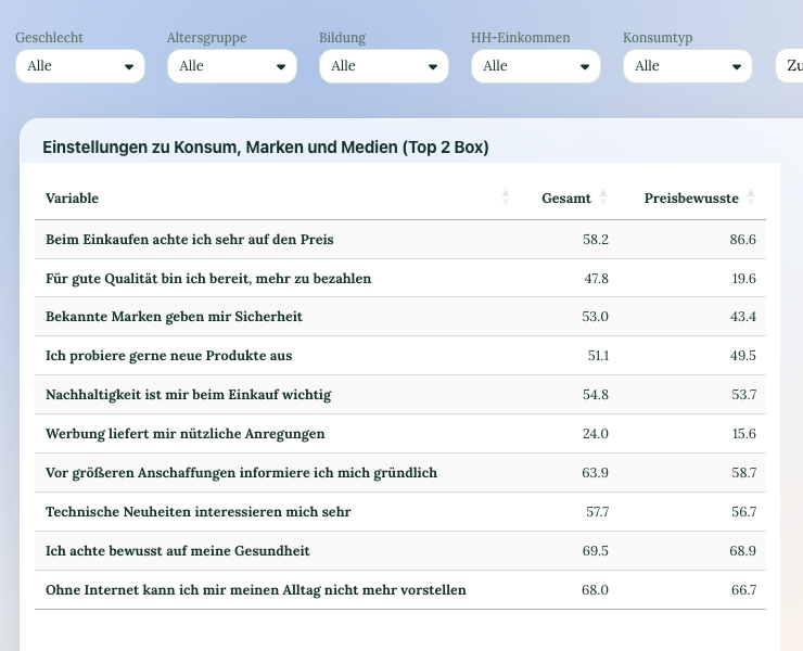
For completeness, since you are on our site: in DataLion you upload the same Excel or SPSS export you would otherwise open in a spreadsheet. Multi-response questions are recognised as 0/1 sets, top and bottom boxes (top box, top-2, top-3 and the mirrored bottom values) are computed automatically for every scale question and you pick with one click which one goes into the table, and crosstabs come with the significance test built in. Open-ended answers run through AI topic analysis, and the report goes out as an editable PowerPoint.
The real difference only shows up at wave two, though: you load the new data into the same structure and the analysis is there. The whole workflow is described in our guide to analysing a survey.
If your survey is a one-off and small, stay with Excel. Honestly.
Past the point where Excel stops: DataLion takes the same export, keeps labels, weights and bases intact, and turns it into a filterable dashboard with significance tests and a PowerPoint report, GDPR-compliant and hosted in Germany. See how survey analysis works or try DataLion for free.