
A brand tracker is not a survey you design once and improve every quarter. It is a survey you design once and then refuse to change, because the whole point is comparability. Every question you reword between waves is a data point you can no longer plot on a trend line.
That constraint is what makes the first draft matter. This is what belongs in it, in which order, and where trackers usually go wrong.
The funnel is the backbone
A tracker measures the same brand funnel wave after wave:
- Unaided awareness — "Which brands in [category] come to mind?" Open text, asked first, before any brand list appears.
- Aided awareness — the same question with a brand list, multiple choice.
- Consideration — which of these would you consider.
- Usage — which do you currently use, or used most recently.
- Advocacy — the NPS question for the brand they use.
- Image — a matrix of attributes across the relevant brands.
The order does real work. Unaided awareness has to come before anything that names a brand, otherwise you have primed the answer and the number is worthless. This is the single most common flaw in home-made trackers: the questionnaire opens with a brand list, and unaided awareness is asked three screens later.
Where trackers break
The brand list changes. A competitor gets added in wave four, and aided awareness for every other brand drops, because respondents now spread their answers across one more option. That drop is an artefact, and it will be read as a real decline. If you must add a brand, add it and note the break in the series.
The sample composition drifts. Wave one runs in January with 500 respondents, wave two in July with 380 and a younger skew. Half the movement you see is demographics. Weighting to a fixed target profile is what keeps waves comparable, and it has to be applied from the first wave rather than retrofitted once someone notices.
The image battery grows. Someone adds three attributes because a campaign is running. Now the matrix has 14 rows, completion drops, and the three new attributes have no history. Keep the battery fixed and put campaign-specific questions in a separate block that you are allowed to change.
And nobody wrote down the analysis plan. Six waves in, the person who built the tracker has left, and no one knows whether "consideration" was defined as top-two-box or top-three-box. Write the definitions next to the questionnaire.
Sample size and cadence
For a total-market read, 300 to 500 responses per wave is the usual working range. What actually determines the number is your smallest reporting cell: if you report by three age groups and two regions, you need enough in each. A cell of 40 will bounce around so much between waves that every change looks dramatic and none of it is real.
Quarterly is the default cadence. Monthly is worth it when you run continuous campaigns and need to see short-term effects; annually is too slow to act on. Whatever you pick, keep the field period the same length and in the same part of the quarter. A wave that runs over Christmas is not comparable to one that runs in March.
A ready-made starting point
Our brand tracker survey template contains the full funnel in nine questions, roughly six minutes of respondent time: unaided and aided awareness, consideration, usage, NPS, the image matrix and an open verbatim. It is built to stay unchanged between waves, and you can try the questionnaire before adapting the brand list to your category.
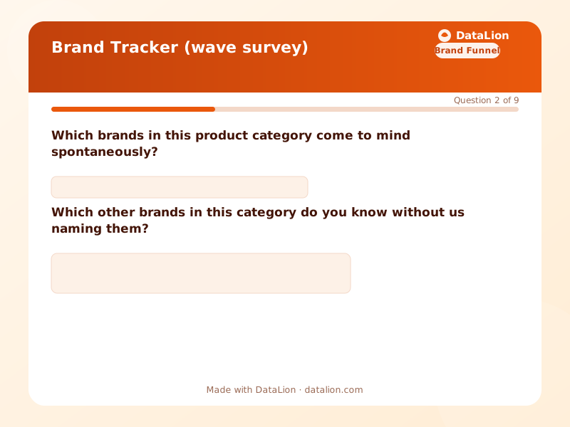
If you only need one part of it, there are narrower templates for brand awareness and brand image.
What the dashboard has to do
The reporting is where a tracker earns its keep. Three things the dashboard needs to handle:
- Waves as a time axis: every metric plotted across waves, with the ability to filter to a segment and have the whole trend recalculate, rather than a separate chart per wave.
- Significance between waves: awareness moving from 34 to 37 percent may be noise. Without a significance test next to the number, someone will present it as growth.
- Weighting applied everywhere, including inside filters. A weighted total with unweighted subgroups is a common combination, and a wrong one.
Mobility Brands in our public gallery is a live example on simulated data: 280 synthetic respondents, nobody was actually surveyed, but the funnel from awareness through usage is complete and filterable by segment. You can click through it without an account and see what the reporting side looks like before you field anything.
Waves, weighting, significance and the export into a slide deck that keeps its formatting are described on the brand tracking page.
One last thing about the first wave
The first wave is a baseline. It will not tell you whether your brand is doing well, because there is nothing to compare it to yet. Its job is to be methodologically clean enough that wave two means something. Spend the effort on the questionnaire and the sample definition, not on interpreting the first set of numbers.