
Team Health Check
The health check based on the Spotify model: teams rate nine dimensions in traffic-light format – from mission via pace to fun.
The live demo opens the real questionnaire — no signup required.
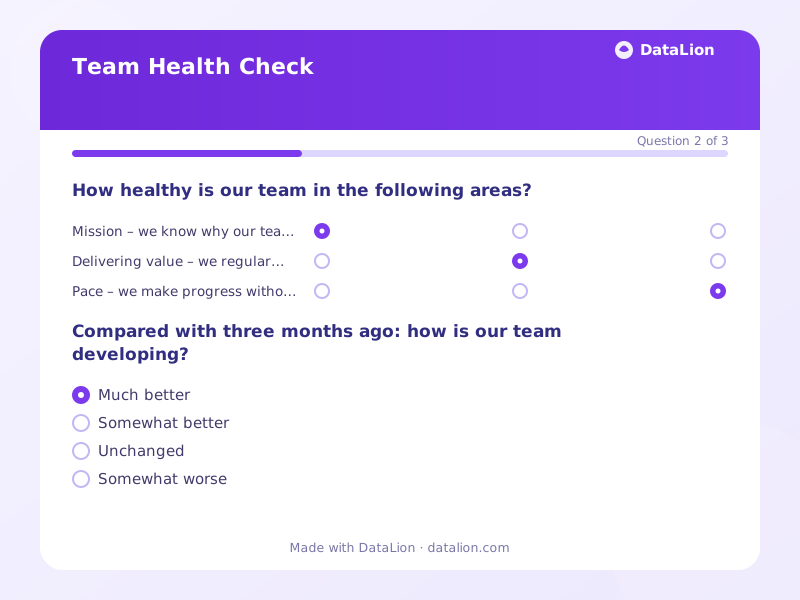
The Squad Health Check, developed and openly published by Henrik Kniberg and colleagues at Spotify, has become the standard for agile team diagnostics: teams rate key dimensions of their collaboration in traffic-light format – deliberately subjective, deliberately simple. This template turns the workshop format into an asynchronous survey with nine generalised dimensions from “mission” via “delivery pace” and “learning” to “fun”. That makes the check scalable across many teams and quarters – but discussing the results still belongs in the team, for example in the retrospective. Traffic-light data is a conversation starter, not a management steering KPI.
When should you use this template?
This template is a great fit for:
- Quarterly per team as a baseline before the retrospective
- Across many teams to spot patterns (e.g. “pace” red everywhere)
- After reorganisations to track the effect on team health
Every question in this template
- 1Matrix
How healthy is our team in the following areas? *
Green = going well · Amber = so-so · Red = needs attention
Red – needs attention Amber – so-so Green – going well Mission – we know why our team exists and what it should achieve. Delivering value – we regularly ship results that benefit our customers. Pace – we make progress without unnecessary waiting and blockers. Process – the way we work suits our tasks. Quality – we are proud of what we deliver. - 2Single choice
Compared with three months ago: how is our team developing?
- Much better
- Somewhat better
- Unchanged
- Somewhat worse
- Much worse
- 3Long text
What is the one improvement that would help our team most next quarter?
From questionnaire to dashboard
The dashboard turns individual traffic lights into your organisation's health board:
- Health board: dimensions × teams: The classic squad health view: all dimensions crossed with teams as a heatmap. Red columns reveal systemic issues, red rows teams that need support.
- Traffic-light distribution per dimension: 100% stacked bars in green/amber/red per dimension – the whole-organisation view at a glance.
- Health trend across quarters: The share of green ratings as a line per wave – is working here getting better or worse right now?
- Self-perceived trend: The “better or worse than three months ago?” question as a donut – often more revealing than the absolute traffic-light state.
- Improvement topics: The open question on the one improvement, clustered via AI topic analysis – ready to use in the next retro.
Related survey templates
- Psychosocial Risk Assessment (Workplace)Anonymous employee survey to fulfil the psychosocial risk assessment required under the German Occupational Safety Act (§5 ArbSchG), along the recognised GDA assessment areas.
- AI Literacy Assessment (EU AI Act Art. 4)Anonymous self-assessment of your employees' AI literacy – as a needs analysis and documentation basis for the training obligation under Article 4 of the EU AI Act.
- Psychological Safety in TeamsMeasures, following Amy Edmondson, whether team members can take risks, admit mistakes and voice concerns – the strongest known predictor of team performance.
- Recovery Experience (REQ)Four ways of refuelling after work: detachment, relaxation, mastery and control – shown as a profile across all four dimensions.
Frequently asked questions
Survey or workshop – which is better?
Should managers see team results?
Can we adapt the dimensions?
Start with this template
Load the template into DataLion, adapt it to your brand and start collecting responses — GDPR-compliant, in minutes.