
DataLion 2026.2 is our biggest release yet. Until today, DataLion was the place your survey data went. From now on, it runs the whole loop: collect it, listen to it, present it. Here are the five changes that make the difference – the full list lives in the complete 2026.2 release notes.
1. Drop a file, get a dashboard
The upload tile on the start page is now a live drop zone. Drop a CSV, Excel or SPSS file on it and DataLion creates the project, imports the data, generates the codebook and assembles a starter dashboard – in a single request. You don't land in an empty project; you land on finished charts.
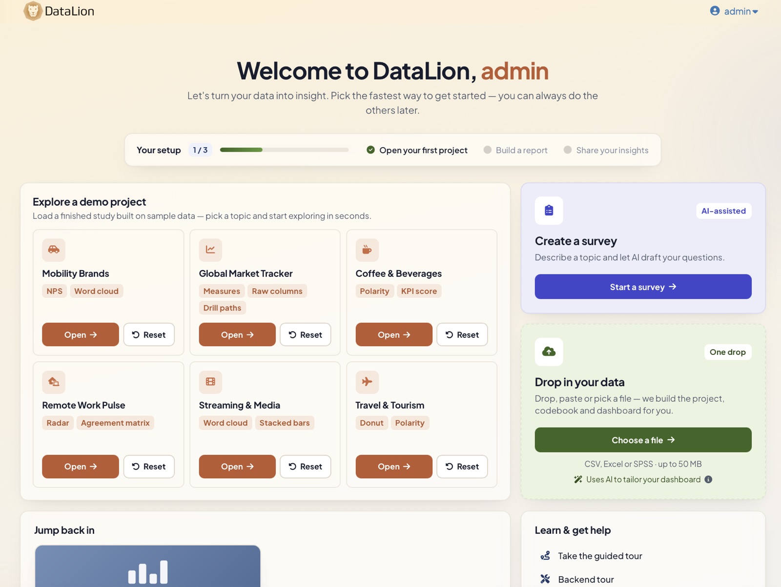
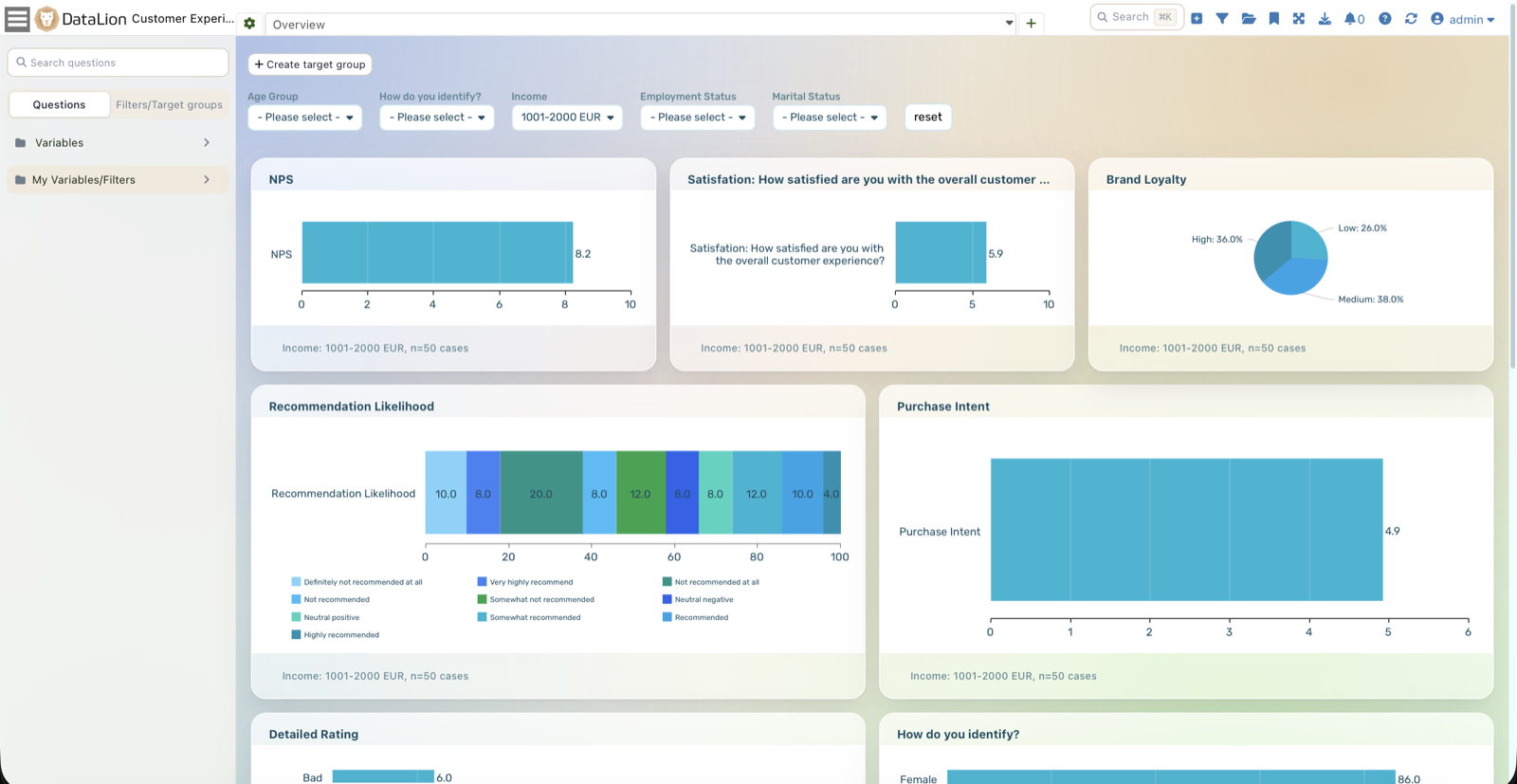
With an AI model configured, it reads your data first and designs the layout for what the file actually is: survey files get one chart per question, with matrix and multiple-choice batteries fused into stacked charts. Business exports get themed tabs of KPI tiles, breakdowns, metrics tables, a wordcloud and – where dates exist – a timeline. Without a model, the rule-based planner builds the dashboard anyway.
More: Excel & CSV import and SPSS import.
2. Build and run surveys, natively
DataLion now has a full survey module. You design the questionnaire in a three-pane editor with 23 question types – single and multiple choice, NPS, matrix/Likert, slider, ranking, picture choice, consent and more – reorder by drag-and-drop, add skip logic and display conditions, and publish in a click.
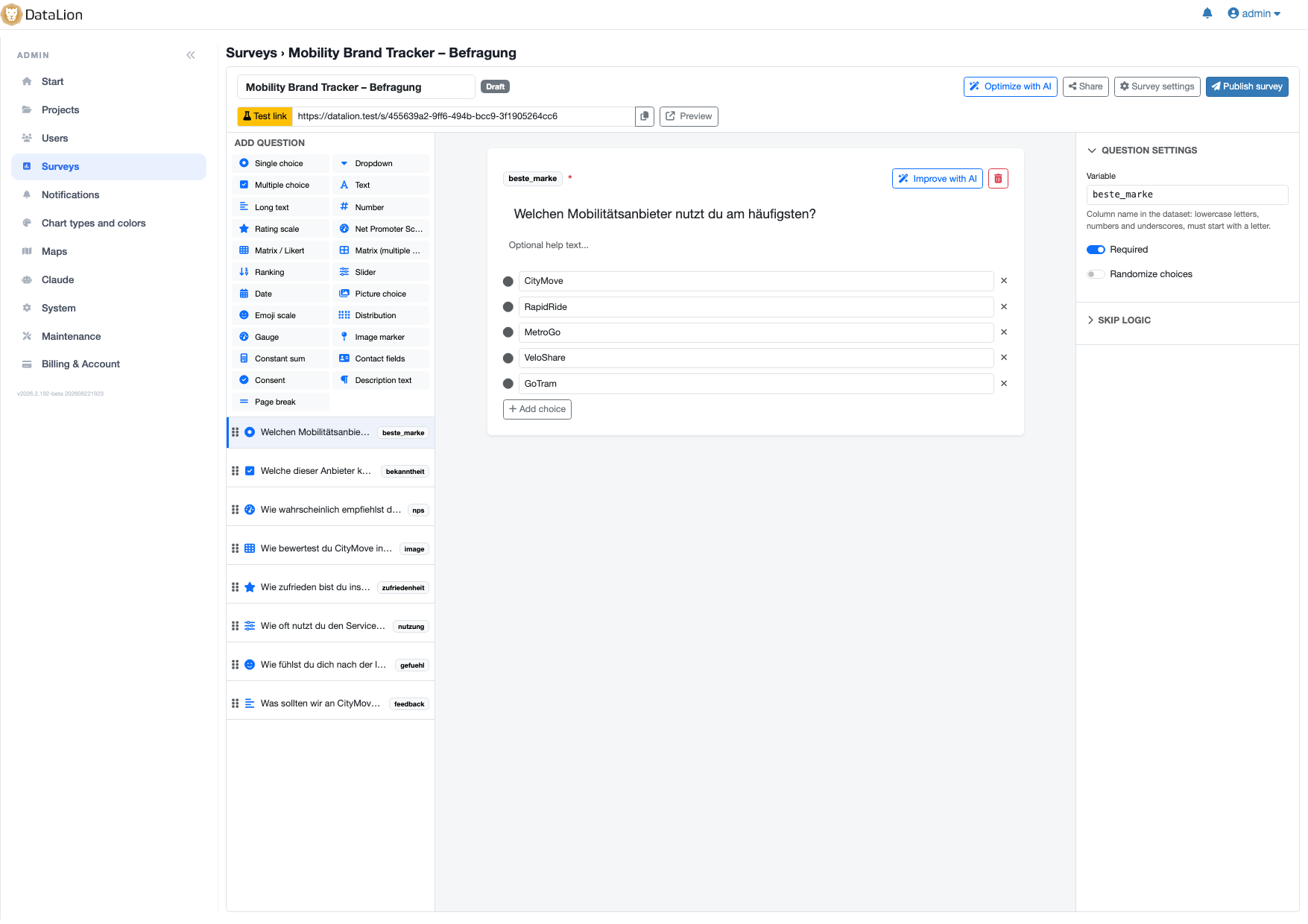
The part that matters happens on publish: DataLion automatically creates a project with a response dataset and a complete codebook. Results are chartable on the existing dashboard stack from the very first answer – with filters, cross-tabs, significance tests and exports. Respondents fill it out on a mobile-first runner under a tokenized link, no login required.
On top of that: 75 ready-made, GDPR-friendly survey templates – customer feedback (CSAT, NPS, CES), HR (engagement, eNPS, psychological risk assessment), market and brand research, events, education, public sector – an AI questionnaire generator that turns a topic description into a full survey, plus Conjoint and MaxDiff question types with balanced designs, R-backed analysis and a preference-share simulator.
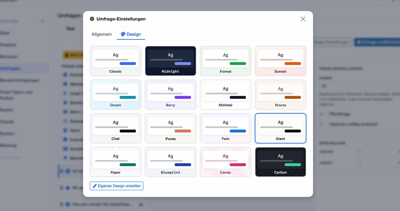
And a survey should look like you, not like your tool: 17 ready-made survey designs – Classic, Connections, Midnight, Forest, Sunset, Ocean, Berry, Minimal, Warm, Chat, Poem, Twin, Giant, Paper, Blueprint, Candy and Carbon – are there as visual preview cards, plus a custom builder with color pickers for accent, background, card and text, and four font styles. Everything applies live to the public survey.
More: question types, survey logic, distribution and survey dashboards.
3. Text analytics for open-ended answers
Open-ended answers used to be the part of the dataset nobody analyzed. New text analytics turns them into structured data: from Admin → Projects → Codebook → Tools, "Analyze open text" classifies every response by sentiment and an auto-discovered topic, then writes the results back as new categorical variables, codebook entries included.
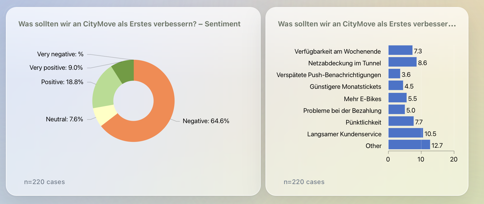
So sentiment and topic immediately work with charts, filters, cross-tabs and exports. A ready-made "Text analytics" report with a sentiment chart and a topic chart is created for you automatically.
More: sentiment & topic analysis.
4. Theme Studio: your look, not ours
A new admin area for building your own brand experience. Start from a preset or one of the 17 built-in design templates, edit design tokens, custom CSS and custom JS with a live preview, apply the theme to any project, and export or import theme bundles to move them between instances. You can also generate a theme from your brand: give it a website URL, logo, description or seed colors and let AI propose the palette and typography. Projects without a theme render exactly as before.
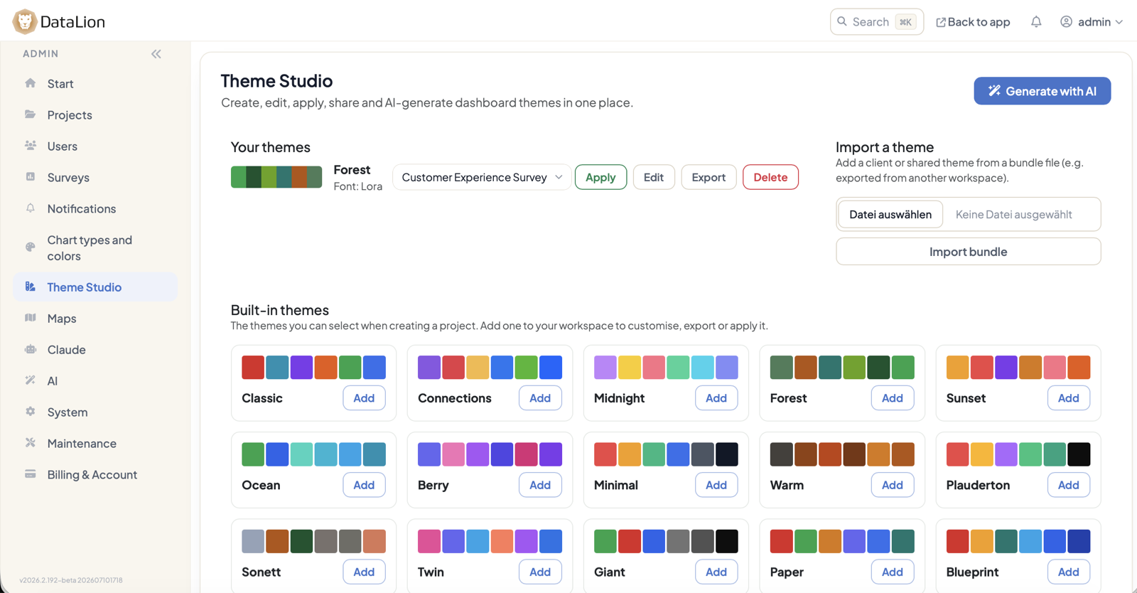
More: dashboard design & branding.
5. Present — live first, then as Google Slides
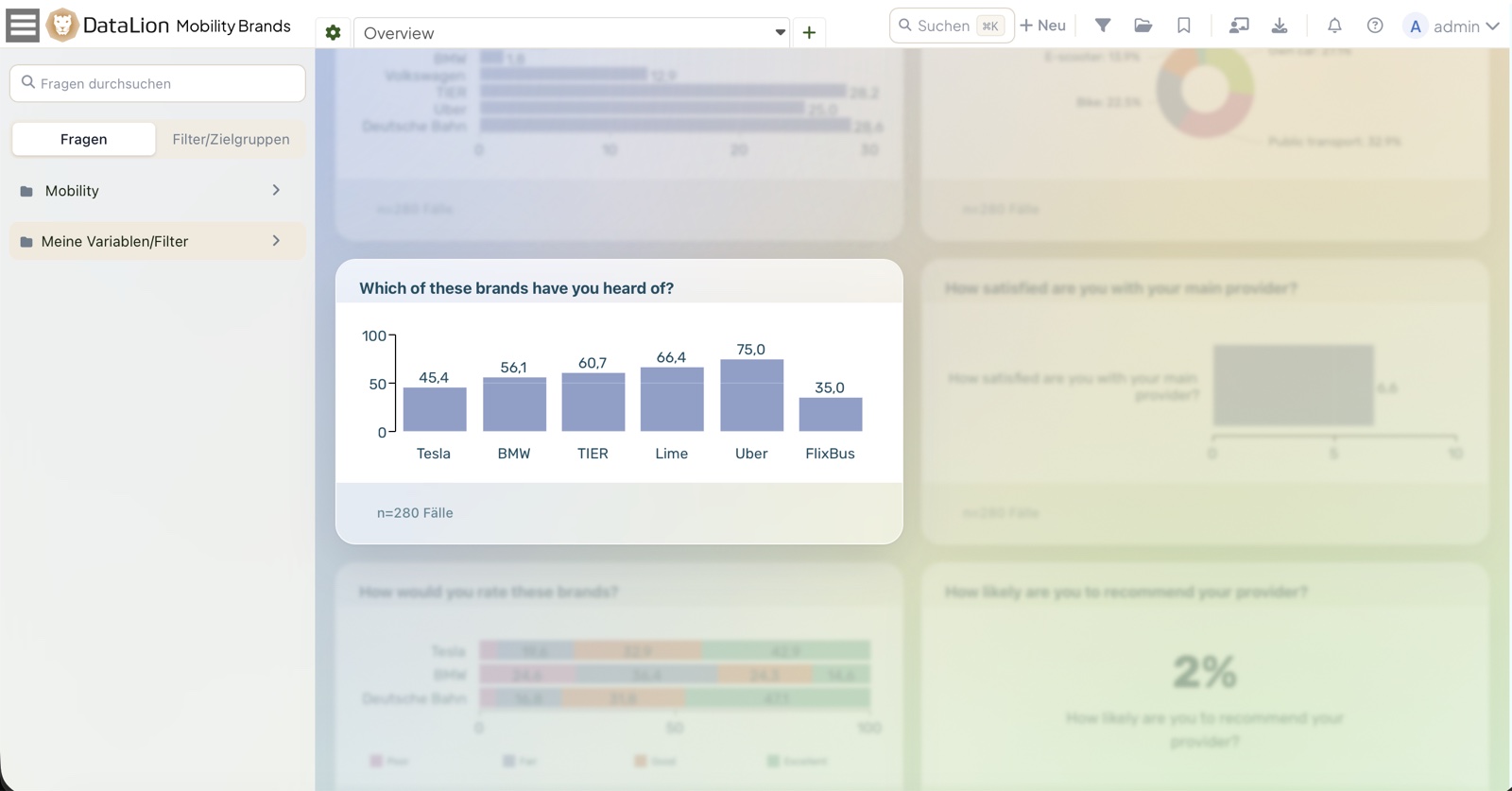
A dashboard with a total and several splits is a lot to take in when you are presenting. A new Presentation menu in the top bar now groups the tools for it: Fullscreen presentation, a Focus mode, a Zoom mode, and “Hide all charts”. In Focus mode, clicking a chart spotlights it and dims the rest; in Zoom mode it opens enlarged in an overlay you step through with the arrow keys. An eye icon on every chart's toolbar collapses individual tiles to their header. All of this is remembered per viewer, in the browser — it never changes the saved dashboard or your colleagues' view. This is the first phase; more presentation modes will follow.
And when it needs to become a deck to share: dashboards, reports and single charts can now be exported as live, editable Google Slides decks into your connected Google Drive. Chart data lands in a companion Google Sheet and is embedded as native, editable Sheets charts – with your DataLion colors, titles, legends, value labels and number formats applied. Tables and KPI widgets render as native Slides tables and number slides. An optional Slides template skins the whole deck.
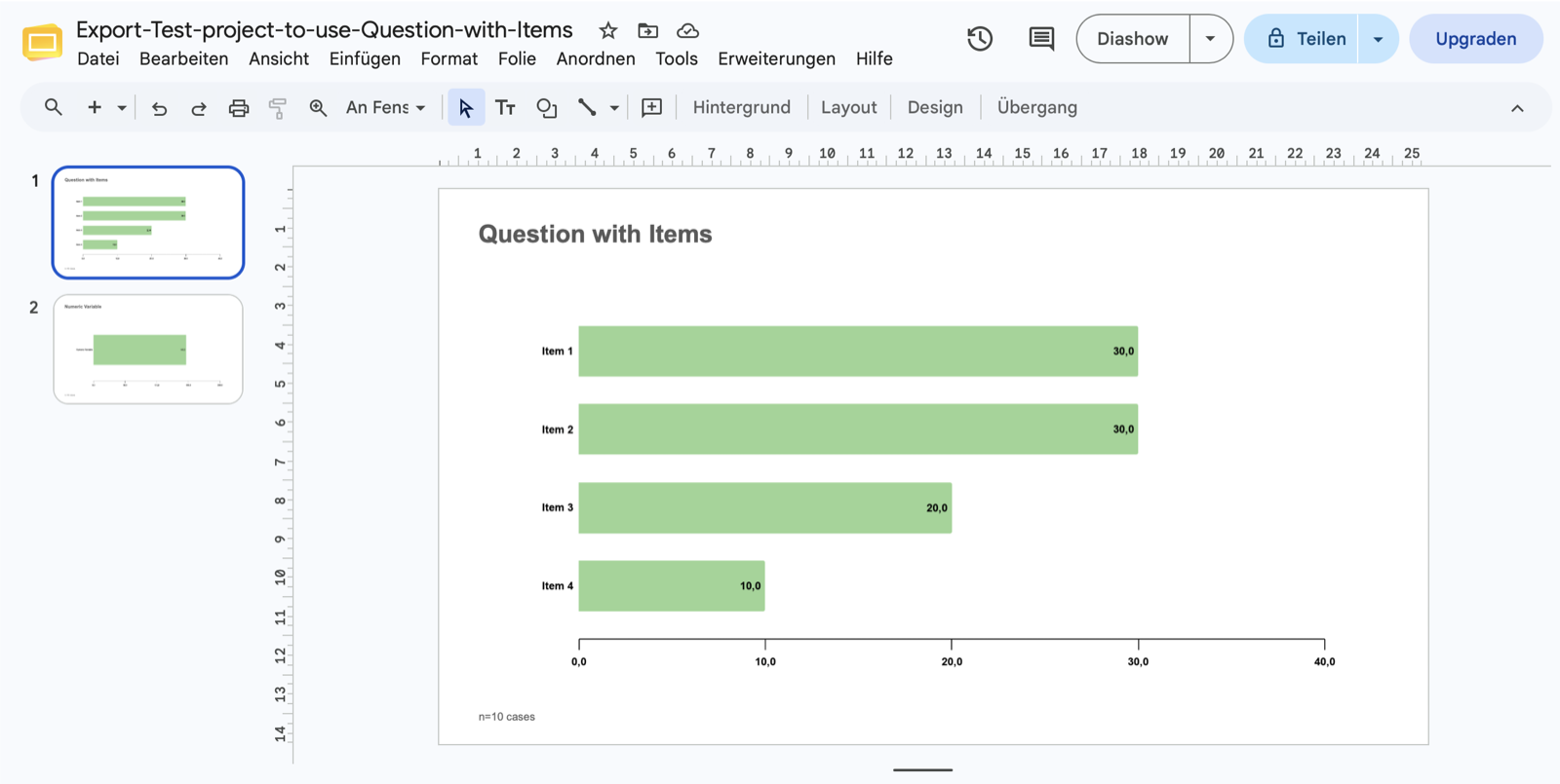
More: Google Slides export and PowerPoint export.
Also in this release
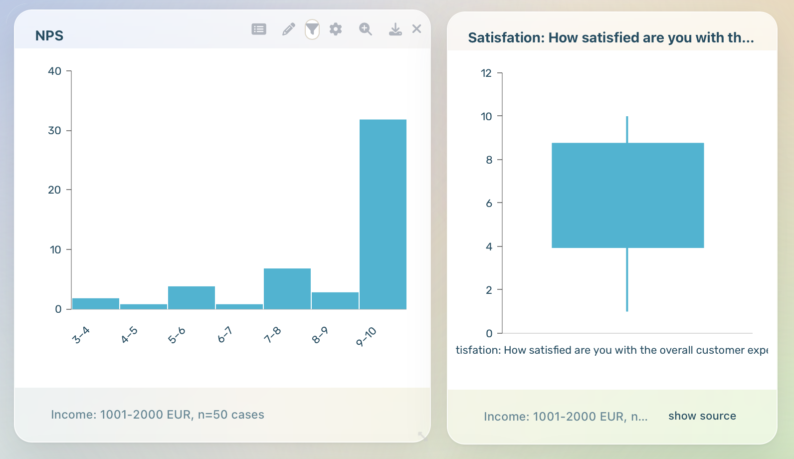
- Box plot & histogram: two new distribution chart types in the chart picker (details).
- Google & Microsoft sign-in: SSO from both the login and signup pages (details).
- Dashboard command palette:
⌘K/Ctrl+Kfor filters, charts, reports and questions. - Filters without the page reload: filters redraw only the affected charts instead of reloading the dashboard.
- Redesigned chart settings with instant preview: the reworked settings inspector previews presets and color palettes right on the chart, makes saved project styles reusable across the project, and shows with a state chip whether a chart follows the project default, a shared style, or its own settings.
- 17 project design templates: the same design family for dashboards – as preview cards on the New Project page.
- Dutch interface: Dutch joins English, German and French as a full interface language.
- New start page with a demo gallery: an onboarding hub with one-click demo projects.
- Bring your own model: your own HybridAI, OpenAI, Anthropic, Azure OpenAI or Mistral credentials (details).
- Build dashboards from Claude: the MCP integration now creates measures, text boxes and widgets from a description.
Plus more than 20 further improvements and bug fixes – from more accurate significance letters to snappier dashboards and hardened admin uploads. It's all in the complete 2026.2 release notes; the detailed notes for the beta build are under 2026.2.192.
Thanks for being part of the DataLion journey. 2026.2 is our biggest step yet toward closing the full research loop – collect, analyze, and present, all in one place. Happy analyzing! 📊